|
|
Critique By:
Roberto Arcari Farinetti (K:209486)

1/30/2006 10:21:27 AM
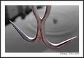
i like it..
roby
|
| Photo By: Philippe Talbot
(K:88)
|
|
|
Critique By:
Rob Patrick (K:2177)
4/27/2003 1:30:57 PM
A real good and simple image.
|
| Photo By: Philippe Talbot
(K:88)
|
|
|
Critique By:
Nita H (K:548)
4/10/2003 7:42:31 AM
I like the setting and how the beauty of the water contradicts the industrial surroundings.
|
| Photo By: Philippe Talbot
(K:88)
|
|
|
Critique By:
Trevor Tollefsbol (K:2458)
4/4/2003 11:44:02 AM
I really like how it seems to be a normal landscape on the right, but as you work your way left it almost turns into a painting with the blurred foliage. Beautiful shot!
|
| Photo By: Philippe Talbot
(K:88)
|
|
|
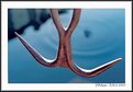
Critique By:
Deleted User (K:6775)
1/26/2003 8:45:13 AM
Philippe...this came up on random images and had to take a look..i remember when you posted this image and those Reds definitely shout at you dont they. Nice abstract...where have you gotten to I havent seen any recent images from you...*smile* Maggie
|
| Photo By: Philippe Talbot
(K:88)
|
|
|
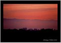
Critique By:
Kim Culbert (K:37070)
6/29/2002 2:02:07 PM
A very unique vantage point... where the hills beyond mimic the cityscape. Very cool.
|
| Photo By: Philippe Talbot
(K:88)
|
|
|
Critique By:
Kim Culbert (K:37070)
6/10/2002 3:53:43 PM
Just browsing your portfolio and I noticed that you ask why most people don't find the pleasing to the eye... I think that having the boy in dead centre doesn't do anything for the shot, plus he seems a little soft (not in focus). Looks like a nice location and with summer on the way maybe you will get to try this again.
|
| Photo By: Philippe Talbot
(K:88)
|
|
|
Critique By:
Kim Culbert (K:37070)
3/3/2002 8:09:13 PM
An interesting image with a lot to look at! Do you have one without the seal to post, even as a side photo to this one... I like the idea of the seal, but if you hadn't told me what it was I would be distracted, trying to figure it out! I would just like to see the difference that the seal makes. I'm confident that you placed this one here for the sole reason that without the seal there is no depth perception. Okay, now I am just rambling.
Great shot! *grin*
|
| Photo By: Philippe Talbot
(K:88)
|
|
|
Critique By:
Kim Culbert (K:37070)
1/30/2002 1:13:19 PM
Great composition with this shot, I like the cross standing against the dark blue shot, but to me (or my computer!) the white cross looks a little soft. Is it me? Or is it the scan? Still a peaceful image.
|
| Photo By: Philippe Talbot
(K:88)
|
|
|
Critique By:
good bye! (K:-694)
1/24/2002 2:59:36 PM
I guess it doesn't look as good as it might be in a larger format.
is there a place I could see this image on the Internet?
|
| Photo By: Philippe Talbot
(K:88)
|
|
|
Critique By:
al shaikh (K:15790)
1/10/2002 7:28:34 AM
I like this a lot too, strange such a nice image had no comments. Well here is one for you. It's great.
al
|
| Photo By: Philippe Talbot
(K:88)
|
|
|
Critique By:
George Marks (K:15437)
11/13/2001 10:16:39 AM
This is basic and very good. There are so many times we are unable to move around a subject so we have to take what is available. Better to make the most of the occasion, or you may never have another opportunity.
|
| Photo By: Philippe Talbot
(K:88)
|
|
|
Critique By:
Petros Stamatakos (K:12101)
11/11/2001 5:48:53 PM
Philippe, I just saw this through the random images... Love your work!
|
| Photo By: Philippe Talbot
(K:88)
|
|
|
Critique By:
Mary Sue Hayward (K:17558)
7/19/2001 6:58:12 PM
Very Rothko. I like it.
|
| Photo By: Philippe Talbot
(K:88)
|
|
|
Critique By:
sameer (K:197)
7/19/2001 8:35:32 AM
a nice gradation of colors phil.....good one !
|
| Photo By: Philippe Talbot
(K:88)
|
|
|
Critique By:
Artie Colantuono (K:12275)
7/19/2001 4:06:07 AM
interesting abstract..tri-banding is a bit unsettling...but the colors and shapes in the bands kind of allow this image to hold its own....pretty nice image Phil....
|
| Photo By: Philippe Talbot
(K:88)
|
|
|
Critique By:
Artie Colantuono (K:12275)
7/17/2001 5:27:08 AM
nice photo shop work however same comments hold for this as the original post of this image........
|
| Photo By: Philippe Talbot
(K:88)
|
|
|
Critique By:
Chris IGP (K:12)
7/16/2001 3:49:04 PM
Like the hand coloring..nice work Phillipe
|
| Photo By: Philippe Talbot
(K:88)
|
|
|
Critique By:
Artie Colantuono (K:12275)
7/16/2001 6:59:07 AM
Phil there are a few visual effects that is causing the reactions your getting......
THe most obvious is the child is a bit dark as the entire scene could be a bit lighter....Frame is very open but that is not a bad thing....however the two together hurt your presentation.....the really distracting thing here is the horizontal banding starting from the childs waiste and up...you have 7 horizontal bands and then when you get up above the image gets muddy.....good concept here but you need to see this through better....
|
| Photo By: Philippe Talbot
(K:88)
|
|
|
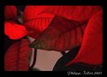
Critique By:
Artie Colantuono (K:12275)
7/16/2001 6:59:07 AM
this image looks very soft, thats unusual for you Phil....Scan?....could be a little lighter....color combo is really nice and your perspective is really good on this...I think the split in the frame needs to be eliminated...left 2 flowers....
|
| Photo By: Philippe Talbot
(K:88)
|
|
|
Critique By:
Debbie Groff (K:9569)
7/15/2001 9:13:50 PM
Very, very lovely picture. I agree with Artie, even tho I do love this color of blue, but when I scrolled down to crop as Artie suggested it really did have a lot of impact.
|
| Photo By: Philippe Talbot
(K:88)
|
|
|
Critique By:
Debbie Groff (K:9569)
7/15/2001 9:07:51 PM
Phillippe if you ever have the time, I would like for you to look at my tulips I posted. I've posted several pics and the tulips are way back there somewhere. I loved the picture myself, but haven't had that many comments about them. Not to be tooting my own horn, but I would just like to see what your comment would be. Thanks, Debbie
|
| Photo By: Philippe Talbot
(K:88)
|
|
|
Critique By:
Debbie Groff (K:9569)
7/15/2001 9:04:27 PM
I like the lighting, maybe cropped from top down to rocks, and if the child had on a different color of shirt, I'm not sure what color it should be but the light on the shoulders is the only thing I find a bit distracting. Just me tho.
|
| Photo By: Philippe Talbot
(K:88)
|
|
|
Critique By:
Artie Colantuono (K:12275)
7/15/2001 6:47:37 AM
Phil I like the about comment on this.......
however I think if you remove the wood or whatever those things is in the left corner and what might be your shadow in the center this would be and is a rather good image....I like the impact you got here...nice framing and lighting...
clone out the minor distractions and this IMAGE GOT BALLS
|
| Photo By: Philippe Talbot
(K:88)
|
|
|
Critique By:
Deleted User (K:2231)
7/14/2001 8:52:17 AM
just a side note.. this thumbnail looked like a womans leg and foot under a table with a red flowing tableclothe... sort of an intersting idea for a shot.. now that I think of it.
|
| Photo By: Philippe Talbot
(K:88)
|
|
|
Critique By:
Artie Colantuono (K:12275)
7/14/2001 4:40:41 AM
this is nice Phil but the original seemed to be more subtle...still a very cool image......
|
| Photo By: Philippe Talbot
(K:88)
|
|
|
Critique By:
Artie Colantuono (K:12275)
7/14/2001 4:40:41 AM
your right it does look 60's /70's....nice perspective...wish you had a bit more texture or detail in the alley but this is workable...nice seeing Phil
|
| Photo By: Philippe Talbot
(K:88)
|
|
|
Critique By:
Artie Colantuono (K:12275)
7/14/2001 4:40:41 AM
I like the abstract quality of this Phil..i also like the framing and the lighting but the front most leaves need to be sharper...would have prefered the front sharp and the back soft on this if you couldn't get sufficent DOF to cover all
|
| Photo By: Philippe Talbot
(K:88)
|
|
|
Critique By:
Chris Whaley (K:3847)
7/14/2001 4:40:41 AM
Actually I think I like this version more...nice work.
|
| Photo By: Philippe Talbot
(K:88)
|
|
|
Critique By:
Chris Whaley (K:3847)
7/14/2001 4:29:20 AM
Very cool perspective...nice work.
|
| Photo By: Philippe Talbot
(K:88)
|
|