|
|
Critique By:
Ronen Helman (K:7393)
1/29/2008 7:40:41 PM
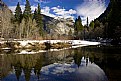
superb:colours,reflection,atmosphere.
well done 7++++++++
|
| Photo By: Mike Rexroad
(K:631)
|
|
|
Critique By:
M jalili (K:69009)

1/29/2008 11:30:29 AM
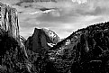
Superb composition and B&W ...............
|
| Photo By: Mike Rexroad
(K:631)
|
|
|
Critique By:
B Hawkins (K:1529)
1/29/2008 4:41:16 AM
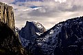
Beautiful. I find the B&W more striking I think.
|
| Photo By: Mike Rexroad
(K:631)
|
|
|
Critique By:
Mike Cook (K:4389)
1/29/2008 4:28:43 AM
Very nice shot - very calming
|
| Photo By: Mike Rexroad
(K:631)
|
|
|
Critique By:
Joel Garabedian (K:2041)
10/20/2007 5:38:15 PM
Really well composed shot Mike, and an original take on a very popular landmark. I love the slightly desaturated and grainy look, and you've done well to maintain such a large depth of field. If I had to make one very small criticism, it would be that the sky is slightly overexposed, and the top of the building gets a little lost in the sky. Nonetheless, an excellent photo - nice work!
Best regards,
Joel.
|
| Photo By: Mike Rexroad
(K:631)
|
|
|
Critique By:
tom lai (K:70)
4/30/2007 2:25:16 PM
Nice capture ... what if the frame could include more of the left side ??
|
| Photo By: Mike Rexroad
(K:631)
|
|
|
Critique By:
Derek Kennedy (K:2270)
2/19/2007 4:09:36 AM
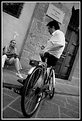
The one thing that is keeping this from being a excellent image is the lack of focus in my honest opinion.
The DoF is a little shallow as evident with the childs left eye out of focus (more than the rest of the image). The eyes actually look kinda odd - where they moving around? (child looking around but not moving the head)
If the eyes didn't look as they do, and if there was more sharpness to the image, this would be an excellent image.
I do like that you went to b&w though.
|
| Photo By: Mike Rexroad
(K:631)
|
|
|
Critique By:
Rashed Abdulla (K:163889)
9/25/2006 7:11:54 AM
Very great image of a great event and moment, very great exposure here and composition, wishing you all of the best
|
| Photo By: Mike Rexroad
(K:631)
|
|
|
Critique By:
Iman M. Nezami (K:3276)
9/17/2006 11:13:06 PM
I love this lovely kitty 
wonderful colors, nice details. nice use of DOF. focus is perfect.
regards
iman
|
| Photo By: Mike Rexroad
(K:631)
|
|
|
Critique By:
Nikoo Yahyazadeh (K:414)
9/17/2006 10:52:00 PM
wow, that eye is hypnotizing and creepy and...it almost looks like a glass eye. nice composition and framing (except i would have liked to see the ears in full). love how you got right in there, right up close. and the light is absolutely stunning in the photo. really nice.
|
| Photo By: Mike Rexroad
(K:631)
|
|
|
Critique By:
* James * (K:20200)
8/3/2006 4:04:27 PM
i love black and white portraits and am always partial to photos containing cute chinese women.
well done. james
|
| Photo By: Mike Rexroad
(K:631)
|
|
|
Critique By:
* James * (K:20200)
8/3/2006 4:01:41 PM
hi mike, i think yoiu could up the contrast and lower the brightness a bit on this one and it would render the black and whites a bit nicer.
best wishes. james
|
| Photo By: Mike Rexroad
(K:631)
|
|
|
Critique By:
Nicole Marcisz (K:10268)
7/28/2006 6:45:59 PM
I think this is excellent. the contrast and composition are perfect.
nice work
cheers,
nicole
|
| Photo By: Mike Rexroad
(K:631)
|
|
|
Critique By:
Jane Doe (K:286)
7/24/2006 4:54:38 AM
I agree with Dierk, you have the right idea with a forground object and show good composition skills by positioning it so the angles lead your eye into the frame towards your main subject, the lights on the building. I think the problem here is not your choice of foreground subject, but its size. I think if I were to re-shoot this scene, I would stand a little more to the right and get up on top of a bench or a car or anything (assuming its possible at the location). That way you could show about half that much flower box in the frame, the lighted building would become the largest object in the frame and really have a commanding presence, and you could eliminate some of the sky which is currently a little overpowering as a negative space.
I think you've chosen the perfect time of day for this shot and the exposure is dead on. Good color saturation as well. If you have the opportunity to re-shoot, experiment! :-) I think a little composition adjustment would take this image from great to amazing!
|
| Photo By: Mike Rexroad
(K:631)
|
|
|
Critique By:
Mike Rexroad (K:631)
7/22/2006 11:40:03 AM
Thanks for the honest feedback. It's refreshing to have some commentary that is actually helpful 
Cheers!
|
| Photo By: Mike Rexroad
(K:631)
|
|
|
Critique By:
Dierk Kruse (K:315)
7/22/2006 11:35:58 AM
Having a foreground-object is often a good idea, but these flower-boxes do not look very nice. They drag my eyes away from the main object - the illuminated house. people`s silhouettes might have been a better choose.
|
| Photo By: Mike Rexroad
(K:631)
|
|
|
Critique By:
Jimmy Piper (K:5742)
7/22/2006 4:31:00 AM
great night shot, good composition..
|
| Photo By: Mike Rexroad
(K:631)
|
|
|
Critique By:
Le Loucos (K:1352)
7/21/2006 10:18:54 PM
Nice shot !
PS : take a look at mine called 'X pose'.
|
| Photo By: Mike Rexroad
(K:631)
|
|
|
Critique By:
ictenbey / Emrah ICTEN (K:16316)
7/21/2006 10:04:38 PM
a nice nigt photo ! ...
well done ! ...
|
| Photo By: Mike Rexroad
(K:631)
|
|
|
Critique By:
Mike Rexroad (K:631)
7/20/2006 12:42:29 AM
Thanks for the comment jim. I finally got back to the states late last night. Regarding the picture, i was thinking of *gasp* cropping off basically the left half of the image.
; but i like being able to see the skateboard on the left. *shrugs* My desktop (and thus photoshop) is currently in trasnsit to San Jose, but hopefully once i get out there and settled I'll be able to process (and sort) the what i shot this summer w/ something other than iphoto.
take care yff.
|
| Photo By: Mike Rexroad
(K:631)
|
|
|
Critique By:
Mike Rexroad (K:631)
7/20/2006 12:42:28 AM
Thanks for the comment jim. I finally got back to the states late last night. Regarding the picture, i was thinking of *gasp* cropping off basically the left half of the image.
; but i like being able to see the skateboard on the left. *shrugs* My desktop (and thus photoshop) is currently in trasnsit to San Jose, but hopefully once i get out there and settled I'll be able to process (and sort) the what i shot this summer w/ something other than iphoto.
take care yff.
|
| Photo By: Mike Rexroad
(K:631)
|
|
|
Critique By:
Jim Goldstein (K:21230)
7/19/2006 8:49:05 PM
I like it. I wasn't so sure after seeing the thumbnail. The subject is somewhat concealed, but I like the out of focus skaters in the foreground. It adds to the setting. Nicely seen.
|
| Photo By: Mike Rexroad
(K:631)
|
|
|
Critique By:
Dave Stacey (K:150877)
7/16/2006 4:35:16 PM
Very nicely framed shot and great lights here, Mike! A little nitpick, I think I might have cropped off the bottom to the car's wheels, but that's just my opinion. Was this near Sacre Coeur?
Dave.
|
| Photo By: Mike Rexroad
(K:631)
|
|
|
Critique By:
Dave Stacey (K:150877)
7/16/2006 4:32:30 PM
Wonderful shot, Mike! Beautiful lighting and good exposure to capture it all. Is it the interior of a mosque?
Dave.
|
| Photo By: Mike Rexroad
(K:631)
|
|
|
Critique By:
Jimmy Piper (K:5742)
7/16/2006 3:38:04 PM
what a stunning view mike. great tones and exposure.
|
| Photo By: Mike Rexroad
(K:631)
|
|
|
Critique By:
Sergio Cárdenas (K:25028)
7/15/2006 4:51:51 AM
Wonderful capture in this one...great point of view and nice lights
Well done.
Regards
|
| Photo By: Mike Rexroad
(K:631)
|
|
|
Critique By:
Gustavo Scheverin (K:164501)
7/15/2006 4:43:56 AM
Muy buena la iluminación y la perspectiva.
Felicitaciones!
|
| Photo By: Mike Rexroad
(K:631)
|
|
|
Critique By:
Paul's Photos (K:35235)
7/13/2006 10:01:26 PM
nice perspective.. for some reason I think this would look great in b/w.... good capture
|
| Photo By: Mike Rexroad
(K:631)
|
|
|
Critique By:
Tony Hunter (K:4647)
7/13/2006 9:32:05 PM
Very well composed. I like the wide angle effect. Regards
|
| Photo By: Mike Rexroad
(K:631)
|
|
|
Critique By:
david vieira (K:729)
7/13/2006 7:31:22 PM
I agree with Jinggoy. Either that or burn a bit more the bircks. David
|
| Photo By: Mike Rexroad
(K:631)
|
|