|
|
Critique By:
james mickelson (K:7344)
3/2/2002 6:57:31 AM
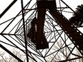
You didn't climb this did you girl?!
Scares me just looking at it. Why do you need fire towers in northeastern Iowa anyway.
|
| Photo By: Lisa Brainard
(K:743)
|
|
|
Critique By:
james mickelson (K:7344)
3/2/2002 6:55:50 AM
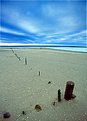
Bbbbbrrrrrrrrr. Man this looks cold. You nguys actually endure this stuff? Give me sunny California any day. Love the clear ice here though.
|
| Photo By: Jason Frey
(K:6)
|
|
|
Critique By:
james mickelson (K:7344)
3/2/2002 6:52:32 AM
Nice set of images here Chris. Nice balance and great moods. Good technique too. I like the toning. Is this a project? Let's see more.
|
| Photo By: Chris Blaszczyk
(K:610)
|
|
|
Critique By:
james mickelson (K:7344)
3/2/2002 6:50:17 AM
I like this very much. Nice colors and movement. Very nice.
|
| Photo By: © Javier Salmones
(K:0)
|
|
|
Critique By:
james mickelson (K:7344)
3/1/2002 6:18:07 PM
Wow Chelsea. This is nice. I love it. This could be a card for sure. Have this printed and send me one.
|
Photo By: Chelsea Burke
(K:5750)

|
|
|
Critique By:
james mickelson (K:7344)
3/1/2002 6:00:22 PM
Nice Tony. Very nice. If you crop off just the very bottom of this image, just the posts that angle back to the left, how does the image look to you? Those few posts distract my eye from a clean line cutting diagonally across the image. Just my tastes. Love it.
|
| Photo By: Tony Smallman
(K:23858)
|
|
|
Critique By:
james mickelson (K:7344)
3/1/2002 5:52:02 PM
Ahhhh, what a good girl. How sweet she looks. I love dogs too. bet she has you wrapped around her paw.
|
| Photo By: Daniel L Quigley-Skillin
(K:1383)
|
|
|
Critique By:
james mickelson (K:7344)
3/1/2002 5:49:05 PM
Being a sucker for trees I like this. A little flat here and with the Mavica you should download it to PC and Shop it. You could make the colors more vibrant. This looks a little overexposed. But I do love aspen trees
|
| Photo By: Dan Sanford
(K:300)
|
|
|
Critique By:
james mickelson (K:7344)
2/27/2002 5:56:19 PM
Yeah Kim. These are the best rewards. The views and the memories we bringback with us. Nice shot. Thanks for helping me remember.
|
| Photo By: Kim Culbert
(K:37070)
|
|
|
Critique By:
james mickelson (K:7344)
2/27/2002 5:50:13 PM
This is cool Javier. I like it. Try darkening the background a little to help the truncks stand out a little more.
|
| Photo By: © Javier Salmones
(K:0)
|
|
|
Critique By:
james mickelson (K:7344)
2/27/2002 5:48:50 PM
Glenn, this is almost there. Almost. There could be a little more light on the face and a little more snap to the entire image. Those are just technical issues. What I would really like to see is a crop to the left hand side of the image to give it more tension. Try cropping through the junction of the pavement dividers on the left. Vertically crop right there. See what that does for you. I think it would be much stronger with that crop. If this is a negative you have then if you would like a nice print send it to me and I will print it for you. I will take good care of the negative.
|
| Photo By: Glenn Michael Binkosky
(K:19)
|
|
|
Critique By:
james mickelson (K:7344)
2/27/2002 5:40:18 PM
This is a nice simple shot. well executed but a little soft on the focus. Nice colors too.
|
| Photo By: Arturo Fajardo
(K:6)
|
|
|
Critique By:
james mickelson (K:7344)
2/27/2002 5:36:32 PM
I like this very much. Cool collage. Nice graphic lines and the colors go well.
|
| Photo By: Adam E. J. Squier
(K:9803)
|
|
|
Critique By:
james mickelson (K:7344)
2/27/2002 5:34:54 PM
The two images combined doesn't do it for me Ted but I love the reflection image by itself. Very impressionistic.
|
| Photo By: Ted Williams
(K:324)
|
|
|
Critique By:
james mickelson (K:7344)
2/27/2002 5:25:40 PM
This is interesting. I like the idea. It may have had a little more impact had you shot it from just a little higher as the swing seats aren't defined as well as they would have been from a higher vantage point. With a higher vantage point the swing seats would have separated from the fenceline a little better. Nice idea here though. And the contrast needs to be higher. It looks flat.
|
| Photo By: Anne Brown
(K:833)
|
|
|
Critique By:
james mickelson (K:7344)
2/27/2002 5:22:07 PM
Hi Anne, I like the composition. And the subject matter appeals to me very much. But I think the contrast is a little flat. Was this a negative scan or a print that you scanned? Either way it could use some contrast adjustment. I would go for the "sunlight at sunset streaming onto the cross" look. The clouds are really nice.
|
| Photo By: Anne Brown
(K:833)
|
|
|
Critique By:
james mickelson (K:7344)
2/26/2002 5:39:31 PM
this is really cool. Nice abstract elements and color.
|
| Photo By: Andy Graham
(K:38)
|
|
|
Critique By:
james mickelson (K:7344)
2/25/2002 2:19:58 PM
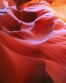
Thedre are about 8 different images here. All of them better than this single image. It is a nice image but the other isolated images within this would be better. This is lower Antelope about halfway through if I'm not mistaken. Nice place to shoot. I could spend a couple days in this canyon. Love it. Nice colors here. If you can please go back in August when the thunderstorms are popping. Not when there is a lot of rain but just nice clouds. Toward late afternoon the light here is stupendous.
|
| Photo By: Chor Wong
(K:0)
|
|
|
Critique By:
james mickelson (K:7344)
2/25/2002 2:13:45 PM
This has a lot of possibilities but here it doesn't live up to it's potential. By that I mean if this were a print done in a wetroom much more could have been done with it. This way it just sits there on the screen. The neck could have been printed down subtly and the face dodged and burned to give it more depth. It has potential.
|
| Photo By: Samuel Downs
(K:7290)
|
|
|
Critique By:
james mickelson (K:7344)
2/25/2002 1:59:25 PM
Alright who pushed me! Heheheh. Made me laugh, made me laugh.
|
| Photo By: Lisa Brainard
(K:743)
|
|
|
Critique By:
james mickelson (K:7344)
2/24/2002 6:45:00 AM
we need to go shoot this. I love the desert landsacape. and you would love new mexico dude. may the PDL last forever.
|
| Photo By: CARL COUCHMAN
(K:0)
|
|
|
Critique By:
james mickelson (K:7344)
2/12/2002 3:11:30 PM
And all the little animal tracks too. I love this. Great balance and texture. I like the toning. Feels very cold. James
|
| Photo By: Lisa Brainard
(K:743)
|
|
|
Critique By:
james mickelson (K:7344)
2/10/2002 12:04:54 PM
LISA!!!!!! Turn this over and look at it. James
|
| Photo By: Lisa Brainard
(K:743)
|
|
|
Critique By:
james mickelson (K:7344)
2/10/2002 10:25:35 AM
Brrrr. Love it. I'd like to crop the top just a little. But other than that this is a way cool shot. Love the snow streaks. I wonder what the streaks would have looked like had you exposed it just a tad longer? Just a thought. Cute model too. I'm jealous.
|
| Photo By: Chris Blaszczyk
(K:610)
|
|
|
Critique By:
james mickelson (K:7344)
2/10/2002 10:21:38 AM
"Surfin is the only life, the only life for me, now surf.....surf....." Nice shot. Do you surf? James
|
| Photo By: R Pires
(K:445)
|
|
|
Critique By:
james mickelson (K:7344)
2/10/2002 9:46:54 AM
Cool. I prefer black and white but this works well too. I hope you got lots of shots here. I see a coup[le right here. Nice.
|
| Photo By: David Tanner
(K:0)
|
|
|
Critique By:
james mickelson (K:7344)
2/5/2002 3:39:11 PM
Isn't this the Ajo Mine? They produced most of the copper during the war and they have just reopened it because the extraction techniques have improved. Nice use of a tobacco filter.
|
| Photo By: Alexander R Perez
(K:0)
|
|
|
Critique By:
james mickelson (K:7344)
2/5/2002 3:34:36 PM
Hi Anne, the contrast here is excessive. The film can hold lots of contrast6 but when it is put on paper that is where the problem comes into play. If this is scanned the contrast is still too high because the iso of the film was such that there isn't enough info to make the shadows more visible. Try cutting your film speed in half and under developing the film by 20%. That may solve the contrast problem. It will certainly give you more negative density to work with while capping the highlight densities. When you framed this image and metered the meter saw the zone 6 1/2 wall and closed down the aperture to make that part of the wall a midtone or zone 5. That is why the shadows are so dark(empty). This image needn't have the shadows be very bright but there should be some detail visible in them. Wynn Bullock, Morely Baer, and Brett Weston created lots of images with very dark shadows and very bright highlights but almost always had some shadow detail. I like the framing of the scene and the balance is fine.
|
| Photo By: Anne Brown
(K:833)
|
|
|
Critique By:
james mickelson (K:7344)
2/5/2002 3:22:35 PM
Nice to meet ya camilo.
|
| Photo By: Camilo Gutierrez
(K:0)
|
|
|
Critique By:
james mickelson (K:7344)
2/4/2002 8:12:16 PM
This is excellent Rogerio. Very nice colors and focussing is great.
|
| Photo By: R Pires
(K:445)
|
|