|
|
Critique By:
dennis ward (K:431)
8/2/2004 3:29:31 AM
bea, thank you for the "original." i guess i'm just too old school, but i like the un-manipulated, film version the best. nice tonal values can occur in ranges of gray. still, nice either way. thank you for the comment on my portrait. she may be thinking that her left eye was damaged in a disabling car accident, and she wanted a portrait that hid that fact. she is a very interesting lady and i would love to do her justice. dennis
|
| Photo By: dennis ward
(K:431)
|
|
|
Critique By:
Bea Friedli (K:10189)

8/2/2004 1:23:10 AM
Hi Dennis ! you captured an interesting face !
makes you wonder what she's thinking ! nice !
and thanks again for your comment !
|
| Photo By: dennis ward
(K:431)
|
|
|
Critique By:
Stephen Bivens (K:7308)
7/29/2004 5:12:02 AM
Do this same shot at Sunrise.
|
| Photo By: dennis ward
(K:431)
|
|
|
Critique By:
Al Calkins (K:1287)
7/25/2004 3:49:23 PM
excellent
|
| Photo By: dennis ward
(K:431)
|
|
|
Critique By:
Al Calkins (K:1287)
7/25/2004 3:45:45 PM
excellent, thanks Dennis
|
| Photo By: dennis ward
(K:431)
|
|
|
Critique By:
greg collins (K:12273)
7/25/2004 7:25:36 AM
Like the shadowing. Nice subject.
Greg
|
| Photo By: dennis ward
(K:431)
|
|
|
Critique By:
Gayle's Eclectic Photos (K:91109)
7/25/2004 6:07:41 AM
hi, i think you did a very good job here with the way you composed..like her expression and the half shadowed face..again,nice tones..gayle
|
| Photo By: dennis ward
(K:431)
|
|
|
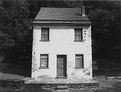
Critique By:
Gayle's Eclectic Photos (K:91109)
7/25/2004 6:04:42 AM
hi, there is an austere look about this place/comp..i like it!..kinda creepy in a good way ;> ...a night shot of this would be cool,too..gayle
|
| Photo By: dennis ward
(K:431)
|
|
|
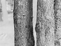
Critique By:
Gayle's Eclectic Photos (K:91109)
7/25/2004 6:00:18 AM
hi,like the tone and textures very much..interesting contrast betwix the two main trees and the lighter,ashy one is different than i have seen before...i love trees and have several images in my portfolio featuring them..thanks for comment on my "the resting place"..regards,gayle
|
| Photo By: dennis ward
(K:431)
|
|
|
Critique By:
Rebecca Raybon (K:26654)
7/25/2004 4:43:03 AM
Beautiful tones and composition. DOF Perfect..This is gorgeous! I love it!
|
| Photo By: dennis ward
(K:431)
|
|
|
Critique By:
Lori Stitt (K:75282)
7/24/2004 8:57:59 PM
Hi Dennis,
Beautiful image! Love the black and white, great tones! Simple but elegant.
Refreshing and delightful!
Lori 
|
| Photo By: dennis ward
(K:431)
|
|
|
Critique By:
Hugo de Wolf (K:185110)
7/24/2004 8:25:58 PM
Ok. There's something we don't get to see every day! This is bloody perfect, Dennis! Great by exception. No rules apply here, and that's the beauty of this one. Great tonal range, softness and atmosphere. Outstanding job!
Cheers,
Hugo
|
| Photo By: dennis ward
(K:431)
|
|
|
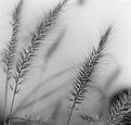
Critique By:
SlowPic (K:42)
7/24/2004 7:49:10 PM
I like the space you gave those grasses. In addition to what Dirk wrote, I find the lower left stalk very importent (tried the crop ... something misses!).
|
| Photo By: dennis ward
(K:431)
|
|
|
Critique By:
Dirck DuFlon (K:35779)
7/24/2004 7:14:02 PM
Beautiful and kind of wistful image, Dennis - I like it a lot! You used the depth of field to great effect, here, emphasizing the softness of the grasses! I'm not sure about the one bent stalk at the bottom-left - maybe you could try a version with it cropped out?
|
| Photo By: dennis ward
(K:431)
|
|
|
Critique By:
Gerhard BuschEFIAP/AFIAP (K:18382)
7/24/2004 1:28:29 PM
An interesting idea, with which the possibility is left to the viewer of carrying out its own interpretation. Greeting Gerhard
|
| Photo By: dennis ward
(K:431)
|
|
|
Critique By:
dennis ward (K:431)
7/23/2004 3:48:51 AM
thank you for your comments. i totally blew color off until that revelation. i still don't do much color, but do find myself seeing in color at times. that, by the way, is a piece of a storefront awning...as if it mattered. dennis
|
| Photo By: dennis ward
(K:431)
|
|
|
Critique By:
dennis ward (K:431)
7/23/2004 3:36:14 AM
thank you for your comments. i totally agree about the arched pipes. i only wish i had more of them in the image.
|
| Photo By: dennis ward
(K:431)
|
|
|
Critique By:
Brenda Orchard (K:1226)
7/22/2004 10:21:16 PM
Yes, and you have captured and displayed that colour. I wonder if this is a flag or a boat or a wooden bench, but as you say... it's about colour, the rest doeasn't matter!
|
| Photo By: dennis ward
(K:431)
|
|
|
Critique By:
emily savva (K:21113)
7/21/2004 12:19:53 PM
beautiful... just beautiful!!!!
|
| Photo By: dennis ward
(K:431)
|
|
|
Critique By:
dennis ward (K:431)
7/21/2004 1:25:32 AM
peter, thank you for your comment. that horizontal line wasn't in what i uploaded. i agree completely. dennis
|
| Photo By: dennis ward
(K:431)
|
|
|
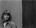
Critique By:
dennis ward (K:431)
7/21/2004 1:19:19 AM
rebecca, may be a vintage "look," but this was made just about a year ago. a quick look at an old friend as i was leaving. classic face, though, i think. thank you for your comments. dennis
|
| Photo By: dennis ward
(K:431)
|
|
|
Critique By:
dennis ward (K:431)
7/21/2004 12:50:07 AM
rebecca, thank you for your comments. this image is about 20 years old. 20 years ago i had no clue about filters. only have a bit more of a clue today. thanks again, dennis
|
| Photo By: dennis ward
(K:431)
|
|
|
Critique By:
Peter De Rycke (K:41212)
7/20/2004 9:52:23 PM
A picture that can work .. very good composition. I find the horizontal stripe rather distracting, something which can easily be fixed ! Regards, Peter
|
| Photo By: dennis ward
(K:431)
|
|
|
Critique By:
George Black (K:102014)
7/20/2004 8:50:54 PM
Elegant, poetic. Nice work.
--George
|
| Photo By: dennis ward
(K:431)
|
|
|
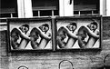
Critique By:
peter dolan (K:104)
7/20/2004 7:37:11 PM
I like the pattern in the posters, but it would fall down if it weren't supported by the patterns in the bottom and top of the frame. Don't crop.
|
| Photo By: dennis ward
(K:431)
|
|
|
Critique By:
Rebecca Raybon (K:26654)
7/20/2004 4:14:59 PM
I love this one. Excellent.
|
| Photo By: dennis ward
(K:431)
|
|
|
Critique By:
Rebecca Raybon (K:26654)
7/20/2004 4:13:55 PM
Another nice shot! Great grainy appearance. I like too, the colors and textures of the wall behind.
|
| Photo By: dennis ward
(K:431)
|
|
|
Critique By:
Rebecca Raybon (K:26654)
7/20/2004 4:11:37 PM
Great shot. Very vintage look, or was this taken a while back? Great tones and grain.
|
| Photo By: dennis ward
(K:431)
|
|
|
Critique By:
Marcin Gorski (K:12388)
7/20/2004 3:28:15 PM
very good
|
| Photo By: dennis ward
(K:431)
|
|
|
Critique By:
Murat Harmanlikli (K:7846)
7/20/2004 2:21:34 PM
very good..
|
| Photo By: dennis ward
(K:431)
|
|