|
|
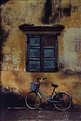
Critique By:
Kristupa Saragih (K:1031)
3/8/2002 3:46:46 PM
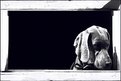
Good choice of object and nice composition
|
| Photo By: richard trager
(K:111)
|
|
|
Critique By:
Ben Gunsberger (K:-458)
3/8/2002 1:08:40 PM
Fantastic! The lighting is perfect.
|
| Photo By: richard trager
(K:111)
|
|
|
Critique By:
Glenn Michael Binkosky (K:19)
3/8/2002 6:51:24 AM
This is a beautiful image!
|
| Photo By: richard trager
(K:111)
|
|
|
Critique By:
Petros Stamatakos (K:12101)
3/7/2002 10:44:41 PM
Wonderful image Richard... Just thought I'd be the first to congratulate you on it... :-)
|
| Photo By: richard trager
(K:111)
|
|
|
Critique By:
Samuel Downs (K:7290)
2/24/2002 8:46:32 PM
Richard, cool shot.
|
| Photo By: richard trager
(K:111)
|
|
|
Critique By:
Kim Culbert (K:37070)
2/24/2002 8:36:08 PM
Nice play on words! *grin*
Very interesting texture effects, but it for me I don't think wood. The lines seem too perfect, too straight.
Very beautiful model to work with and the shadows are great.
|
| Photo By: richard trager
(K:111)
|
|
|
Critique By:
Anne Brown (K:833)
2/13/2002 3:07:44 PM
This really grabs me, the colors, angle and shapes. Very nice. Anne 
|
| Photo By: richard trager
(K:111)
|
|
|
Critique By:
michaelle . (K:3807)
2/7/2002 7:34:31 PM
Such a good doggie! I hope you gave him a treat after his photo shoot
|
| Photo By: richard trager
(K:111)
|
|
|
Critique By:
Scott Jones (K:1093)
2/7/2002 7:29:43 PM
I share all of Turgay's comments AND I want to smootch this pooch!!!
|
| Photo By: richard trager
(K:111)
|
|
|
Critique By:
Debbie Groff (K:9569)
2/7/2002 3:52:22 PM
Awww. He looks so so so sweet.
|
| Photo By: richard trager
(K:111)
|
|
|
Critique By:
Guy Tem (K:747)
2/7/2002 3:41:18 PM
Great angle of view. Great background. I loved the brown eyes on the brown background. And the depth of field... it's fine too. I suppose it's a daylight coming from a door or a soft lamp & I think it could be better if the light on the floor was equal at either side. But it's just a little detail. Good job.
|
| Photo By: richard trager
(K:111)
|
|
|
Critique By:
Samuel Downs (K:7290)
2/7/2002 3:24:22 PM
Richard, I have a dog just like this one and I know the look. You should see the look that I get when I return home as well...
|
| Photo By: richard trager
(K:111)
|
|
|
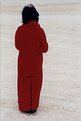
Critique By:
Steve Kompier (K:4629)

2/6/2002 8:02:55 PM
WOW...very dramatic. Excellent.
|
| Photo By: richard trager
(K:111)
|
|
|
Critique By:
Samuel Downs (K:7290)
2/6/2002 1:22:56 PM
Wow Richard! I love this shot. The rich red / orange and the contrasting fense really work to create a mood. Way to take an everyday 'walk by' scene and capture it as a keeper!
|
| Photo By: richard trager
(K:111)
|
|
|
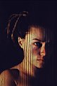
Critique By:
Samuel Downs (K:7290)
2/5/2002 12:51:54 PM
Richard, I thought I'd leave a comment. I know I like to recieve comments on my work - complement or constructive... So, here goes. First, I like the lighting that you used for the shot. There is plenty of detail in the arms and hands - with nice tones for interest. As for the colored ring. I missed that one at first - which might be a sign to leave it in. Let the viewer discover it... :-) Nice shot.
|
| Photo By: richard trager
(K:111)
|
|
|
Critique By:
Anne Brown (K:833)
12/28/2001 9:56:26 PM
I've only heard about and have seen pictures from burningman (from website.) When I saw this in thumbnail, I said to myself "wonder if this was from burningman." Sounds like a very interesting event - not sure if I'd be able to take it though. Anne 
|
| Photo By: richard trager
(K:111)
|
|
|
Critique By:
good bye! (K:-694)
12/17/2001 6:11:36 PM
I think it's your best shot here, but I can't agree on her fingers being cut off.. it would have introduced a bit of delicacy.. something.. she lacks here.. argghhh, give the fingers back! =o)
|
| Photo By: richard trager
(K:111)
|
|
|
Critique By:
Deleted User (K:6775)
12/13/2001 12:19:15 PM
Richard I love the idea and setup of this photo but my personal preference would be to have the model in less shadow...especially on her lips. I want to see her upper lip and right eye more clearly.
Possibly the use of a reflector placed below and in front of the model would bounce enough light up into her face to lighten these areas. Just my thoughts...hope someone else with more knowledge on portrait type shots will comment on this one...cause I really do like the concept here!....Maggie
|
| Photo By: richard trager
(K:111)
|
|
|
Critique By:
Danny Provost (K:812)
12/12/2001 5:16:33 PM
Hi Richard, I like this image a lot. I like the pose, the color and the background. The only thing I might do is crop a little off the right side to square it up. Good work.
|
| Photo By: richard trager
(K:111)
|
|
|
Critique By:
Deleted User (K:6775)
12/12/2001 3:15:28 PM
Richard...just looking through your portfolio and saw the thumb on this and had to take a look. I have a pic in my portfolio that looks like it is taken at the same place! Mine was taken in Southern Alberta, Canada...where was this one taken??.... *smile*....Maggie
Forgot I can attach an image now!!
|
| Photo By: richard trager
(K:111)
|
|
|
Critique By:
Deleted User (K:6775)
12/12/2001 3:12:20 PM
Richard...just looking through your portfolio and saw the thumb on this and had to take a look. I have a pic in my portfolio that looks like it is taken at the same place! Mine was taken in Southern Alberta, Canada...where was this one taken??.... *smile8....Maggie
|
| Photo By: richard trager
(K:111)
|
|
|
Critique By:
Petros Stamatakos (K:12101)
12/12/2001 4:05:22 AM
Richard - I think you've got a winner here mate. Love the photo as it is... I wouldn't change a thing (including the shadows on her neck). Of course this is only my personal opinion, others might disagree...
Keep up the good work :-)
|
| Photo By: richard trager
(K:111)
|
|
|
Critique By:
Deleted User (K:6775)
12/11/2001 5:16:21 PM
Hi Richard
Wondered what happened to the color here till I read your about...yes it does make for an unreal look *smile* A couple of things that maybe you can try next time though. Your models seems to be too tight in this image. I think if you had used a verticle format rather than a horizontal one it would have worked better.
Also...a fill flash or a reflector panel held in front of the model would have put more light into her face and neck area and would have accentuated the expression on her face. Hope to see more of your work...*smile* ... Maggie
|
| Photo By: richard trager
(K:111)
|
|
|
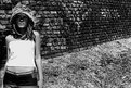
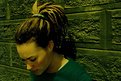
Critique By:
Ted Williams (K:324)
12/10/2001 9:02:54 PM
Love the contrast of textures in the brick and grass, and the expression and the hair, whatever its doing, and the exposed midriff. Simple and strong.
|
| Photo By: richard trager
(K:111)
|
|
|
Critique By:
james mickelson (K:7344)
12/10/2001 4:16:18 PM
Hi Rich, she's cute. Where'd you find her? The contrast between her shirt and the rest of the image is a little hi although the rest of the image is low in contrast. Not a good color to wear if the scene is flat but you are shooting in bright sunlight. Where idi you clone in this image? I like the framing. And she is cute. James
|
| Photo By: richard trager
(K:111)
|
|
|
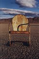
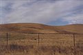
Critique By:
Ted Williams (K:324)
12/9/2001 2:03:43 PM
Actually, I love the pole. Its so unexpected intruding on the serene scene. Probably a hotline for the cows to phone home on. Color is that of a painting, which is good to me.
|
| Photo By: richard trager
(K:111)
|
|
|
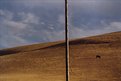
Critique By:
Steve Kompier (K:4629)
12/9/2001 10:58:32 AM
The photo would be more interesting if the pole was gone. My eye is constantly being pulled to the center.
If the pole has to be there, then I would move it left of center and keep the cow on the right.
|
| Photo By: richard trager
(K:111)
|
|
|
Critique By:
Sean Fitzgerald (K:310)
11/27/2001 3:23:02 PM
I wonder what it would look like as a really high contrast black and white shot...
|
| Photo By: richard trager
(K:111)
|
|
|
Critique By:
Sean Fitzgerald (K:310)
11/27/2001 3:20:23 PM
I'm diggin' it, my friend!  Nice profile you've got here: by the way. Nice profile you've got here: by the way.
|
| Photo By: richard trager
(K:111)
|
|
|
Critique By:
Joellen Wilcox (K:102)
10/10/2001 3:53:14 PM
The last time I saw this on random images, I became so embroiled in the rule thing I forgot to say I think the combination of sunshine, red hat, happy smile and interesting hair do combine for a pleasing portrait.
|
| Photo By: richard trager
(K:111)
|
|