|
|
Critique By:
Bruce McFadden (K:47)
7/23/2005 3:21:01 PM
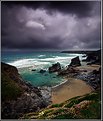
Wow! So blue. Did you add blue? The person in the photo adds to the composition. I'm not sure but I think it would help to get the horizon off the centerline of the composition. I enjoyed your photo, thanks Bruce
|
Photo By: Mark Julian
(K:36866)

|
|
|
Critique By:
Bruce McFadden (K:47)
7/23/2005 3:16:10 PM
Nice. The rain is a key part of this compositon. The resulting saturated colors I like. The feel of the photo is much better than a sunny day with hard lighting. Normally I would think having the street centered in the photo would not be good but it works great here. Nice.
|
| Photo By: khoa pham
(K:360)
|
|
|
Critique By:
Bruce McFadden (K:47)
7/23/2005 3:10:28 PM
Your creativity shows here. I agree with the others: Well seen. But your application of the dark border is a key part of the compositon. Nice!
|
Photo By: Dr. Rafael Springmann
(K:89517)

|
|
|
Critique By:
Bruce McFadden (K:47)
7/23/2005 3:04:29 PM
Robert- I noticed I gasped when I openned this picture. Very striking photo. The colors and sharpness appeal to me. The only nit pick I would offer: I am not sure on this but I think if the pillar was in the right 1/3 it would improve the composition.
|
Photo By: Robert Gaither
(K:34128)

|
|


