|
|
Critique By:
Alex Billington (K:1260)
2/9/2005 5:22:05 AM
Ahhhh holy crap you're throwing me off! =P It looks absolutely stunning! Is that actually entirely an original photograph? Or is one part actually painted or something... Cause it looks awesome! Excellent work! I'd say even if it was a natural photograph (and none of it was painted) it'd still be brilliant! I love trains, need to work on finding some to photograph. Great job!
|
| Photo By: Mitchell Miller
(K:3009)
|
|
|
Critique By:
Alex Billington (K:1260)
2/9/2005 5:17:13 AM
Ooooh wow cool the fog in the background and all. The silhouetted porch things frame the photo beautifully, really adds some more dimension and just a very good extra element to the overall image. The colors are fairly good, natural tones, nothing too oversaturated. Excellent job overall, very good picture. Keep up the good work!
|
| Photo By: Ana Martins
(K:5643)
|
|
|
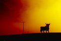
Critique By:
Alex Billington (K:1260)
2/2/2005 6:58:22 PM
Wow awesome! You have an excellent gallery... This one in particular reminds me of when I was in Spain and went to this store called something del Toro, sold t-shirts with that name on it. Bought a lot... Their logo looked exactly like that bull. Awesome job, this is a new fave! 
|
| Photo By: Felipe Rodríguez
(K:9200)
|
|
|
Critique By:
Alex Billington (K:1260)
2/2/2005 5:16:49 PM
Oh hell yea!! Strawberries are awesome! The contrast seems almost too high... The seeds on the back center one almost look like deep black holes more than seeds... I think if you improve on that, this would be something I buy. Strawberries are awesome and the colors and the arrangement in this are perfect!!
|
| Photo By: Chad Parish
(K:6440)
|
|
|
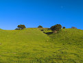
Critique By:
Alex Billington (K:1260)
2/2/2005 5:14:36 PM
Wow, such beautiful landscapes!! Wish I could be there!! If you back up or zoom out to get a fuller wide view of this area, it would be an awesome picture. I think so far it is quite good, and lush. The colors are on it are excellent. Makes me feel like I'm already right there in the warm country side...
|
| Photo By: Eric Salsman
(K:0)
|
|
|
Critique By:
Alex Billington (K:1260)
2/2/2005 5:06:01 PM
This sparked a new photographic interest with me. I remember the ancient castles and buildings in Europe that were quite awesome to visit to, but I didn't have a good camera with me at that time. I've now been inspired to go out and search for excellent shots encompassing that "life" in the castles and buildings.
Although I know your piece isn't really about that, I still enjoy it as it is. The light coming in is an excellent catch. Looked like a beautiful day at a beautiful place. Also, the edge of the entrance is framing the sides of the picture, another good compositional element. Great work on this! (Sorry I don't speak Spanish 
|
| Photo By: I g n a c i o D e L a F u e n t e
(K:10518)
|
|
|
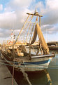
Critique By:
Alex Billington (K:1260)
2/2/2005 5:02:26 PM
This is not bad... That light blue rope across the front throws off the picture just a bit. Otherwise, I love the wide-angle feel to it. You've captured some true feelings of the dock life and fishing boats. Excellent work!
|
| Photo By: Luca Tranquilli
(K:37)
|
|
|
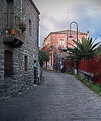
Critique By:
Alex Billington (K:1260)
2/2/2005 5:00:46 PM
This is an excellent photo. It needs a bit more contrast and levels fix in order to stand out. This reminds me of one of those "post card" Italy photos of the beautiful streets, and it certainly is close to that, it just needs to be brightened up, cleared up, and added some saturation and it would be an excellent photo! Good job! (Sorry I don't speak Italian
|
| Photo By: Orazio Minnella
(K:49417)
|
|
|
Critique By:
Alex Billington (K:1260)
2/2/2005 4:58:38 PM
The ledge that the cup is sitting on could be a little more exposed in... That would add a little more to all of it. The tones are very natural and don't need vibrant colors and are perfect as is. It's generally a good photo, just lacks a few elements.
|
| Photo By: Ahmad Ehab
(K:275)
|
|
|
Critique By:
Alex Billington (K:1260)
2/1/2005 5:09:25 PM
Wow this is cool...! That building is captured perfectly and everything! Only thing I suggest for improvement is clearing up the sky, making it a lighter but still strong blue. The polarizer was a good choice, but just a little too dark. Hard to say though just because it's in contrast with the building that is perfectly exposed. Good job tho!
|
| Photo By: Felipe Rodríguez
(K:9200)
|
|
|
Critique By:
Alex Billington (K:1260)
1/31/2005 2:08:18 PM
Beautiful!!! Colors are AMAZING!! The detail is excellent too!! Awesome job!
|
| Photo By: kokupsy_un morita
(K:2651)
|
|
|
Critique By:
Alex Billington (K:1260)
1/31/2005 1:45:16 PM
Agree'd... Interesting journalistic shot but good job as a whole.
|
| Photo By: Kip Cole
(K:87)
|
|
|
Critique By:
Alex Billington (K:1260)
1/31/2005 1:27:17 PM
Cool photo, good idea for composition. The background to the right just feels... out of place or, not much in it? It just lacks. Only bit I see for improvement, otherwise everything else is technically great. Good job!
|
| Photo By: John Beavin
(K:4477)
|
|
|
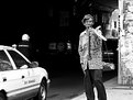
Critique By:
Alex Billington (K:1260)
1/31/2005 1:21:10 PM
Awwww wow this is a really emotional and great photojournalism / portrait shot... Great job, the contrast between the man and the dark tunnel is great. The only thing I maybe suggest different was maybe to have gotten a faster shutter speed so that you could've prevented blur on the cars... Or just the opposite and had the cars blur longer than a slight blur that it is yet kept the man perfectly in focus. My only tip for suggestion. Otherwise a simply great photo!
|
| Photo By: Hanggan Situmorang
(K:24833)
|
|
|
Critique By:
Alex Billington (K:1260)
1/31/2005 1:17:05 PM
Whoa freakin' cool... I think you could've gotten a better picture if you kept the same angle, just went later in evening and had a longer exposure so that the orbs glow more and you capture more soothing darker colors in reflections of the water. It would've also been better if the water didn't have ripples and was just flat. That way you'd throw people off having a sense of futuristic abstraction and yet still be the same objects as before.
It is otherwise great, you have the idea for the perfect picture, you just got to get to the perfect moment to catch it.
|
| Photo By: Nuno Murias
(K:5323)
|
|
|
Critique By:
Alex Billington (K:1260)
1/30/2005 1:37:46 PM
Haha! On the few sites that I've posted this, I've heard that from at least 1 person! He hear's it so much himself too and he is always asking me if its true cause he doesn't think so... I don't know either, I suppose he kind of looks like him. He's not Edward though...
|
| Photo By: Alex Billington
(K:1260)
|
|
|
Critique By:
Alex Billington (K:1260)
1/29/2005 7:45:38 AM
This is a beautiful shot... All the colors are so warm and saturated and beautiful...! Excellent! I only wish I could see a bigger version with more crisp details!
|
| Photo By: Marcio Cabral
(K:12496)
|
|
|
Critique By:
Alex Billington (K:1260)
1/29/2005 7:43:48 AM
Super sexy... =P The light from upper left above her seems a little too bright/harsh on her face... I don't know what your setup is, but I'd suggest trying to lower the FEC 1-stop and upping the regular exposure compensation about a stop or less too. That way it fills everything in smoother without having the harsh flash. Like I said, I don't know your setup and I don't know if you were going for that harsh light, but it just seems like a little too much and detracting away from the full smooth sexy... Hope my comment helps!
|
| Photo By: Johan Sorensen
(K:3449)
|
|
|
Critique By:
Alex Billington (K:1260)
1/28/2005 1:22:02 PM
Everything is sharp and detailed and perfect...!! The bug is the only thing that detract from it all unfortunately, but otherwise it looks pretty damn good! Great job otherwise!
|
| Photo By: Subhash Sen
(K:11931)
|
|
|
Critique By:
Alex Billington (K:1260)
1/28/2005 5:46:04 AM
I wish I could see more of the dog... Dog's are such beautiful subjects, and this would truly show the friendship and compassion of the dog if you maintained the action that is currently visible but expanded the composition. Otherwise it's a very good soft-feeling shot.
|
| Photo By: Bryan Steffy
(K:4910)
|
|
|
Critique By:
Alex Billington (K:1260)
1/28/2005 5:36:04 AM
An excellent looking silouhette! The color of the sky and the sunset is brilliant in contrast to the composition of the Mosque. Great job!!
|
| Photo By: Khaled Mursi Hammoud
(K:54005)
|
|
|
Critique By:
Alex Billington (K:1260)
1/27/2005 1:32:16 PM
I agree with the others in saying that this is an excellent photo and would make a great poster. The sense of style to it is awesome and the technical excellence in it is just as appealing. Good work!
|
| Photo By: Manu
(K:13082)
|
|
|
Critique By:
Alex Billington (K:1260)
1/27/2005 1:29:50 PM
Dogs are always a sensitive subject to me... and this is a perfect shot of what can be an emotional situation. Excellence!
|
| Photo By: Jani Salvataggio
(K:27283)
|
|
|
Critique By:
Alex Billington (K:1260)
1/27/2005 8:25:33 AM
BRAVO! Holy crap this is excellent!! I've always enjoyed colorful flowers with water droplets, but combining it with sun, WOW! I only am taking 1 point off from a full 7 because the sun could be either a bit more closer to the flower (to create a star effect) or a bit away to fill more with its rays, but it still is in a great place... Excellent job!
|
| Photo By: Dino Lupani
(K:15142)
|
|
|
Critique By:
Alex Billington (K:1260)
1/27/2005 8:03:07 AM
Whoa! Although it is a very good shot to capture a hummingbird without any blur on the wings, it needs to be touched up in contrast, levels, and saturation. Try working with the levels and contrast in a program like Photoshop and then do the saturation after. That background could be lightened a lot and then the colors on the flower and the feathers of the bird could be brightened and made much more dynamic. After that, you'll have a much better photo!
|
| Photo By: Nick Hengeveld
(K:17)
|
|
|
Critique By:
Alex Billington (K:1260)
1/27/2005 7:58:51 AM
The clarity is perfect, would have to agree... It just feels a little too "gray" maybe. It feels like it needs some dynamic saturation as so to accentuate every little berry and its edges. Other than that it is "delicious" and fills everything completely...
|
| Photo By: Jose Barrera
(K:621)
|
|
|
Critique By:
Alex Billington (K:1260)
1/27/2005 7:47:42 AM
I wish it was spring here... Everything is dead, nothing is growing, just white snow (which is cool in its own sense). I agree... great colors and composition, this really makes me feel close to the warmth that is coming from the beauty and simplicity of the flower.
|
| Photo By: Rudra Mandal
(K:56)
|
|
|
Critique By:
Alex Billington (K:1260)
1/27/2005 6:54:12 AM
Of course! I'm actually a student in lighting design at the university, and this is a fellow student who did the design for this. He did do an amazing job...!
|
| Photo By: Alex Billington
(K:1260)
|
|
|
Critique By:
Alex Billington (K:1260)
1/27/2005 6:13:41 AM
Whoa this is excellent. The eyes express an amazing sense of beauty and are a glorious green! I don't know how I feel about the background choice and the way the hair is... I assume she was lieing down for this or? Still a good shot but that's the only bit I would critique on.
|
| Photo By: Simon Pang
(K:-41)
|
|