|
|
Critique By:
Ryan Donahue (K:159)
3/2/2006 1:02:39 AM
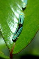
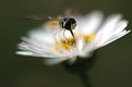
I used kenko extension rings... i think i used all of them.
|
| Photo By: Ryan Donahue
(K:159)
|
|
|
Critique By:
Laura E. (K:5598)

3/2/2006 12:02:54 AM
Hi Ryan,
Nice work, I like the pattern and intense colors.
How did you get such a good close-up with a 50mm lens? Did you add any extension?
Laura
|
| Photo By: Ryan Donahue
(K:159)
|
|
|
Critique By:
Roberto Arcari Farinetti (K:209486)
3/1/2006 5:09:13 PM
well hello Ryan..
the mode and presentation is good, also the fine texture created in the lcurves and the material..!
nicely
roby
|
| Photo By: Ryan Donahue
(K:159)
|
|
|
Critique By:
John Pitman (K:8473)
3/1/2006 2:38:19 AM
Like the colouring and lines. Very pleasant close up. John
|
| Photo By: Ryan Donahue
(K:159)
|
|
|
Critique By:
Sophie King (K:3250)
12/18/2005 4:41:05 PM
Yummo. Whats the recipe for these? This picture would be great for a cooking book, so I'd say it suits its purpose. Well done.
|
| Photo By: Ryan Donahue
(K:159)
|
|
|
Critique By:
Nadia Stanke (K:5318)
12/18/2005 1:37:30 PM
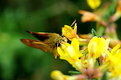
Oh, great shot. Do you have any more of these? I would love to see some other crazy hats!
The hand holding the rim of the hat in focus is a really good part of the picture.
Well done.
Nadia
|
| Photo By: Ryan Donahue
(K:159)
|
|
|
Critique By:
Cássia Rabetti (K:480)
12/17/2005 11:18:03 AM
Uma foto muito bem realizada, é necessário muita paciência para realizar uma boa foto em Macro! A nitidez e as cores é o que chama a atenção em sua foto.
|
| Photo By: Ryan Donahue
(K:159)
|
|
|
Critique By:
Larry Fosse (K:66493)
12/16/2005 7:12:22 PM
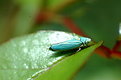
What a cool little critter you've caught here Alastair...great color & composition
|
| Photo By: Ryan Donahue
(K:159)
|
|
|
Critique By:
Joanna Ohmori (K:547)
9/27/2005 1:46:22 AM
The shadow wouldn't be distracting if there were more of it for him to stand on. Somehow, I feel like I am missing part of the picture, or maybe that he will fall off backwards out of the picture. I too though it would make a good advertisement.
Joanna
|
| Photo By: Ryan Donahue
(K:159)
|
|
|
Critique By:
Craig Hanson (K:7836)
9/2/2005 3:14:00 AM
Personally, I like! It could be an advertisement for something.
|
| Photo By: Ryan Donahue
(K:159)
|
|
|
Critique By:
Cem KIRMACIOGLU (K:758)
9/2/2005 1:38:32 AM
imperessive
|
| Photo By: Ryan Donahue
(K:159)
|
|
|
Critique By:
Ryan Donahue (K:159)
8/29/2005 8:00:40 AM
I had one light only and I used a bunch of seamless to try to cut down on shadows. He was tough to capture, as he would make a break for furniture at every oppurtunity.
|
| Photo By: Ryan Donahue
(K:159)
|
|
|
Critique By:
p e t a . (K:18700)
8/28/2005 11:52:42 PM
cute concept, but not quite there...that shadow is distracting.
|
| Photo By: Ryan Donahue
(K:159)
|
|
|
Critique By:
p e t a . (K:18700)
8/28/2005 11:49:28 PM
your best easily Ryan. was this naturally lit?
|
| Photo By: Ryan Donahue
(K:159)
|
|
|
Critique By:
André Bermak (K:14443)
8/28/2005 9:50:42 PM
Excelente composição e momento.Também acho que ficaria muito bom em P&B.....
|
| Photo By: Ryan Donahue
(K:159)
|
|
|
Critique By:
Gabriella Carta (K:22879)
6/15/2005 8:19:58 PM
wowwwwwwww.... wonderful!!!!
|
| Photo By: Ryan Donahue
(K:159)
|
|
|
Critique By:
Michele Carlsen (K:146013)
6/14/2005 11:43:03 PM
Amazing how camoflauge keeps us all alive in our own ways. This is a super cool picture .
Great job !
Michele Carlsen
|
| Photo By: Ryan Donahue
(K:159)
|
|
|
Critique By:
Donald Shawo (K:45)
6/14/2005 5:26:52 PM
good macro, Ryan
bye
|
| Photo By: Ryan Donahue
(K:159)
|
|
|
Critique By:
tejas agarwal (K:13)
6/12/2005 6:26:53 AM
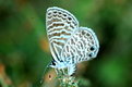
a good wildlife shot but slightly handshake
|
| Photo By: Ryan Donahue
(K:159)
|
|
|
Critique By:
Dawn F. Collins (K:560)
6/11/2005 12:15:52 AM
This is a wonderful capture or a butterfly in an unusual position.
It's really difficult to get these shots just right since you often don't have much time. I attempted this kind of shot. In my case it was the wind I fought with. It kept moving the plant my little critters were perched on.
I think you've made the same miscalculation I did. As someone told me, if you use a bit more depth of field, the butterfly would have been brought completely into focus. Regardless, I think its a a very nice pic.
|
| Photo By: Ryan Donahue
(K:159)
|
|
|
Critique By:
ian pearson (K:1736)
6/10/2005 10:52:04 AM
The composition is unbalanced.The moth should be pointing into the photo, not looking out. It needs cropping to reduce the amount of empty space to the right. The overall detracting feature is that it is out of focus on the vital part where all the detail is, on the wings.If this is caused by the flapping wings, then the shot was captured at the wrong moment and shots like this rarely raise much interest. Ian Pearson
|
| Photo By: Ryan Donahue
(K:159)
|
|
|
Critique By:
Jose Ignacio (Nacho) Garcia Barcia (K:96391)
6/7/2005 5:41:48 PM
wonderful.
|
| Photo By: Ryan Donahue
(K:159)
|
|
|
Critique By:
Jose Ignacio (Nacho) Garcia Barcia (K:96391)
6/6/2005 2:24:24 AM
wonderful.
|
| Photo By: Ryan Donahue
(K:159)
|
|
|
Critique By:
Jose Ignacio (Nacho) Garcia Barcia (K:96391)
6/4/2005 2:48:07 PM
simply gorgeous. 7
|
| Photo By: Ryan Donahue
(K:159)
|
|
|
Critique By:
Evelyn Mayes (K:8132)
6/4/2005 12:56:59 PM
Looks like other bugs chewed on it before he got there. I love the colors of light on the wings and the shallow DOF is nice too.
|
| Photo By: Ryan Donahue
(K:159)
|
|
|
Critique By:
Humayun Rizwan (K:3235)
6/3/2005 10:13:19 PM
EXCELLENT macro, Ryan. Love the colors, detail and use of DOF 7/7
|
| Photo By: Ryan Donahue
(K:159)
|
|
|
Critique By:
Jose Ignacio (Nacho) Garcia Barcia (K:96391)
6/3/2005 7:55:07 PM
outstanding. 7
|
| Photo By: Ryan Donahue
(K:159)
|
|
|
Critique By:
Christopher Gooding (K:2278)
6/3/2005 2:13:56 PM
Ryan,
It's good to see your variation in compositions on these three photos...I have also tried a few product shoots (www.thinkingteal.com).
Of your three images, I prefer this one. Larry says the glass reflections are a distraction (for your first photo, I agree) but this image is very well done. The only MINOR comment I would suggest is a slightly tighter crop from the bottom and the right. To me (my opinion only), there's a bit too much space in that area. Again, VERY minor. This image is magazine quality.
Christopher
|
| Photo By: Ryan Donahue
(K:159)
|
|
|
Critique By:
Toshi (K:11924)
6/3/2005 6:26:59 AM
Excellent macro and depth of field. This is a great image, nice work!
|
| Photo By: Ryan Donahue
(K:159)
|
|
|
Critique By:
Patrick Ziegler (K:21797)
6/3/2005 5:02:01 AM
Now that's a good macro.. the softnes is to the point it adds to the images rather than being a distraction... An interesting bug indeed!
|
| Photo By: Ryan Donahue
(K:159)
|
|