|
|
Critique By:
Nick Karagiaouroglou (K:127263)

5/3/2009 1:03:32 PM
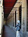
Very descriptive shot of not only the fantastic details of that fantastic city, but also of the special atmosphere that it has when under clouds. The colors and the shapes seem to merge with the presence of that muted light, which provides a special sense for the age and the meaning of Florence in its historical civilizatory role.
I can't be really detached in this comment, since I was standing exactly there, at Piazza Michelangelo, trying to get some images of the city, but still the enormous DoF and the great details are above all suspicion here. The gradual and subtle increase of the haze toward the depth enhances the huge space of the image even more.
Only as a question here: Could a bit more contrast do good? I adjusted the levels for that (attachment) but then the subtle diffuse light of the image became much weaker. So, which of both possibilities do you think matches better the view? I think yours comes much closer to that atmosphere.
Cheers!
Nick
|
| Photo By: Dave Stacey
(K:150877)
|
|
|
Critique By:
Nick Karagiaouroglou (K:127263)
5/3/2009 3:15:46 PM
There is no "regardless of the shot being good or bad", Saad. Just as there is no "regardless of the chord being played well or false", or "regardless of the novel being written grammatically right or not". It is a good image for what it shows.
I already told you about many other images of yours, where you try to impose "general truths" and things like that. First of all this is not the subject of photography. This is subject of social science, or of history, politics, philosophy, etc. The fact that photography can be a helping enhancement for the understanding of such matters is not for concluding that photography deals itself with such matters. For example, not a single of the images of mine that were used for my latest job for a flyer of an attorney office had anything to do with the content of their work. I didn't think about "lawyers" when I shot them. But I did think about good photography.
Second of all, and this is my personal taste, about that, even if we accept for a moment the statement "regardless of the shot being good or bad", it is trivial what you are doing. What do you think that it is? Special? Does it bring anything to the already known values and points of view of humanity? Are you one of the few that has that point of view? Is that really so special? Almost the whole humanity would have the same point of view, Saad, so what do you expect? You don't get any comments about that from me because the subject is not worth it. It is not difficult for me, it is trivial. I don't sit and write about "couch-philosophy". There are more than enough "hobby-philosophers" here that will tell you how "good the subject is" etc, etc. This is like standing on the pedestal, saying that the earth is not flat but rather a sphere, and expecting everybody to break out in celebrations.
Now, if that statement about the earth would be at least special, or subtle, or remarkable, or different, or aggresive, or demanding, or insane, or anything than the usual hyper-romantic approach that was already beaten to death, then I would get on that car and say what I think. But the way you do it is like repeating the songs of Bob Dylan with some new notes and expecting me to say that the music is yours where it is a cover version of a cover version. So I stay on the technical side until there is reason for going further.
Cheers!
Nick
|
| Photo By: Saad Salem
(K:89003)
|
|
|
Critique By:
Saad Salem (K:89003)
5/3/2009 3:07:20 PM
Nick ,for the first three paragraph of your argue ,I have understand that you do not like the programs and software that enhances shots,that is OK ,for me and I could understand that,but I could tell you also that a monkey can not produce a simple kid story even if we allow him to mix words for say a million year,that is so very well understood too,
but what I have said about the program is the true and very fair and correct statement,and it is exactly like saying it took hundred years of more than thousand man continuous work and effort to reach the perfection of your camera that you use now,to its present state compared to the first model of Canon,
Photoshop is a very efficient program for correcting shots,for production of artistic shots,for mending badly shot photos to an acceptable one,
photoshop for me is the tool that the old professionals equivalent of one month work in the dark room,and 10 to 15 exposure ,and then blending their negatives to produce one shot,with say two or three coworker and assistant,
to be continued
|
| Photo By: Nick Karagiaouroglou
(K:127263)
|
|
|
Critique By:
Allen . (K:-667)
3/26/2009 12:46:01 AM
Kinda hard to understand why this picture hasn't gotten more attention. Excellent landscape that I'd be hard pressed to find any fault with. Love the subtle combination of leading lines and S curve. Very good eye.
|
| Photo By: Sei Tchiez
(K:71)
|
|
|
Critique By:
Nick Karagiaouroglou (K:127263)
3/21/2009 12:22:23 PM
It has a very "trainy" mood indeed, Andre, in the sense that cargo will not only follow the well known "photogenic" routes that appeal to the typical tourost, but it will follow many routes that have a different kind of photogenity than what appears to be "nice" to the lazy eyes of the monotonous "aesthetic rules".
So, thanks to your good focus, I see the good details of the rail world as it expands to the depth between machines, vegetation, and rather "dirty" colors, if I can call them like that. There is also some kind of refraction-like effect on the edges of the objects on the image that suggests humidity just like after a heavy rain. It certainly adds much to the athmosphere. It makes it very very real.
The composition is again pretty well balanced for me. I wouldn't add or subtract anything at all.
Only a small idea about that. Do you also notice a more "closed" kind of view by cloning of the small piece of sky near the top left? (Attachment).
Cheers!
Nick
|
| Photo By: Andre Denis
(K:66327)
|
|
|
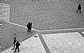
Critique By:
Anindya Chakraborty (K:12765)
3/26/2009 3:53:33 AM
excellent street photography this! The street patten looks very nice and the position of the men in this picture also adds to whole composition in the frame ....overall an excellent street photograph....
regards
anindya
|
| Photo By: Linh Ha
(K:120)
|
|
|
Critique By:
Gary Dyck (K:12834)
3/26/2009 7:05:14 AM
Great shot, Rifat! I may have cropped a bit of the bottom off to de-centre the bird a bit, but that's more of a personal taste. Good sharpness and dof here. Cheers, Gary
|
| Photo By: Rifat Icoz
(K:168)
|
|
|
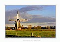
Critique By:
Roderik Koenders (K:2740)
10/6/2008 12:07:09 PM
Hoi Teunis,
Great shot. I really like the colour depth with the bright green of the grass, blue in the sky and warm tints on the mill.
I don't know how much post-processing you have done on this picture but maybe you can enhance the colour depth by removing the slight red tint from the grass, that way it might pop even more? Just a thought though.
|
| Photo By: Teunis Haveman
(K:37426)
|
|
|
Critique By:
Roderik Koenders (K:2740)
10/6/2008 1:27:49 PM
Ania,
Great shot. I really like how you darkened the edges a bit to keep the focus on the two central figures. You have used the low depth of field very well, with the high aperture value. What ISO did you shoot at?
I think you already darkened the sky a bit already, but I think it is still a bit too overpoweringly bright. Also the figure on the right draws my eye away from the main subjects.
The composition is very nice though, with the big sister being protective of her little brother. I really love how you managed to get the trust of these kids to shoot them in this way. Is this a street photography shot or are these kids you know? If the former I would love to hear how you approached the situation and got your shots. I am experimenting with street photography myself a little, and it always makes me a bit nervous to just go and take picture of people :-).
|
| Photo By: Ania Blazejewska
(K:23981)
|
|
|
Critique By:
Paul de Beukelaar (K:26449)
10/6/2008 1:30:18 PM
Hi Pim,
I agree with Phillip about the pose of Janneke's leg. The previous B&W portrait was such natural and so excellent, but here I notice immediately what Phillip already clearly described.
Another thing I notice is, however I can't read her thoughts, she was willing to pose but also she seems to be maybe bored and somewhat impatient. It is clearly visible from the tension seen around mouth and neck.
Lighting however is really perfect,
vriendelijke groet,
Paul
|
| Photo By: Pim de Ruijter
(K:2170)
|
|
|
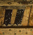
Critique By:
Nick Karagiaouroglou (K:127263)
10/6/2008 1:46:42 PM
A very very authentic and original idea, Ian! It has both "order" and at the same time "disordering" for me. The restricted palette adds much to its abstract power. The texture on the wood looks nice too, but above all I find that kind of "diffuse light glow" over the whole image very interesting. Is that the result of the reflections on the water?
Another possible crop would be like on the attachment, but then it loses much of that abstract look, doesn't it?
Cheers!
Nick
|
| Photo By: Ian McIntosh
(K:42997)
|
|
|
Critique By:
Bob Brins (K:4130)
10/6/2008 12:25:09 PM
The image transcends the subject matter. I've done similar work at Coney Island. But, my images are about the place. This peaceful moment is everywhere. I don't know if it's seeing or skill but, I very much like the lighting that keeps the figure from blending into the (back) ground.
Bob
|
| Photo By: Artan Korenica
(K:232)
|
|
|
Critique By:
Roger Skinner (K:81846)
10/5/2008 10:24:38 PM
beautiful girl but the pose is wrong.. her legs have disappeared so if you crop the top out that might help but in all seriousness I would re pose her... try this too last thing you do before you depress the shutter button is to run your eye round the periphery of the viewfinder, this has two effects 1 You see the odd things about the shot.. ie trees poking into peoples heads and stuff like that and second you detach from the centre of interest the thing you are hot to photograph and simply see an image as the camera sees it. I cropped it according to my taste in order to tidy it up, but it would be better cropped in camera so you dont lose image size and so on.. hope you dont mind
|
| Photo By: Srna Stankovic
(K:172232)
|
|
|
Critique By:
Roger Skinner (K:81846)
10/5/2008 10:37:36 PM
OK Plain english I see this as a cruddy old toilet block washbasin, no frills no clever cute piece of plumbing just serviceability that is all.. the colour of the light IS depressing.. the sad lonely and cold or cool feeling it imparts because of the colour of the light, is bang on for the mood you are trying or should I say have portrayed the bloke who commented and did a rework hadnt felt what you felt when you saw the scene and more than likely smelled the overpowering disinfectant smell that stays in your clothes after you have been to the loo.. all these things add up.. I guess further he hasnt looked at your portfolio as your work is depressing.. you seem to be attracted to the downtrodden the forgotten the empty loneliness that pervades your surroundings.. it is a brave photographer who will persist with this view .. take Grant Mudford, for years he persistently photographed the mundane and boring aspects of architecture in particular... now.. he is the justified master of the art.. and people hire him BECAUSE of his singular view of the world.. keep it real keep it happening stick to your guns You Rock Shel.. Love Roj
|
| Photo By: SRS SRS
(K:6731)
|
|
|
Critique By:
Jan Graziano (K:17920)
10/5/2008 5:15:38 AM
Very nice composition and rich colors - the soft slightly blurry focus gives the impression of a painting. The winding trail leads you right in to the scene.
|
| Photo By: Paul Harrett
(K:791)
|
|
|
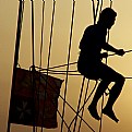
Critique By:
John Hatz (K:156973)
10/4/2008 11:09:17 AM
Absolutely excellent shot, silhouettes are very nice... and of course a silhouette on a very interesting subject like a man trying to work hardly on the....top of the world (kidding about the highs and how I'm scared about...) is surly something very nice... excellent the way to tightly frame the subject as also the way you 'use' the metallic parts and the flag into the frame... amazing... that must be on a boat...even I had a different idea firstly about a man working on a contracted building... but the flag gives the reality about what going on here... unique place anyway to seat a man!!! (again no way to be there...hahaaha)
be well Tommaso!
|
| Photo By: Tommaso Di Falco
(K:23819)
|
|
|
Critique By:
Nick Karagiaouroglou (K:127263)
9/29/2008 10:42:09 AM
The lighting and the coloring caught the atmosphere very well, in a combination of real view and a look at one of those old posters whose colors get washed out by rain and sunlight. In this sense it has also much of the "aged" look that seems to be ideal for preserving vague memories. Very good details and perspective with a great DoF that adds much of that "could touch it" kind of look and feel.
On some places there is a slight overexposure, like for example on the tower of the church, but this enhances the sense for light in this case. The whole balance remains intact - there is no too much or too little here.
Very good work.
Nick
|
| Photo By: Orazio Minnella
(K:49417)
|
|
|
Critique By:
Riny Koopman (K:102911)
6/29/2008 3:33:17 PM
We live in an increasingly complex world that challenges us every day with a wide range of disturbing issues that are difficult for children to understand and for adults to explain. We believe this Web site can help by offering practical, concrete tips and techniques for talking easily and openly with young children ages,very intresting human portrait,be well my friend,riny
|
| Photo By: srimanta ray
(K:2710)
|
|
|
Critique By:
Billy Bloggs (K:51043)
6/15/2008 8:19:15 PM
Well spotted, Stan. It would be a good abstract even without the loaded meaning. It's hard to say whether mono is best for this image. I suspect keeping colour might lose the crosses, in which case it has to be mono.
Regards, Gary
|
| Photo By: Stan Hill
(K:35352)
|
|
|
Critique By:
Doyle D. Chastain (K:101119)
7/6/2008 5:52:48 PM
I'm going to echo David on this one (ok, an English echo but you know what I mean). The darker clouds on the lighter left sky work well to accent this shot as does the tower. Love getting some info too. Nicely done and the tower central to the composition is one of those rare exceptions to the rule of thirds that works in this composition ver well!
Regards,
Doyle I <~~~~~
|
| Photo By: Julie Salles
(K:22654)
|
|
|
Critique By:
Larysa Khomenkova (K:3039)
6/26/2008 12:21:20 PM
Dear Shibnath, Excellent shot, the best from what I could see during last time at diffeent photographer's web-sites and jornals. I like relfestions and even in the smallest pull I try to take them. But yours is perfect, I like the peoples that are here, minimum things and maximum reflection of the sky. Amazing job, congratulations. Have a nice day and more nice shots, all the best, Larysa.
|
| Photo By: SHIBNATH BASU
(K:-907)
|
|
|
Critique By:
Nick Karagiaouroglou (K:127263)
7/1/2008 1:37:07 PM
But for photography it is quite an alive end, Saad! Only perhaps a different frame (attachment) for enhancing the edhe of the column at the very left, that otherwise "flows" into the white background of the web page. This is only a suggestion for presentation, however, and not for the shot itself.
The shot itself is simply strong, full of vivid details in all the DoF, with a great composition and enhancement of the depth, and with a very well balanced lighting/toning. Only perhaps the whole woman would be better included on the image, which on the other hand still doesn't lower the tension of depth and distance.
Cheers!
Nick
|
| Photo By: Saad Salem
(K:89003)
|
|
|
Critique By:
Stan Hill (K:35352)
7/1/2008 2:06:25 PM
Title is not important with an image as nice as this. Unbelievable calm of water and the motion blur of the clouds is really nice. Of course the colors are really nice. Be nice to that Canon, it is treating you very well.
Be well, Stan
|
| Photo By: Collin Stebbins
(K:1868)
|
|
|
Critique By:
Andrzej B. (K:2244)
6/25/2008 1:24:52 AM
Excellent piece of landscape, perfectly composed. My only problem is with the blue as dominant color, specially on the mountains. Kind of unnatural, imho.
|
| Photo By: Gregory McLemore
(K:35129)
|
|
|
Critique By:
Al Ungar (K:4626)
2/26/2008 10:08:06 PM
Julie,
Have to be upfront with you..
Subject - Good nice looking lady, nice smile, dressed well
Composition - Good, eyes in the top third of the image, cut-off of the head well done (can tell it is on purpose)
Colors - no punch in them..you said no post processing, don't think it is a plus in this case, alittle more saturation and pop would help a lot
Light - Flat, boring, no catch light in her eyes, no shadows
Killer- wrong lens !! you used a wide angle which distorts her lovely face. You should not use anything less than 100. If you were at the far end of your lens and 1.5 factor the best you have is an 82.
|
| Photo By: Julie Salles
(K:22654)
|
|
|
Critique By:
Nick Karagiaouroglou (K:127263)
11/29/2007 12:28:20 PM
It is not only hilarious but also very unreal, almost surreal, I would say, Erin! Any capture of a single moment in time has that kind of exciting surreal look, but only if it is techically perfect, which this one is above all doubts. The composition is well balanced, the lighting too, and the unimaginably strictly correct focus reveals the momentray expression and details of the persons.
I would use this one in a photography course for many of the wannabes here who think that it is only just take the camera and shoot something... anything. ;-) you demonstrated very well, that even (or perhaps especially) a funny photo is captured by conscious applying technique and knowledge!
In a way this is a BIP for its own! Hat off!
Nick
|
| Photo By: Erin Kelley
(K:1603)
|
|
|
Critique By:
Mary Brown (K:71879)
11/28/2007 6:54:51 PM
Great shot, Walter. The blues in the background mountains are wonderful. The two rocks sitting on the edge in the foregreound remind me of a couple of people sitting there admiring the lovely view. The fact that you have the foreground section on a bit of a slant is a great compositional element. Super perspective for taking this image.
MAry
|
| Photo By: Walter Scarella
(K:19671)
|
|
|
Critique By:
Gustavo Scheverin (K:164501)
10/17/2007 1:29:04 AM
ahhh, esplendida!, puro surrealismo aquí, con un toque a Delbaux: onírico, y ese reflejo en el agua que es impecable, y los colores, intensos y muy armonioso. Yo creo que sin dudas vos tenes un estilo, y yo puedo reconocer un Steinberg...con solo ver la imágen, o casi...:-)
Como conseguís esos escenarios?, bueno la respuesta creo que es casi evidente, yendo a buscarlos...ja...ja...voy a salir a buscar escenarios, y personajes también, la verdad eso es nuevo para mí, siempre busco la foto, no elementos para una foto.
Che, perdoname que insista pero el libro de Mellado es muy interesante, plantea la fotografía digital desde la óptica del fotografo clásico que tiene que pasarse a la tecnologia digital y quiere obtener los mismos niveles de calidad...
Está lleno de simples trucos, mucho sobre RAW, ajustes de colores de dispositivos, manejo de archivos que no se degradan con la manipulación...muy, muy interesante!
Un abrazo! ahhh, un merecido 7, master!
|
| Photo By: Luis Steinberg (EFIAP)
(K:21250)
|
|
|
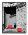
Critique By:
Dennis Hendricksen (K:4817)
10/15/2007 8:25:20 PM
So does artistic licence mean you placed the milk crates in a more eye pleasing arrangement? This is such an interesting picture, the snaking electrical conduit is the icing on the cake - an element curving chaos amidst the straight lines in the rest of the image. I now realize looking a little closer that the monochrome look (except the crates) was created by you. I think it works well in this context - not too unrealistic that it becomes distracting. A nicely conceived work, and well executed.
|
| Photo By: Jeff Cartwright
(K:52046)
|
|
|
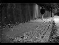
Critique By:
Nick Karagiaouroglou (K:127263)
10/16/2007 7:14:08 PM
E*x*c*e*l*l*e*n*t! Perfect control of focus for creating the scene, that might have been different in reality but reveals its essence on the image! The concentration of focus on the foreground and the gradual dissolving of the depth takes much of the importance of the walking person! It is only a person, who knows who, walking on the *street* - the scene itself! I've seen many street images but just a few of them manage to draw its special kind of isolation as well as this images does!
Hat off again!
Nick
|
| Photo By: Avi
(K:70138)
|
|