|
|
Critique By:
Angelo Villaschi (K:49617)
8/19/2005 7:54:35 PM
Nice abstract, Jill. Love the colours and the use of the totally white background without any borders.
If I may, I think it would be even more effective if the circles were slightly smaller in dimensions and the white space around the whole thing was a bit more, to separate it from the automatic text from UF.
Very striking work, though!
|
Photo By: Jill Bartlett
(K:8130)

|
|
|
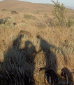
Critique By:
zane anderson (K:620)
8/19/2005 2:15:41 AM
katie you took off the most interesting part of the picture!!
well i think this is how it should look the way you took it i just thought that it was relly interesting to see only part of that kid on the right because with the shadows you see hes part of something even if we still dont know what lol
well heres the way i see this picture
<3
zane
|
| Photo By: katie dominic
(K:255)
|
|
|
Critique By:
George Marks (K:15437)
8/18/2005 2:14:45 AM
What can I say? I've never seen a bad image of the Grand Canyon... some are just better than others. The problem is often one of scale. I think that to capture this well and do justice to mother nature, you should shoot from a levelled tripod in the "portrait" aspect. Use the aperture priority mode and stop down to f/16 while using your lowest ISO setting. Use your cameras remote control or self timer to trip the shutter. Then shoot in sequences of four images with slight overlap. Vary the focal length of your lens with each sequence. Then you can stitch the various sequences together. I guarantee you will like the results. If you want to get real creative, shoot in the manual mode and hand meter the exposures. Using prime lenses could also bump up the sharpness of your images. I'll be doing quite a bit of this next year, and some shots will probably taken near this location.
|
| Photo By: Sam Graziano III
(K:14064)
|
|
|
Critique By:
Patrick Ziegler (K:21797)
8/16/2005 3:30:09 AM
I am not familiar with Miami so I do not know what your orientation with the sun was, but I do think a circular polorizer would would have helped your lighting situation here.
And the detail, Not sure what went wrong here, what are you settings as far as image file type size etc... I'm a film guy but it looks like maybe you captured a small file and bumped it up. Or maybe just missed the focus...?
Advice, capture large files, To me this shot looks like it called for f/11 and a tripod. Use Auto focus when possible, Expose for the sky and use a polorizer..
Not picking on you just trying to help. You seem to have a good eye for composition.
|
| Photo By: TimeShift Studios
(K:7)
|
|
|
Critique By:
Jan Graziano (K:17920)
8/13/2005 9:14:11 PM
I can hardly wait until I get good enough to take shots such as these. Colors, details, reflections are amazing. I just don't even want to think about where you were to get this shot. The lines, the angles, and the lights that look like stars in this shot are great. But, IMHO, I think this one needs to be centered just a little more. I didn't take alot of time to fool with it, but I think the attached is almost "even-steven". What do you think?
|
| Photo By: Rob Graziano
(K:6678)
|
|
|
Critique By:
Martin . (K:24957)
8/12/2005 9:57:59 PM
nicole,
I cropped it pretty hard, but not much else? I think the Rembrandt Triangle under the left eye is 2nd to none. Not to mention the triangles regarding the arms. Your lighting on the triangle is awesome and the pose is wonderful?
Martin
|
| Photo By: N.R. Miller
(K:946)
|
|
|
Critique By:
sammy - (K:4108)
8/9/2005 1:22:52 AM
Hi Ellen-
I like this double portrait.
I like the sun on her cheek.
You might want to try burning
in the bright background a bit.
As Don said their arms are
hanging straight down so there's
not much storytelling going on
below her shoulder. Another
reason viwers might like a tighter
crop is that gets rid some of the
stripes on his shirt.
_____________________________
Here's a few tips I was taught in photo school for portraits in general:
* Try to keep your lens above the subject's nose level. If you're short it might mean using a heavy tripod and chair or apple box to stand on. "Apple box" is a movie term, it's not an actual apple crate. I made a "half-apple" and use it all the time. The short side of mine is about seven inches high. "Hey Joe, toss me a half-apple!" This one looks to be about the size Robert Redford would stand on to make him film taller. http://www.bhphotovideo.com/bnh/controller/home?A=details&Q =&is=REG&O=productlist&sku=99402
* Try to keep people from tipping their heads back. Try not to shoot up people's nostrils (hard not to do sometimes.) It is known from psychological experiments that viewers usually feel better about a portrait when taken from nose level or somehwat higher.
* Avoid striped clothing. Especially in a TV studio, but for still portraits too.
Reflectors are used to control lighting ratio. 4:1, 3:1, 2:1 etc. For your portrait above the ratio is very low (except for the patch of sunlight), it's close to 1:1 so a reflector in this case might raise the ratio. At any rate...
* A big piece of foam core in front of them should make nice catchlights in their eyes.
* You can vary from the traditional lighting types as you wish, but you should know what they are and be able to recognise them even when the lighting ratio is very low.
There is plenty more they taught us about portraits, but that should be enough to deal with for now.
Google these combinations of key words:
[Rembrandt light photo portrtait]
[Butterfly (or glamor)light photo portrait]
[broad side photo portrait]
[narrow side photo portrait]
[studio lighting ratio photo]
|
| Photo By: Ellen Smith
(K:14418)
|
|
|
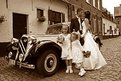
Critique By:
Tracey MacLeod (K:3244)
8/10/2005 7:26:23 PM
ok. Bjorn you want critique I like to be told flat out too likes and dislikes good man! Well, it's nicely exposed! it's a good shot. it's VERY straight forward. nothing wrong with that but when you shoot weddings try more angles and vantage points! try several different approaches ex: little girls in tack sharp view in front of the camera and couple and car slightly out of focus in back.... I don't know what else you shot but.... this is nice don't get me wrong but is very plain jane. in weddings REMEMBER you can never get to close - try a loose shot like you have and go for a little tighter and then get crazy and go tighter yet! and change angles! sometimes you may surprise yourself! (I'm a wedding photog - but maybe by next week i'll have a few posted... after the series I started with! Good Luck! you can NEVER shoot too much!
|
| Photo By: Bjorn Beheydt
(K:12096)
|
|
|
Critique By:
tom rumland (K:14874)
7/16/2005 10:41:14 PM
sally, this is wonderful! you mentioned in your comment to me that you were not entirely happy with your exposure but i see no issues with it whatsoever. there is a tad of a bright spot in the center of the frame but i suspect it is ps "residue", no? lovely colors, btw. did you squeeze them out of ps or did you use a second color photo as an overlay? the color definitely bumps up the surreal factor, don't you think? either way i think it came out fantastic.
i also see now what you meant about the frame. looks great.
take care,
tom
ps - thanks so much for your comment, btw. it seems to me that you've also been doing this for a while ;^)
|
| Photo By: Sally Morgan
(K:9219)
|
|
|
Critique By:
Martin . (K:24957)
8/7/2005 1:40:26 AM
Kevin,
Try to shot with slow film and a slow shutter speed. ISO 100 @ 1/125, or 1/60... My 1st shots were boring shot a 1/250, or 1/500...
The following photo is around 1/125 and panning is very important... Get good at panning with no vertical movement...
Martin
|
| Photo By: Kevin Settles
(K:638)
|
|
|
Critique By:
Petros Stamatakos (K:12101)
8/5/2005 10:28:56 AM
Peta, a very nice photo indeed... Well composed... Exposure is good too...
There used to be a Usefilm member called John Shephard, he was an assistant for Ken Duncan for a number of years, before he returned to America to do his own thing... His photos were all out of this world. What made his photos outstanding was the fact that he'd visit the same location day after day, at like 4.30am to set up, and get the magic morning light... And eventually he always did... He nailed one image after the other. Like I said though he sacrificed a lot to get the "perfect" image... I recall he used to joke that as he was packing up to finally go home, he?d see all the other ?photographers? arrive?
I've noticed that you too tried to ?get in? early in the morning and do all the right things... It will definitely pay off soon enough. You have a great eye, great ideas, and you?re definitely learning the technical side fast enough.
A while ago now, you reached a stage where you can look at your photography a little more objectively (many users here still can't take criticism, even when it's delivered with a silver glove). So, here it goes:
Nothing wrong with what you have shot here, but this is not different to a photo taken by the next tourist with a digital point and shoot that happened to drive by this location. What would make your image stand above the rest, is after having found the location, setting yourself up to capture the ?magic light?.
Not that you don?t know this already, but you should now strive for the perfect image every time (and I think you do anyway). You and I both know of course that many a times this is not practical. After all the great ocean road is not around the corner from where you live? Nor is it practical to wake up and go shooting at 4.30am every day? Knowing the difference though between this image and what you could potentially achieve is important. I guess that it?s all about bridging this gap?
One of these days, I?ll get my act together and try and organize a shoot together with the rest of the Melbourne Usefilmers :-)
Love your stuff!
|
| Photo By: p e t a .
(K:18700)
|
|
|
Critique By:
Carsten Ranke (K:14476)
8/5/2005 11:04:11 AM
Love this sparkling blue light myself, great shot. Simple but extremely beautiful motif. It is a light you should wear sunglasses, and such pictures need contrast ! I played a bit with PS to show what I mean (a hard light blended layer mask and an "S" shaped curves adjustment layer). Hope you dont mind.
|
| Photo By: Caterina Berimballi
(K:27299)
|
|
|
Critique By:
Sebastian Zachariah (K:3382)
8/3/2005 8:20:25 AM
I like the picture but would have loved it if the flowers were to any one side and you had gotten a lot more of the bridge in the foreground into prominence. If you can reshoot this - you must carla.
regards
sabz
|
| Photo By: Carla Sie
(K:2057)
|
|
|
Critique By:
Pierre Martin (K:3355)
8/1/2005 11:56:23 PM
Hi Shane!
I know I'm gonna sound like I'm repeating myself but I want to congratulate you again for an incredible capture!!!! WOW!!!! I just picked up a copy of today's Ottawa Citizen - and I see this picture on the front page! Congrats on getting published!!!
Kudos also for getting this week's SkyNews picture of the Week as well as being on spaceweather.com main page. You deserve to be recognized!
I missed seeing it happen as I had my camera in my scope, and the image too dim to see anything. I was also unlucky enough to start shooting my burst of exposures too soon, and then missed out. Ah well... I'm glad for this image that I can view :0)
Maybe we can catch the next ISS transit next Saturday morning. What ya say we try it again?
|
| Photo By: Shane Finnigan
(K:1990)
|
|
|
Critique By:
Evangelos Koutsavdis (K:379)
8/2/2005 1:23:31 AM
Jaque:
The perspective is captivating. I wish the shoe was not cut (was it the purpose of the shot, to show the shoe?). Last comment, the leg wanted a bit of airbrush, but I don't know anything about makeup.
|
| Photo By: E H
(K:1665)
|
|
|
Critique By:
Andre Denis (K:66327)
8/2/2005 2:00:58 AM
Hi Maria,
I am going to try and be honest from my point of view when I write this. Nothing really negative, just a question. First of all, I like the concept of this series a lot. I went back and looked at the first one and one of the things I liked about it was the fact that the old Sepia image was sharp while the present day image in colour was soft focus. My question is... do you think the above image would have been better if you used the same concept. The composition and thought behind the image are great. But, no one in all the comments has mentioned the sepia image is almost as soft as the colour in this one.
Andre
|
| Photo By: Maria José Barres
(K:11276)
|
|
|
Critique By:
Randy Lorance (K:24769)
7/31/2005 11:07:31 PM
Congratulations on BIP for this good capture. Your choice of toning fits it well as does the noise. Good perspective and tight cropping. I think the blown out area of lights on left is an integral element that makes the picture click. Even a different arrangement of the guys would quite change the final image, as the big guy in front with the 'shades' provides the correct ballast for the whole. One of those compositions where everything falls into place for the overall good of the shot.
Randy
|
| Photo By: Trish McCoy
(K:15897)
|
|
|
Critique By:
Kim Culbert (K:37070)
7/28/2005 3:51:34 PM
This makes me want to go to Zion so badly!!! Lovely long exposure treatment of the water down the narrow shaft... it's an excellent contrast to the textured rock on either side. Even the colours are contrasting, the soft, cool blue with the rough, wet reds... perfectly handled!
I wonder if a polarising filter would have removed the blue glare from the rock, giving even more contrast and saturation to the image?
Anyways, gorgeous shot!
|
| Photo By: Tomas Kaspar
(K:-336)
|
|
|
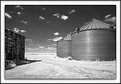
Critique By:
Paul Sanders (K:744)
7/28/2005 5:50:24 PM
Don,
It's funny how every time there is a critique only post no one ever does that. Anyway, I think the composition is nice and the fact that you can see all the detail inside the corn crib is great. If this was my shot the crib would probably be really dark and contrasty (bad). The only critique I have is probably the fact that another time of day would have probably been better or even a more overcast day would have turned out better. It seemed the day was really bright or maybe it is the IR effect. Also, possibly not using IR would have been a better choice because the grass just looks really burnt and too bright. Just some things to think about. I'm no expert myself.
|
| Photo By: Don Loseke
(K:32503)
|
|
|
Critique By:
Sean Schwoerer (K:268)
7/28/2005 3:35:24 AM
Nice Photo - Great Color and exposure.
Suggestions:
I wasn't there so I don't know exactly what your situation was, but if I was taking the photo I would have looked for a different background as the building on the right is a little distracting. If anything I would have seen how it turned out with the entire building in the photo or not at all. I think the clock tower was definitely a must!
I have to say I love the color..... If you could I would like to see Shutter/Aperture..
Thanks.
|
| Photo By: Erik Shea
(K:1600)
|
|
|
Critique By:
Bradley Prue (K:30678)
7/27/2005 12:20:29 AM
This is beautiful, Biliana! You have done very well in your effort to "look vintage". The only way I could see it more authentic, would be a slightly paler face...perhaps even a little blush in the cheeks. The touch of turquoise in the dress is perfect!
Aside from the effort for "vintage", the photo itself is very, very beautiful, the background is so subtle and effective! Wonderful work, as always.. ..Brad
|
| Photo By: B:)liana
(K:30945)
|
|
|
Critique By:
Manu (K:13082)
7/10/2005 8:32:17 AM
Wonderful composition, Rebecca...full of colors, definition and coolness. If I were to be picky, I would see if you can enhance the green or levels in the far distance. I know the sun would have been hitting it but it looks a little "bleached" in comparison to the rich colors in the rest of the shot...just an idea?
Great frame that hold in the image and adds to the special feeling you have given to this place.
Cheers
Manu
|
| Photo By: Rebecca Raybon
(K:26654)
|
|
|
Critique By:
Aram Gharib (K:4656)
7/23/2005 5:18:13 AM
Yes! Photographing kids is a transaction: you capture the moment and they receive a little portion of attention. The camera is the instrument to receive and to give.
Nice picture, Mary. Thanks for sharing it.
|
| Photo By: mary karimi
(K:10818)
|
|
|
Critique By:
* James * (K:20200)
7/21/2005 3:44:47 AM
a good shot of a bird in flight. did you try a faster shutter speed? with the speed these birds move their wings, a shutter speed of about 1/1000 would produce a sharper image. DOF is good here.
well done ~ james
|
| Photo By: Rich Swanner
(K:-3732)
|
|
|
Critique By:
Michael Kanemoto (K:22115)
7/19/2005 10:16:31 PM
Wonderful work - manipulating colors and matching the city geomerty. Certainly a creative idea that I have not seen before.
Placing the subject on a diagonal and not one of the standard 15, 30 ,60 degrees certainly gives this more energy, yet there is repetition and stability through the grid and reflections. I think the application of color lends itself to a Mondrian sort of view.
Clear and crisp, yet still abstracted. Heck of a shot.
|
| Photo By: Dominic Daigle
(K:641)
|
|
|
Critique By:
Alastair Bell (K:29571)
7/19/2005 11:18:54 PM
Hi Mary,
This is a beautiful image. I love the colours and the reflections over the water.
On a technical note I too can see the line around the selection area (I'm nearly certain thats what it is) that Chris mentioned.
What Chris is referring to is feathering the selection area. Assuming you are using Photoshop, make you selections, then go to the menu, choose Select -> Feather and input a number of pixels to feather the edge by. Now do whatever you need to do to make your adjustments. This will remove or reduce any sharp lines around an area that has been adjusted and provide a smoother transition.
Another wothwhile tool is a noise reduction tool. This will help reduce the digital noise effects that so often appear on night shots due to the inherent digital noise present in a camera. There are several free ones on the web you can try or if you want to email me I can point you at the one I find best (email address is on my profile). On this image you can just see a little noise in the clouds directly below the moon.
On an aesthetic note, I think this is a stunning image!
Alastair
|
| Photo By: Mary Brown
(K:71879)
|
|
|
Critique By:
Rona K ** (K:2375)
7/19/2005 9:11:25 PM
This is very nice Julie. You did well with the background. I really like the softness around it.
Next time try using some soft lighting in PS with it and see what you think. It brightens things up sometimes. Keep working at it . Practice makes perfect.
Rona
|
| Photo By: julie hugill
(K:6730)
|
|
|
Critique By:
Brenda Guiles (K:6128)
7/18/2005 1:02:48 AM
Wow 15 viewings and not a one of them left you a comment. Your point of focus seems to be right on the butties eyes and snout which is rather cool! I love the checkerboard eyes!
I am not sure what the red is from, but I find it a bit over powering IMO. I am wondering if you cropped the image this small or just resized it? I normally post an image that is resized to 640 x 480 or there about, that way one can see more detail.
Just because this image drew no comments, please don't get discouraged, keep at it! I think you have an eye for macro detail and would like to see more of it! I can give you some pointers on presentation if you are interested. 
|
| Photo By: steve poznanski
(K:0)
|
|
|
Critique By:
Cheryl Ogle (K:24494)
7/16/2005 2:38:58 AM
I read the whole "line comment" from Svend but I disagree on his take - if you look at the wall, the panel is leading you to your subject and work and the floor seems to be leading the eye into them (both in the layout and the framing of the carpet and the furnature) - that's my HO. As far as the composition entirety - I love the shot. Feels very regal - her leg forward is an assertive stance yet her clothes say she's rather laid back and unpretentious. Well done on this shot - it can give anyone a story to read. Is she an artist or a collector? She is rather wealthy without showing off too much (wood paneled walls like this are rather pricey and the gradour of the room...). She's happy without a forced feeling. The colors and lighting are lovely. Well done.
|
| Photo By: Terrence Kent
(K:7023)
|
|
|
Critique By:
Angelo Villaschi (K:49617)
7/13/2005 10:39:35 PM
Chris,
Seems like a nice place. A nice little harbour and some interesting coloured stones around it.
I do feel as though there is a bit too much foreground included. I wasn't there, so I don't know if it was possible or dangerous, but how about getting closer to the edge and including more of the village in shot, especially the bit currently behind the verge?
Just a sugestion from someone who hasn't been there, so take it with a pinch of salt!
|
| Photo By: Chris Spracklen
(K:32552)
|
|


")