|
|
Critique By:
waleed montasser (K:2569)
11/4/2005 1:42:24 AM
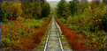
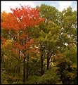
Extra-ordinary mood u make here and the wide angle lense helps alot 2 put the spectator inside of it , the contrast between the dark branches spreading all over the image and the bright grass on the ground gives the shot a moody feel and adds potential 2 it
1 of ur best Linda
Regards 
|
| Photo By: Linda Imagefree
(K:72276)
|
|
|
Critique By:
Kelly Duntley (K:13889)

11/4/2005 1:50:11 AM
Ooh, I like this one very much. It has a great deph of field. My eyes start at the beging in the track and travel down. The landscaping on both sides of the track is beautiful and you have captured the colors and textures nicely. Well done.
Kelly
|
| Photo By: Anis Ahmed
(K:356)
|
|
|
Critique By:
John Loreaux (K:86210)
11/4/2005 2:08:35 AM
Fantastic photo Kevin!!! Love the light here!The tree silhouettes are great!Love the tones and the rays of sunlight! The gulls are beautiful! Congrats on a super photo! My best!!!...................John
7 !
|
| Photo By: KEVIN TEMPLE
(K:8657)
|
|
|
Critique By:
Gary Riedel (K:979)
11/4/2005 2:20:26 AM
Greg, I usually pass on pet pictures, but this is great! I have an equally hadnsome partner named Java and so appreciate your love of this capture. This is above the normal pet picture. Congrats to you and hope to see many more. The paws, nose, and leathery lips of felines are so beautiful and you have done a fantastic job here of promoting that fact. More...more.
|
| Photo By: Greg Scott
(K:1990)
|
|
|
Critique By:
Ann Nida (K:45248)
11/4/2005 2:59:36 AM
Nice composition there showing the guy on just the corner stretch of beach. Looks like a cold, windy day with those white caps. Makes for interesting colours and textures. I like the strip of blurred land in the background and the great clarity in the foreground. Nice relaxing image yet the waves give it some excitement too. Good shot and nice to view....ahem....if you know what I mean.  Cheers - Ann Cheers - Ann
|
| Photo By: Larry Donnelly
(K:644)
|
|
|
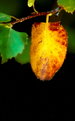
Critique By:
painsama (K:4902)
11/4/2005 4:19:41 AM
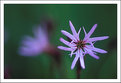
Looking through your portfolio was like taking a stroll in a garden full of very nice pictures. Simple as they are, those pictures are very thoughtful pictures of nature. In this picture, I was very interested in the very beautiful green in the background, like splash of water color. The main subject itself, though with very narrow DoF, enough to reveal the essense of it.
Best regards. Thank you for your comment on my recent picture, and thank you for your very nice portfolio.
|
| Photo By: Lukasz Kuczkowski
(K:14687)
|
|
|
Critique By:
Chelsea Burke (K:5750)
11/1/2005 12:06:58 AM
Nice pleasant portrait, I'm just wanting a bit more "punch" to the lighting, and would elliminate that little brown bit in the upper right corner.
|
| Photo By: Dan Goldberg
(K:0)
|
|
|
Critique By:
Darlene Boucher (K:15739)
10/26/2005 3:27:56 AM
Gorgeous image of the brown pelican Marcus! I love the lighting and the colors are so brilliant! I am always in awe of your bird images, I learn so much from coming here and checking out your exposures (but I can never get them close to what you get!) And these guys are one of my most favorite birds to shoot! We usually get lots of them around january and february just hanging around the numerous bridges we have down near our camp. You would have a ball here in Louisiana, let me know if you're ever in "this area." Darlene
|
| Photo By: Marcus Armani
(K:36599)
|
|
|
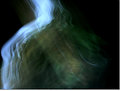
Critique By:
Larry J. Rhodes (K:2441)
10/26/2005 3:28:41 AM
Now this is a moving image, and I don't just mean the motion in the picture. It's touching. I love the mood. It's darkly toned, but not in a menacing or sad way. It's more like a dream, as is the softness of the parts in motion. I like the framing, everything. Great job.
|
| Photo By: Pat Fruen
(K:12076)
|
|
|
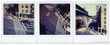
Critique By:
Russ Hewitt (K:1831)
10/26/2005 4:26:19 AM
Everything everyone else has said about the SX-70 colour palette is true. There's a delicate, washed-out quality to it that makes it feel dated, left out on a ledge in the sun and forgotten. Love the angling of the image in the centre and as I look at that particular one I find it fascinating that the cab seems super-saturated while the van on the right is almost completely washed out. That's SX-70 for you. So sad that they're pulling the plug on it but I guess the writing has been on the wall for awhile (especially when Kodak has decided to flush their B&W paper division ). Beautiful triptych my friend, love to see you continuing to post this kind of work.
cheers
Russ
|
| Photo By: Carlheinz Bayer
(K:14220)
|
|
|
Critique By:
Ernie Basciano (K:1940)
10/29/2005 9:14:57 PM
I took a few minutes to take a look at your image. If you use the channels pallet and look at each channel you will find that the spots are visible only in the blue channel. i made a selection which DID NOT include the yellow part of the photo from the centre of the flower (with a 10 pixel feather). I then selected the red channel which had no spots at all and copied the selection. I then went back to the blue channel and pasted it in. This is the result. What do you think?
It is basically the same technique used to get rid of moire in an image. Email me direct (from my profile) and I will send you a link to a great tutorial on this.
Enjoy.
Ernie
|
| Photo By: Caterina Berimballi
(K:27299)
|
|
|
Critique By:
Aram Gharib (K:4656)
10/26/2005 5:21:49 AM
Just a precision, Dear Ina, about the question of "what the subject of A photograph might be" (I meant "in general"): I am in total agree with you and for me the question is never "what the photographer (or the artist in general) WANTED to be the subject of the work" but what actually it is (for me and you the observer). There you'll have to look for relationships and proportions of the visible elements AND, going beyond the frame of the photograph, looking for possible hidden meanings (hidden even to the artist)... Well it can be a long long discussion and I am not a specialist in aesthetic matters.
This was just to say that I do agree with you and am glad that you find these words of some interest.
Cordially yours.
A.
|
| Photo By: Ina Nicolae
(K:44481)
|
|
|
Critique By:
Mirek Towski (K:14880)
10/26/2005 6:09:05 AM
Excellent picture. I like the simplicity, only two colors black and green. Nothing to distract the viewer from the flight of the bird. I have to congratulate You on the composition. You left much more space in front of the bird giving it more room to travel and for the eye of the observer to get ahead.
|
| Photo By: Liz Wallis
(K:26133)
|
|
|
Critique By:
So Cal Photograhper (K:15529)
10/24/2005 3:21:43 AM
I too went to the Long Beach Acquarium, but didn't even come close to capturing an image like this.
Given the light I'm surprised that this image came out as good as it did especially at 1/125th with a flash.
The detail is perfect.
Did you use any kind of filter? I see absolutely no relflection from the tanks that the jelly fish were in.
7+!
|
| Photo By: Snehendu Kar
(K:2427)
|
|
|
Critique By:
Nour El Refai (K:12481)
10/24/2005 3:33:21 AM
it gives a feeling of time and air, two important forces that if we just are aware of their importance, we could be much better, it controls our lives actually, the techniqality of this image is not very important than the idea behind it, once you got the idea, you ignore anything else. images which deliver ideas are far better than the pretty once, i've learned that lately, well done
|
| Photo By: jude .
(K:14625)
|
|
|
Critique By:
david henderson (K:16659)
10/24/2005 5:41:50 AM
taking shots of a person, or yourself, taking pictures seems to draw out the worst in people, it is hard to do and even harder to do well, in my view....now, what you have done here is a lovely job, composition, textures, lighting, you have captured a very engaging image, some may dislike the dark space at the back of the young persons head but it is a matter of opinion, well done indeed. cheers, david.
|
| Photo By: Sergey Datsenko
(K:-1509)
|
|
|
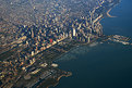
Critique By:
Jürgen Reinold (K:1651)
10/20/2005 6:51:36 AM
Now that is breathtaking, Mark. Wonderful shot. I never seem to be that happy in and out of Chicago. Maybe it has to do with the fact that I always try to have an aisle seat.
So, how do you work with scratched airplane windows? Special post processing or something you do while taking the photo?
Congratulations for this outstanding photo.
Jürgen
|
| Photo By: Mark Mahar
(K:3233)
|
|
|
Critique By:
Colin Cartwright (K:15699)
10/20/2005 8:31:07 AM
Hello, Marie. Sorry, I didn't realise. DOF, means Depth Of Field. In other words how far your focus is, when you are choosing an aperture, (measured in 'f' stops). For example, if you have a large aperture, say 2.8, there is lots of light getting into the lens. This produces a shallow focus, so that only a small area of your subject is in focus. This is good for blurring back and foregrounds, so you emphasize the subject.
If you choose a small aperture, say f8, then the 'pinhole' effect will make all of your picture in focus. This is good in landscapes.
Sorry that wasn't very concise, but to conclude - low number f stops, (F4 or lower)have a shallow focus, and large number f stops, (f8+) keeps everything sharp!
Hope that helps, Marie
Regards
Colin
|
| Photo By: Marie Hopkins
(K:42)
|
|
|
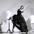
Critique By:
Mirek Towski (K:14880)
10/20/2005 8:31:17 AM
Great setting for this photograph. I like the sparse presence of props and the pose of the model is very interesting, it looks to me as if she is dancing tango all by herself. Very dramatic and pleasing to the eye of the beholder. Congratulations!!!
|
| Photo By: PIERRE THOMAS karkau
(K:2031)
|
|
|
Critique By:
Jason Mckeown (K:22200)
10/16/2005 5:31:15 AM
Fantasic shot the colour have been rendered beautifully, the lighting is perfect, with the spots of light perfectly placed. The perspective and the lines leeds you perfectly though the frame to all the sublects
|
| Photo By: Sergio Leal
(K:1468)
|
|
|
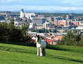
Critique By:
Becky V (K:9699)
10/16/2005 2:58:43 AM
This is a really cool shot . . . I love how there's three elements to the photo: the rural, the urban and the suburban (it's great that the hill slopes away, otherwise the suburban may have remained hidden). I also like how three definitive colours (blue sky, red rooves and green grass) interact to make this unique photo even more bold.
Is the horse tethered? There seems to be a thin rope hanging from its head . . . you could try to clone it out just to remove the (very slight) distraction or make it appear that the horse is roaming free. You may also have been able to get away with irising down one more stop in order to mitigate the sun shining off all the white objects, but overall, I love this intriguing shot.
|
| Photo By: Colin Cartwright
(K:15699)
|
|
|
Critique By:
Ina Nicolae (K:44481)
10/16/2005 3:03:19 AM
Hi Kathy! Wonderful scene, with bright fall colors and a great location I love the winding path covered with leaves and the way the green and red trees blend. Very nice brushstroke treatment, just the right amount, to still be realistic, great job! Well seen and well done! This is a really nice gift! Ina
|
| Photo By: Kathy Hillard
(K:25721)
|
|
|
Critique By:
Neal Nye (K:15827)
10/16/2005 3:09:02 AM
Probably all sorts of interpretations, but I think of you being married to your instrument and your music. In any case, it's a beautiful shot with that little red strip running diagonally across the keys. Very well done.
|
| Photo By: Amy Astolfi
(K:160)
|
|
|
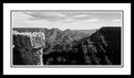
Critique By:
Paul's Photos (K:35235)
10/16/2005 4:32:06 AM
the grand canyon is not as easy to photograph (at least well) as people think... the vastness, differences in lighting, and picking the right perspective is always a challeng.. this shot works well.. it is a different perspective than most canyon captures and using b&w gives it some nice balance with the lighting. Athough I can see that it has some bright spots, you did a nice job with the exposure.. good work
|
| Photo By: 神 風
(K:10665)
|
|
|
Critique By:
Ann Nida (K:45248)
10/16/2005 4:46:08 AM
There are some lovely colours in this image D.A. I think I would like to see a tighter crop without the top sky portion of the image as the brightness is distracting from the lovely warm colours in the trees and I would even crop some off the bottom to remove some of the green. By cropping this image it would centralize the colours being the main subject and draw the eye further to the colours. At least that's just my humble opinion. I love fall colours. Nice capture. Cheers - Ann
|
| Photo By: D W
(K:2560)
|
|
|
Critique By:
Andre Denis (K:66327)
10/13/2005 2:37:35 AM
Hi Mark,
That was a great time back in the late sixties and early seventies for sports car racing. Jim Hall not only drove the Chaparrals but he was a major designer for all but the 001 model.
Most of the shots you were looking at (birdcage maserati chaparral 001) are new images of old cars from the Lime Rock Vintage car festival on Sept. 3/05
They were not scanned from prints. Just uploaded from the digital xd card and worked on in Photoshop. There are some older scanned images that I took in the seventies of other race cars further back in the portfolio. some scanned from the original negative and some from prints.
Andre
|
| Photo By: Mark Longo
(K:12760)
|
|
|
Critique By:
Jan Graziano (K:17920)
10/13/2005 3:19:50 AM
This looks just like the night vision shots I have seen in some movies - same effect. Did the ISO and everything set itself or is there a particular setting required with your night vision equipment? Just wondered if you could have gotten the same effect with a lower ISO which would have made the shot less grainy - or is this the effect achieved with this equipment? New to photography so these are "I'd like to learn" questions. I might have done a tighter crop on the right - yet leaving enough of the black so it still looks as if the flower is reaching out. Jan
|
| Photo By: Drowned Rat
(K:249)
|
|
|
Critique By:
Ann Nida (K:45248)
10/13/2005 3:26:52 AM
Interesting effect although a little too technical for my level. I did get a sunset shot with corn in the foreground and the background was black but I lit using flash from the camera onto the corn. I odn't know if that achieved similar to what you are doing here. If the diffused leaf is the main point of interest here would the leaves perhaps be too distracting from the main subect. Just a thought. I like the effect but would like to see a sharper image. Boy I sure have a lot to say for someone who doesn't understand the technical aspect of your photo. My comments are written with good intent. Cheers - Ann
|
| Photo By: Michael Fox
(K:3180)
|
|
|
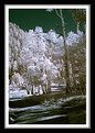
Critique By:
Ann Nida (K:45248)
10/13/2005 3:48:08 AM
I liked the thumbnail when I saw it but when I opened it up to see the larger image I particularly enjoy the sky effect. It appears to be a deep green which works very well against the white trees. I love the tree trunk against that green sky. It almost glows. Very nice photo. A pleasure to view and the frame is beautiful. Would love to know how you did the frame. Cheers - Ann
|
| Photo By: Don Loseke
(K:32503)
|
|
|
Critique By:
Michael Fox (K:3180)
10/8/2005 11:26:46 PM
Ali -- Given my fondness for slow-shutter, in-your-face water shots, I was quickly drawn to this version; however, in my heart I still preferred the other image. I couldn't say why until I had flipped between the two images (repeatedly). The far-side stream bank in this image nearly divides the image in two equal halves. The prior image places the stream bank further away from the middle and, to Kathy's point, introduces a third compositional element: the shallow water in the foreground of the stream bed. I do agree that the little branch in that stream foreground is distracting, but I still prefer that image. As TV icon Homer Simpson may say, "Stupid branch!" Both shots are of superb quality, Ali. Keep shooting!
|
| Photo By: Ali Naghizadeh
(K:19600)
|
|