|
|
Critique By:
iiiii iiiii (K:-283)
9/9/2015 1:59:25 PM
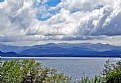
Fabulous view. Having this to look at is a rare treat. How you reduce it to a memorable image is the challenge. First image. I would crop out the closest foreground (the green bushes). Or move your viewpoint to exclude it. Next image. Look at cropping out ALL of the middle and concentrating on only the mountainous background.
|
Photo By: Solmaz Pahlavanzadeh
(K:5141)

|
|
|
Critique By:
iiiii iiiii (K:-283)
9/1/2015 9:52:48 AM
The tonality of the shot is perfect except for the circle at the top. I wish that were not blown out.
|
| Photo By: siamak jafari
(K:20075)
|
|
|
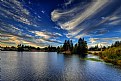
Critique By:
iiiii iiiii (K:-283)
8/28/2015 12:44:09 PM
Wonderful sharpness, marvelous color, striking contrast. I would straighten the horizon and include more of the sky. That is where my eyes want to go.
|
| Photo By: Paul Harrett
(K:791)
|
|
|
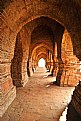
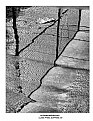
Critique By:
iiiii iiiii (K:-283)
7/13/2015 7:35:58 AM
Love the tonality and the blown out end of the walk.
|
| Photo By: PRADYUT RAY
(K:327)
|
|
|
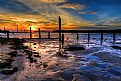
Critique By:
iiiii iiiii (K:-283)
7/2/2015 11:51:18 AM
The texture in the water is what does it for me. Should the exposure be longer and the texture gone, you'd end up with just color changing. Oops! That might be nice, too.
|
| Photo By: Paul Harrett
(K:791)
|
|
|
Critique By:
iiiii iiiii (K:-283)
6/18/2015 8:43:40 PM
Love the limited focus.
|
| Photo By: mike cable
(K:-4301)
|
|
|
Critique By:
iiiii iiiii (K:-283)
5/1/2015 1:36:30 PM
Beautiful reality. Thank you for not overdoing the HDR.
|
| Photo By: Paul Harrett
(K:791)
|
|
|
Critique By:
iiiii iiiii (K:-283)
4/28/2015 4:12:33 PM
I respectfully disagree with Paul and Serge. Highlighting the vehicle feels right. The rest of the road is of lesser import, but stands out very well. Should this be printed to, at least, 20X30 (as it should) the detail in the dark areas would be obvious and appropriate.
|
| Photo By: siamak jafari
(K:20075)
|
|
|
Critique By:
iiiii iiiii (K:-283)
4/2/2015 8:45:20 AM
I appreciate your minimalist use of HDR.
|
| Photo By: Paul Harrett
(K:791)
|
|
|
Critique By:
iiiii iiiii (K:-283)
2/6/2015 8:57:03 AM
I enjoy what your eye sees.
|
| Photo By: Barbara Socor
(K:13559)
|
|
|
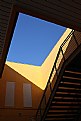
Critique By:
iiiii iiiii (K:-283)
1/28/2015 9:30:29 AM
Love the complementary colors and trapezoidal squares. I'd like a little more shadow detail.
|
| Photo By: pasquale ale angelini
(K:2543)
|
|
|
Critique By:
iiiii iiiii (K:-283)
12/30/2014 9:32:42 PM
Love the minimal colors. They dominate.
|
| Photo By: Barbara Socor
(K:13559)
|
|
|
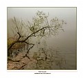
Critique By:
iiiii iiiii (K:-283)
12/12/2014 3:38:14 PM
It appears to me that a post processing effect to add 2 bands of out of focus was used. Don't. In a shot like this, everything should be in focus.
|
| Photo By: siamak jafari
(K:20075)
|
|
|
Critique By:
iiiii iiiii (K:-283)
12/8/2014 2:16:26 PM
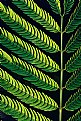
The lines and the texture are impressive,
|
| Photo By: Piero Falciani
(K:279)
|
|
|
Critique By:
iiiii iiiii (K:-283)
11/24/2014 8:41:08 PM
I like your work.
|
| Photo By: Barbara Socor
(K:13559)
|
|
|
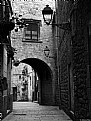
Critique By:
iiiii iiiii (K:-283)
10/13/2014 9:05:12 AM
Love the place and the tonality and the texture.
|
| Photo By: Alfons Rial
(K:7600)
|
|
|
Critique By:
iiiii iiiii (K:-283)
9/6/2014 6:42:42 PM
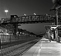
I don't know how to take your picture from here to my computer, change it, and put it back for you to see. I am suggesting to crop out the trees and pole and boost the contrast.
|
| Photo By: Libby Murray
(K:516)
|
|
|
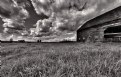
Critique By:
iiiii iiiii (K:-283)
8/12/2014 8:28:06 PM
You seem to be blessed with being around such fabulous places. Try losing the lower green, darken, and boost contrast.
|
| Photo By: Salvador María Lozada
(K:69375)
|
|
|
Critique By:
iiiii iiiii (K:-283)
8/12/2014 8:24:24 PM
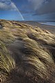
Love the sun touched individual weeds in the lower right. Would like to see more of the two 'light paths' from the center to the left.
|
| Photo By: Paul Harrett
(K:791)
|
|
|
Critique By:
iiiii iiiii (K:-283)
8/12/2014 8:19:00 PM
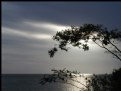
Like all the clouds. I would boost the contrast and lose the attachment to Earth.
|
| Photo By: Libby Murray
(K:516)
|
|
|
Critique By:
iiiii iiiii (K:-283)
8/12/2014 8:05:38 PM
Interesting. Try putting the horizon on a third.
|
| Photo By: Marcos R Fernandes
(K:3630)
|
|
|
Critique By:
iiiii iiiii (K:-283)
8/5/2014 7:06:49 PM
The BEST tonal range I've seen.
|
| Photo By: Steve Kompier
(K:4629)
|
|
|
Critique By:
iiiii iiiii (K:-283)
7/13/2014 12:50:15 PM
Thanks for showing your exposure info, Bones.
|
| Photo By: George Oeser
(K:934)
|
|
|
Critique By:
iiiii iiiii (K:-283)
7/3/2014 6:16:17 PM
This is very nice! Lighting and framing.
|
| Photo By: mike cable
(K:-4301)
|
|
|
Critique By:
iiiii iiiii (K:-283)
6/19/2014 6:17:58 PM
Thank you for recording your camera's particulars.
|
| Photo By: JP Spicer-Escalante
(K:3831)
|
|
|
Critique By:
iiiii iiiii (K:-283)
2/25/2014 7:04:21 PM
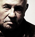
My initial thought was that I wanted to see his eyes. Then I saw the original. Now I like the black and white better. Powerful portrait!
|
| Photo By: mohamed sobhy
(K:2186)
|
|
|
Critique By:
iiiii iiiii (K:-283)
2/24/2014 9:08:14 AM
It has a nice feel.
|
| Photo By: Derek Hansen
(K:24)
|
|
|
Critique By:
iiiii iiiii (K:-283)
9/24/2012 10:03:45 PM
Marvelous lighting.
|
| Photo By: Armando Giambolini
(K:17779)
|
|
|
Critique By:
iiiii iiiii (K:-283)
9/2/2012 3:19:25 AM
Very nice. Crisp and clean.
|
| Photo By: Brian Steele
(K:620)
|
|
|
Critique By:
iiiii iiiii (K:-283)
8/15/2012 9:41:56 PM
I think the main flower needs to stand out more by itself. The rest of the background obscures that. Additionally, the plane of focus doesn't include each petal.
|
| Photo By: Wayne Harridge
(K:18292)
|
|