|
|
Critique By:
Kelly Duntley (K:13889)

7/2/2014 3:11:01 PM
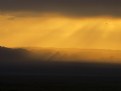
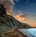
Nice journalistic photo.Great capture of the fire, with the smoke spreading out in to the sky. Makes one feel hopeless to see it. The newspaper needs to see you for this story and pictogram with the fire fighters.
|
| Photo By: a. Scarabeo
(K:16333)
|
|
|
Critique By:
Nigel Watts. (K:5251)
5/14/2014 2:11:06 PM
I like, interesting colours and light
The layers into the distance, very nice, a dream
I'm not to sure about the upper right, it's, I can't think of the correct words. Or is it something I have no idea about, is it natural, a cloud. I do not know.
Great photograph (I like)
Nigel
|
| Photo By: siamak jafari
(K:20075)
|
|
|
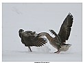
Critique By:
Roberto Arcari Farinetti (K:209486)
5/14/2014 3:37:20 AM
wooow another great shot and perfect timing...
I have never tried to make these shots, it certainly is difficult.
perhaps it is slightly underexposed, but I think even the cloudy day was hard!
all the best
roby
7
|
| Photo By: Vladimir Meshkov
(K:749)
|
|
|
Critique By:
Doyle D. Chastain (K:101119)
8/25/2006 2:35:12 AM
Hmmmmmmm ". . . test upload" according to the about section. That calls for a "Test Critique"!

The lighting in this image has been done very well and I especially like the diffuse nature of it and the fact that it gradually descends into a darker, almost vignette style corner shadow. The shadowy area behind the object offers a pleasing mix of shadow and reflection . . . with the tonal range coming through with almost textbook variation - The cherrywood(?) is nicely saturated with an appropriate amount of color and the reflections in the hour glass give virtually no distracting views that would cause a viewer's eyes to be distracted from the overall composition. The brass accents and sand balance the range of light values and the minimal composition seems to be just about perfect with a pleasing touch of balance by the off-centered object and a higher and leftward shadow to off-set the alternate interest points along with the "rule" of thirds guidelines.
Since this IS a CC image I should point out that (IMHO) the white signature line in the lower left is really not good for this image . . . it's . . . you know, . . . a tad distracting. I would (were it mine) prefer to see it almost melt into the BG and likely make it a tad smaller as well.
Overall though . . . Nicely Done . . . !
"Test Critically" Yours,
Regards,
Doyle I <~~~~~
|
| Photo By: Phillip Cohen
(K:10561)
|
|
|
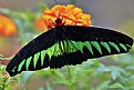
Critique By:
Riny Koopman (K:102911)
4/19/2014 10:09:50 AM
Hi Jose when I see a close like this one which atract me a lot!
This is a wonderful image here, well balanced by all means, the butterfly in its original colors and with enough details, the back ground do make the Necessary Separation allowing your subject to atract the viewers.
Thank you my friend for sharing it with us and Wishing you all of the best.
Keep up the good work.
|
| Photo By: a. Scarabeo
(K:16333)
|
|
|
Critique By:
Nigel Watts. (K:5251)
4/9/2014 4:31:32 AM
Interesting photograph, maybe if you were passing there one day,again. It looks similar to a human head(thumbnail-view), it's missing the nose and mouth. The correct piece of cardboard(or object) at the correct angle, would create (an addition shadow) to the upper shadow of the circle,(but then again it already has a face). The face looking into the shadow of the forest (maybe it's the incorrect spelling of the word Forest, trapped(in imprisoned) in their own mind). I guess portrait view(not landscape view). I guess it's already a person(the shadow), all shadows disappear from view. layered blocks.......... it's just an idea :)
Great photograph(so 7+)
Nigel:)
|
| Photo By: Kamran Bakhtiari
(K:24054)
|
|
|
Critique By:
Olga-Eva Krajciova (K:19240)
11/24/2007 9:45:31 PM
looks like from a fairy tale drawn by night
seems so soft and a bit unreal, like a picture that has never been paited by any painter or other human being
so great in its simple beauty
regards
Olga
|
| Photo By: Chelsea Burke
(K:5750)
|
|
|
Critique By:
Roberto Arcari Farinetti (K:209486)
4/6/2014 1:58:42 PM
hello gregory
when i see his one my words was "Oh My God...."
your country is so far away from my country, but this one, this mountain are so equal a those that we have in Valtellina land... above alps !
..
this is the example that our great mother earth was fantastic, she has created everything slowly, and everywhere in the same way.
it's really a shame that human beings have the arrogance to want control over nature !
now i search my photo... best wishes!
roby
ps: a relly nice crispy panoramic land...
bravo!
7
|
| Photo By: Gregory McLemore
(K:35129)
|
|
|
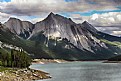
Critique By:
Roberto Arcari Farinetti (K:209486)
3/31/2014 12:41:36 PM
venice is always a very powerful image, like also the "calle", this one in a very nice idea from sea pov in "canal grande" !
congrats for the BIP,... your panorama cut choice increase the power of this image!
ciao
roby
|
| Photo By: Phillip Minnis
(K:13131)
|
|
|
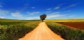
Critique By:
Steve Miller (K:236)
3/19/2014 4:05:45 PM
This image is not just rich in color, contrasts and in its simplicity as others have mentioned, but the caption in my opinion actually enhances the total impact of the photo itself. It shows how a well thought out photo with a near perfect caption, Road to Nowhere, can make a dramatic statement. I can see this photo with caption as a greeting card in which parents for example, can give to their high school children with the not so subtle message "Get a great education or you may risk going down a 'Road to Nowhere'. Ok, for some that message would be overly dramatic, but the main point being that a good or great photo with a GREAT caption can make for a powerful message!
|
| Photo By: Phillip Minnis
(K:13131)
|
|
|
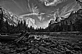
Critique By:
Breda Kroselj (K:7121)
3/16/2014 1:51:48 AM
Fascinating nature scene with great quality of B&W tones, splendid details, textures and contrast, great cloudy sky and superb perspective, terrific done, regards.
Cogratulation for well deserved awards!
|
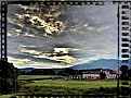
| Photo By: Gregory McLemore
(K:35129)
|
|
|
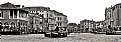
Critique By:
Mary Brown (K:71879)
3/10/2014 5:01:30 PM
Those are very dramatic clouds. They are both foreboding and appealing at the same time. The gray tone of the buildings nicely mirror the gray clouds. This is a dramatic scene. Well taken and presented.
|
| Photo By: Roberto Arcari Farinetti
(K:209486)
|
|
|
Critique By:
Breda Kroselj (K:7121)
3/9/2014 9:57:37 PM
Splendid perspective and view, great shape of the rocks, beautiful colors with excellent light and used shadow, horse riders add to image an special bonus, fascinating scene and impression, regards.
Congratulation for well deserved award!
|
| Photo By: parehan .K
(K:27453)
|
|
|
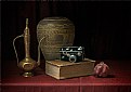
Critique By:
stingRay pt.4 . (K:250410)
2/24/2014 5:11:08 AM
CONGRATULATIONS on this well deserved award Ali. An excellent still life study thoughtfully composed with each item an antiquity posed alongside a fresh pomegranate which in itself is well established 'ancient' fruit. The theme is great, the detailing perfect and the tones superbly accurate. Very best wishes.
|
| Photo By: Ali Alkatib
(K:2684)
|
|
|
Critique By:
Tommaso Di Falco (K:23819)
2/2/2014 11:05:26 AM
You have well chosen all and the result is a masterpiece.
I like warm tones.
At firt glance I thought perhaps red apple was better but then your choice of yellow apple break the overall.
SC well deserved.
|
| Photo By: Adam Orzechowski
(K:2974)
|
|
|
Critique By:
Mary Brown (K:71879)
2/9/2014 8:51:16 PM
I really love the new techniques you are using to so beautifully display your flowers.
In this one, the bloom glows while it is so well complimented by the rich, velvety background.
Two more well deserved Awards.
|
| Photo By: Bill Voizin
(K:78)
|
|
|
Critique By:
Bradley Prue (K:30678)
1/26/2014 6:20:16 AM
Deliscious... as usual. Your vision may be considered "dark", as I have detected by comments on many of your photo's, but I consider it "rich". You have a wonderful talent for bringing "the way that you see things" to fruition. I appreciate your previous explanation to me about your post-processing. I agree that you are using tools (like any other artist) to create your vision. Your work is amazing.
|
| Photo By: James Crotty
(K:2083)
|
|
|
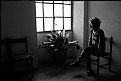
Critique By:
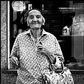
Carol Cefalu (K:8388)
4/11/2010 9:33:53 AM
I love the style...I would like ot maybe see a tad more of her face but i understand sometimes less is more mysterious. It just seeems in this setting we should see her facial expression more as shes looking out the window.
Just that one darn curl :>
Beautiful still and makes me wonder what shes might be contemplating :>
|
| Photo By: Rocco T
(K:4130)
|
|
|
Critique By:
James Crotty (K:2083)
4/9/2010 10:44:21 PM
Hi Margaret! or may I call you Maggs? Your work reminds me of someone I know! This is a beautiful image, great colour and subject matter. I particularly like your treatment of the image with your emphasis on this lovely painterly quality that you have achieved, almost like one of the great 'masters' of seascapes. I would love to have had a hand in something like this! Keep up the great work. 7+++++ Regards......JIM
|
| Photo By: margaret waters
(K:432)
|
|
|
Critique By:
Roberto Arcari Farinetti (K:209486)
3/27/2010 9:36:22 AM
woowww, hello..
is really a very good composition, with the cliff down to the sea ..
well-saturated colors and clear and very balanced composition on the third make a good picture.
personally I imagine even with a longer exposure time, so the sea would be more smooth and homogeneous.
the result of a more relaxing picture.. (IMHO)
all the ebst and see you later
roby
|
| Photo By: Igumnov Viktor
(K:853)
|
|
|
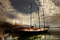
Critique By:
Avi (K:70138)
12/3/2009 5:59:50 AM
See, THAT is a great photo. for a second it makes the viewer think that the man is tugging the boat.. but then, when he looks more carefully, he says.. naaaah...
For me, a successful photograph is often one which has this element of surprise in it. THAT factor makes it linger in my mind. That, plus the fact that the title does not attempt to draw any unnecessary attention.
Superb work !!
|
| Photo By: K r i s h n e n d u - The NoOne
(K:12059)
|
|
|
Critique By:
Joe Johnson (K:8529)
6/26/2009 2:55:58 AM
As CC, I'd say good expression, and she overwhelms any background - because her posture and expression are interesting. She's demanding attention. Still there's a lot there and maybe a crop would isolate things better. It's a classic 'A-frame' composition.
|
| Photo By: Pablo Dylan
(K:63918)
|
|
|
Critique By:
stingRay pt.4 . (K:250410)
6/25/2009 8:36:29 AM
Another beautiful portrait study of the lovely little Ebru my dear Aylin. I love the boldness of the crop/composition and the use of her tiny shoulder and arm with wisps of hair to frame her pretty little face. Gorgeous skin tones, excellent details and the gaze from her eyes would melt the strongest heart. Well done to you sweetie, another great shot. A great big HUUUUUUUUUG for you, a little squeeze for Ebru (for being a wonderful model) and as always my very best wishes to you all.......Uncle Ray
|
| Photo By: Aylin ATASAGUN
(K:13273)
|
|
|
Critique By:
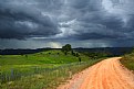
Anindya Chakraborty (K:12765)
6/5/2009 3:18:22 AM
The clouds look ominous and the road takes viewer into the middle of the whole scene. you have done good pp to bring out the detail of the clouds. A very picturesque shot with great light....a very good picture indeed.
|
| Photo By: Phillip Minnis
(K:13131)
|
|
|
Critique By:
stingRay pt.4 . (K:250410)
6/12/2009 8:52:53 AM
This is such a beautiful creative intimate portrait study Kes. The finished composure/crop is bold and tight exposing just enough of the bride and her emotions. The mono tones are master class and the delicate soft focus is superb. Very well done to you my friend.
I know you probably have your reasons but I do wish we could get to see more of you here on dear old UF. Great to see your name when it appears. Hope you and your family are all well. My very best wishes to you as always.........Ray
|
| Photo By: Nelson Moore [Kes] -
(K:20241)
|
|
|
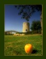
Critique By:
Anthony Lound (K:6661)
6/12/2009 7:33:13 AM
This is one of those fascinating, almost surreal, images which causes one's eye to explore, and to be confused as to the artist's intention. The focus is ambiguous. Yet, it's so beautifully-executed, one's eye flits between the apple and the crenelated tower in search of context and meaning.
One small idea: the tree trunk at right might be lost, since the eye wanders to it uselessly.
Bravo Rashed.
Anthony
|
| Photo By: Rashed Abdulla
(K:163889)
|
|
|
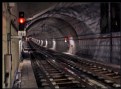
Critique By:
Olga-Eva Krajciova (K:19240)
6/12/2009 10:58:23 AM
For today my number one! I love the way how the whole image is composed, I like the real feeling and how documentary image it is. There is a sort of motion captured as well, and the train coming to the station bring s a bit of danger, mostly when I imagine how fast these trains usually drive. The red light on the left is a warning - this can be undesrtand in an easy way - just don´t step to the railways and do not drive, the train is coming...or maybe it brings also some other sort of message - which gives to the image many different sences. The whole image can seem seimple but so creative as well.
best wishes
Olga
|
| Photo By: Nuno Milheiro
(K:453)
|
|
|
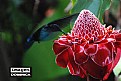
Critique By:
Anindya Chakraborty (K:12765)
6/4/2009 5:51:29 AM
Excellent color and capture....at first glance I could not see the hummingbird but then saw the beautiful little bird collection honey from the flower. Wish the right side of the flower was not cut, it would have enhanced the image even more. Beautiful.
|
| Photo By: Arun Madisetti
(K:1148)
|
|
|
Critique By:
Anindya Chakraborty (K:12765)
6/4/2009 6:07:17 AM
Interesting pp in this one, certainly make the image look surreal. The tones are beautiful, too and the softness really adds to drama depicted in the whole image. I like the tree in the center giving strong point in the image.
|
| Photo By: luis pereira
(K:26013)
|
|
|
Critique By:
Petal Wijnen (K:50989)
6/4/2009 7:49:13 AM
Fine architectural shot!!! Great in B&W, wonderful tones. Excellent POV/composition... the way you took this shot... at first glance the dome looks like a cone sticking out instead of going in... well done!!!
|
| Photo By: Martijn Leensen
(K:-421)
|
|