|
|
Critique By:
Billy Bloggs (K:51043)

4/23/2007 5:42:38 PM
Re Luis's comment. Different horses for different courses. It's enough for me. I like minimalist style and here the kerb heading out of the corner balances the composition. The round and square manholes complement the curve and the stained roadway stops the image looking too pristine. I can imagine some story here. The only downside for me is the white spot on the grass, I'd clone that one out.
Regards, Gary
|
| Photo By: Anna Leminski
(K:283)
|
|
|
Critique By:
Joe Brown (K:23213)
4/19/2007 10:29:31 PM
In my opinion, this shot has the potential to be a really great image except for two things. First, I feel the vapour trail really distracts from the natural beauty of the shot. Second the sail boat is two centrally placed. I would be more pleasing for the boat to be at the right hand side, one third point, nearer the sun. I realize that both of those things were beyond your control at the time you captured the image. My version would look something like this. Best regards,
Joe
|
| Photo By: Alberto Romano
(K:2407)
|
|
|
Critique By:
Devon Chastain (K:319)
4/10/2007 3:08:32 AM
Well, son or not I must give my honest opinion. Personally, I'm really interested in the light, (Well, duh it's the image title) Haha, but the way it looks like a cracked orb shimmering white light everywhere is great, although I'm not too sure about the chimes around it. I'm totally new with photos and all that, so my opinion really means close to nothing, but to me, the chimes aren't too fascinating because the red light on each of the chimes are in no connection, to the light... really saying it just doesn't match. I'm not sure if it was supposed to or not but just giving my opinion, but again, I'm new at this stuff have to start from somewhere right? Overall it's a good picture because light is what I'm focused on, and like the image title states, "Marny's Magic Light" the photo I would assume is related to the light and not the chimes. Haha.
|
| Photo By: Doyle D. Chastain
(K:101119)
|
|
|
Critique By:
SRS SRS (K:6731)
4/10/2007 8:26:43 AM
I love the location for this, great choice. Great picture! The only thing I wish were different is the one white rectangle of light in the distance at the side of her face, a lil' distracting, but overall the picture is so well done that it isn't much of a problem. I like your other portrait too. Welcome to UF. Am so looking forward to what's next!
|
| Photo By: joanne spyridakos
(K:-197)
|
|
|
Critique By:
C.A. Mikulice (K:13300)
4/5/2007 3:18:59 PM
I love this. It is well composed and has an excellent exposure. It does have the look, perhaps, of being, perhaps, as Visar says, oversharpened, but that actually makes it look almost like a painting. I am not sure I can describe it correctly, it has a feel to it that is hard for me to pin down (although if I babble long enough I might impart some rational critique). 'Nuf said. I like it. 7+.
christine
|
| Photo By: Fernando Machado
(K:491)
|
|
|
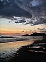
Critique By:
Andre Denis (K:66327)
4/3/2007 12:39:37 AM
Hi Andrzej,
I really like what you did with this one. I'm not sure if it was intentional, but the way you have the surf boards mostly in the dark seems like a good thing in this image. The reason being that they are a part of the image without being a distraction. The image tells the story of the boards down and retired for the night. And what a night!!! You must have had a great time there!
Another good little part of this image is the lone set of footprints in the sand. I feel I don't even have to comment on the beautiful clouds and sunset. That is just so obviously right.
This is a very nice image Andrzej, great job!
Andre
|
| Photo By: Andrzej Pradzynski
(K:22541)
|
|
|
Critique By:
Bhabesh Chakrabarti (K:11394)
4/3/2007 2:12:59 AM
Wonderful sils of the windmill against a very colorful yet calm sunset. This could even be fit in the minimalism project and look how even a minimalist approach can make a composition with brilliant mood of calmness. Tha standstill of the windmill speaks for a feeling of quiteness, so is the wonderful gradient of color at the BG. I want to think time stands here, as still as it can be...
Best regards,
Bhabesh
|
| Photo By: Jeroen Wenting
(K:25317)
|
|
|
Critique By:
Gayle's Eclectic Photos (K:91109)
3/28/2007 2:23:34 AM
hi, i would crop down a bit from the top because i find that "V" shaped bright shape of light glaring and distracting...otherwise you did good work here...a beautiful DOF,pretty BG color which makes the dark bird stand out well...good timing,clarity and contrast of colors
regards,gayle
|
| Photo By: Andrzej B.
(K:2244)
|
|
|
Critique By:
Francisco N-G (K:28728)
3/27/2007 11:26:20 PM
Lovely portrait, beautiful model in a very expressive pose; I like the tension on her right hand, however, her expression is not convincing of the action. The background is quite delightful and, in my opinion, it goes well with the complexion and outfit of the model. I like her hair, a bit wild and heavily lit, it adds to the expressive qualities of the artwork. Another concern is that some shadows are too harsh on her face, which would look so soft and beautiful with more even illumination.
That's just me, I'm sure that other more erudite opinions from the lighting experts from UF may think differently.
Best regards and congratulations for a beautiful image.
Francisco
|
| Photo By: Lukasz Rzepinski (Łukasz Rzepiński)
(K:1211)
|
|
|
Critique By:
G G (K:61359)
3/26/2007 5:30:40 PM
This is a nice portrait but something attracts the eye. By searching what, I find the fact that there is a lot details on the nose, but this gives rise due to the aperture used, to a DOF on the right eye leading to a blurry effect. Anyway this is a nice shot regarding the eye you captured, and the way you managed the light and you framed it.
This is a nice work Paolo.
Congrats
|
| Photo By: Paolo Corradini
(K:59552)
|
|
|
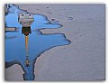
Critique By:
Jan Hoffman (K:39467)
3/26/2007 12:38:06 PM
Doyle -- Actually I think the razor-thin DOF and the smooth, soft representation of the seeds works well for this abstract-like photo. I would never have thought of the composition the way you did and full lower third with the blurred 2/3 background actually works. I think I would not have ventured there but bingo! It works.
Have fun fumbling and thinking four or five times before finding and getting the settings right. A new camera will do that to you; menus, buttons, physical placement... they are never the same. Each new camera is created as an improvement and it drives us nuts as we get into the head and mind of the designer.
Enjoy; I think you should be pleased with the results so far.
--Best regards, Jan
|
| Photo By: Doyle D. Chastain
(K:101119)
|
|
|
Critique By:
Joggie van Staden (K:41700)
3/25/2007 4:04:14 PM
Hilton, the saturated colours due to the wetness and low cloud conditions is great. Your composition works very well, creating a mosaic of blocks of contrasting colour. The slight halo around the tree trunk is most probably due to a bit aggressive use of the shadow/highlight feature in PS (playing a bit with the radius setting helps to limit the effect). My main critique is the softness of the tree trunk, where imo it should be pinsharp. ( I use Neat Image for sharpening - free on the internet and more subtle and better than PS imo). Great work!
Joggie
|
| Photo By: hdw Photography
(K:6630)
|
|
|
Critique By:
Francisco N-G (K:28728)
3/25/2007 5:04:26 AM
I love your version of this tender Aphrodite, emerging from rolling waves of sugar. Little blond, delicate and soft, joins, timidly this world of unsightly "Raw Materials".
Another magical view that could only be conceived in the fertile grounds of your creative mind, twisting your models into colourful quilts of surreal combinations. Your work has the power of transporting me into dimensions of Cheshire Cat and the Queen of Hearts.
Great use of your macro lens, the sharpness of the flower and the sugar is superb, as it is the white balance and exposure. The very directional lightning enhances, imho, the 3D qualities of the sugary sea. It seems that you used a good aperture to avoid a drastic shift of your DOF, great idea because the horizon has been diffused just enough to give a sense of depth.
Well done mi alma.
Francisco
|
| Photo By: Radmila Gorjanovic
(K:3113)
|
|
|
Critique By:
Lydia Nel (K:3579)
3/23/2007 1:40:25 PM
I agree with Hugo de Wolf - this capture deserves a comment, but I don't know how to approach it.
It definitely screems artist! I find it intriguing, but wish there were something more in the negative space, even if only a few small splashes... Placing the reflection in the middle of the image would not solve the problem, I realize that, but something...
Nevertheless, it's a great find - so well executed.
|
| Photo By: Saeed Al Shamsi
(K:47735)
|
|
|
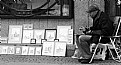
Critique By:
Nick Karagiaouroglou (K:127263)
3/22/2007 3:03:15 PM
Great! I am a fan of low key and of rusty brownish colors, so I can't speak completely unbiased about this one, but I do think that this is a special study! The perspective and the countless hidden details make it to a journey of visual discovery!
The person at the left... a bit too weak as a main character, as it remains in the shadow - I think that a more prominent light would have enhanced the atmosphere of the question that seems to evolve out of this image: Who are you?
On the other hand, even without the person, this one would be still a superb study of that rusty machinery that surrounds us. The coloring alone is simply remarkable!
Between the two possibilities, I think I would choose the first one - the person in the middle of... yes, in the middle of what? An undefinable world that seems to exist only for the purpose of being there! Definitely a fotogenic subject, but not in the usual "beautiful" way ;-)
Best wishes and keep it up!
Nick
|
| Photo By: Erin Kelley
(K:1603)
|
|
|
Critique By:
Nick Karagiaouroglou (K:127263)
3/22/2007 3:54:11 PM
A great moment to capture, though some corrections of EV might be appliable to make the overxposed paintings better visible. Still, it is the dedication on the face of the artist that counts most here! Fully discoupled from the real, only there for his paintings - a very intense similarity to the photographer that captures the world through the visual stimulation of the view finder. Some small composition problems (imperfect finishing at the left edge) are way not as important as the perceived seriousness of his expression. A very dedicated study!
Nick
|
| Photo By: G G
(K:61359)
|
|
|
Critique By:
Doyle D. Chastain (K:101119)
3/22/2007 10:37:18 PM
Lana:
Just a couple of things come to mind on this shot. The black on black title leads me to point out that this has a blue hue throughout . . . not really black. True desaturation . . . or true B&W might add drama to the shot. Certainly work on the DOF mentioned as it will force the eye of the viewer to the subject. I have attached a very fleeting, quickly worked example for your consideration. In the example, I did an ersatz DOF adjustment which shows how the eye can be forced. This DOF adjustment CAN be done in camera by adjusting the aperture setting . . . using the shutter speed afterward to control exposure as needed. The light levels were also off a tad . . .
It's a good shot . . . and all I'm saying is that it COULD be better. While you'd like to get it all right in the camera . . . It is a rare photog that uses NO editing, since light levels and minor adjustments can dramatically increase the dynamics is virtually all shots. I sincerely doubt a prefessional or even good amateur exists who does not use something. Some things that can help are available free online.
This was a great idea and a challenging shoot which you did very well on. Keep in mind the rule of thirds and keep your focal point OUT of the center.
Nicely done.
Regards,
Doyle I <~~~~~
|
| Photo By: Lana M
(K:811)
|
|
|
Critique By:
Albert Jacobs (K:9527)
3/21/2007 9:33:35 PM
Hi Eb,
Fabulous dreamy view with excellent colours all fit in a wonderfull composition. Perfect tribute to the Spring feeling.
Your use of DOF adds a lot and brings this soft dreamy atmosphere. This goes well together with these fresh bright colours, simply a splendid image. I really enjoyed looking at your beautiful floral expressions. Great work, I will return to see more of your nice attractive portfolio. Thanks for sharing and compliments !
Wish you many more of these wonderfull shots, when "painting with the light".
Friendly greetz,
Albert Jacobs  :) :)
|
| Photo By: Eb Mueller
(K:24960)
|
|
|
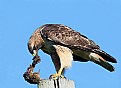
Critique By:
Dr. Rafael Springmann (K:89517)
3/18/2007 2:06:31 PM
This is marvelous, John. I always wonder how birds let you come that close, or is it your being fast on the draw? Whenever I try to point, even with a 300mm lens, the tiny bandits are long gone. very good focus & lighting.
Happy to see you too & thank you so much for your kind comment.
Rafi
By the way, I don't mind the left coloumn. I think it harmonizes the composition.
|
| Photo By: John Loreaux
(K:86210)
|
|
|
Critique By:
Leonie Fitzpatrick (K:40551)
3/1/2007 10:54:54 PM
Offensive!!!...
... Wonderful work Marcus... We marvel at there beauty and power... We see them circling high, we see them dive but rarely do we get to see them eat... :)
Excellent work again Sir...:)
Onie...
|
| Photo By: Marcus Armani
(K:36599)
|
|
|
Critique By:
Audrey Reid (K:5872)
2/22/2007 7:25:05 PM
Hello Becky,
Compositionally this is text book perfect, hard for anyone to find fault. This is a scene one has come to expect of beautiful BC (and Alberta - I was once ticked off for not mentioning Alberta!).
Since this is 'suppose to be' a critique site.....while the mid/upper half of the picture is perfectly exposed, I find the near half slightly too dark.
One of these days, I'll need to find out from you where all these pretty places are in and around Vancouver :)
|
| Photo By: Becky V
(K:9699)
|
|
|
Critique By:
Tim Schumm (K:29196)
2/27/2007 5:41:02 AM
I hope you don't mind but I find that there is so much sky and foreground in this composition to my eye that the elements of your photo do not help my eye focus on what I would suggest is the main interest of this image. So if I could be so bold as to crop top and bottom to help direct the eye more forcefully towards the mountain top without letting my eye vacillate with parts of the image that are not needed and dilute the potential power of this shot. This is just my opinion and you may not agree, but I thought I would put my 2 cents worth in anyway.
Cheers, Tim
|
| Photo By: Eb Mueller
(K:24960)
|
|
|
Critique By:
Olga-Eva Krajciova (K:19240)
2/12/2007 8:48:39 PM
Paolo, wonderful work. I love many small points about this images. Like for example the fact all of them have covered their heads. (Maybe because I love to cover mine as well :)) Each of the used a way how to cover it in a "symphony" with his roots, nationality r just a life style. Each ot them is typical.
Maybe it is just my feeling, but there are some similarities in their faces and way how they look..how they look on a world around. Like the lady on the picture in the middle...she has really the same "look" like a girl in upper right picture. Or the man in a middle down picture has the same (bit sad) look as the lady on the picture on the right from him. They both look down. And why did only one woman gave you her look? Why just she looked into your camera? Why do people smile less as they used to?
Such tone, such atmosphere...as only such peson as you is able to give to pictures.
Many hugs for you Paolo, once again you gave me many reasons to think and many reasons to look around more carefully.
Bacio
|
| Photo By: Paolo Corradini
(K:59552)
|
|
|
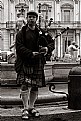
Critique By:
Annemette Rosenborg Eriksen (K:55244)
1/26/2007 10:32:20 AM
Ah yes- I´ve always been crazy about sackpipemusic for some reason:-) Also men in kilts are just so handsome and masculine.
Thanks for posting this and bringing good vibes:)
I would have liked seing it in colours though because of the different patterns and clancolours on the kilts.
Best wishes
Annemette
|
| Photo By: Gianes Ma
(K:26069)
|
|
|
Critique By:
Annemette Rosenborg Eriksen (K:55244)
1/26/2007 10:51:14 AM
Dear Konstantin
This is a great narrative and documentary shot full of atmosphere. Interesting aboutsection. Incredible that this dog lives on so well - maybe because his other senses are increased.
I read that dogs can scent cancer at all stages in a human and much better than any technique. Any domestic dog can learn this within five weeks - amazing.
Had this dog been a sleddog I would have thought this was from Greenland with the sweet girls looking a bit like the inuit.
Take care
Annemette
|
| Photo By: Konstantin Yudintsev
(K:3253)
|
|
|
Critique By:
Leonie Fitzpatrick (K:40551)
1/26/2007 11:44:24 AM
What can I say that hasn't already been said Riny... :)
Wonderful soft light... On my screen a soft gentle lavender tone... Not sure but it is absolutely beautiful... The barn and your placement in the frame, excellent... :)
A winter scene which is indeed Perfection Riny...:)
Onie...
|
| Photo By: Riny Koopman
(K:102911)
|
|
|
Critique By:
p e t a . (K:18700)
1/11/2007 1:14:05 AM
Wow, one of the best b&w landscapes I've seen! Love how all lines lead us to that wonderous mountain line in the valley. There are two strong moods - the cold wet boat in the shadows contrasting with the sunny warmth in the distant mountains. Brilliant. Look forward to seeing more!
|
| Photo By: maciek duczynski
(K:129)
|
|
|
Critique By:
AJ Miller (K:49168)
1/8/2007 9:45:28 AM
This works so well, with the colours against the background. And I like the way the snow seems to fade into the UF background. This is a marvellous image which must have involved a major stitching effort.
AJ
|
| Photo By: Valerij Reznikov
(K:3367)
|
|
|
Critique By:
Abolfazl Erfani (K:7431)
1/8/2007 10:17:44 AM
Bravo dear Louise! Really nice portrait, superb images captured of very beautiful girl. The technically and idea is amazing .focus is best and minimal DOF is great, sharpness and color tones is well done. Her color skin is really great and nice. Crop is very well. Details is very good clear. Framing is very good match with her pose. I like her look to the camera, her look very good contact with viewer.
Thanks for sharing
Warm Regards,
I'm "Abolfazl Erfani"

|
| Photo By: Louise Vessey
(K:13862)
|
|
|
Critique By:
Gary Dyck (K:12834)
1/8/2007 9:57:26 AM
Very nice, Janet. I think i agree with Saintz about having a tad more sharpness in the foreground... but then this is probably more like what ones eye would see. Nice low angled perspective and composition... almost feel like I'm lyin' on the beach here! Cheers, Gary
|
| Photo By: Janet Marie ;-)
(K:-2076)
|
|