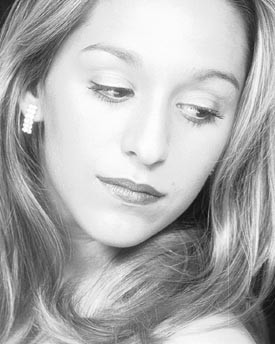
I agree with Arthur moýstly about the croppwing and the contrast.its a lovely portrait indeed and expression of the model and softness of the photo fits so well.I d also like to see it bigger on the screen dear Karen, regards bahadir
The softness works with most portraits, in my humble opinion, and I don't think this one should be any sharper...it works as is.
I would, however, like to see a little more contrast. The image seems a bit flat to me. If you are using Photoshop, a little "S" bend using the curves tool would help this image a lot. The bend does not have to be drastic, just enough to add a bit more contrast in the important tonal range.
I also like the crop as is. I think if you try to crop out the negative space as Barry suggests, you will lose too much of the nice composition of this image. The negative space, in my opinion, does not detract enough to crop even tighter.
Of course, everyone has an opinion, and this is just mine. Take it for what it's worth, but you be the final judge.
I would like to see more work like this from you. Keep 'em coming!
I really like this. The curves of her hair, the glance to the side, slight smile starting - nice cimposition, nice moment. Would this be a 'high key' portrait? Either way, I think it's great.....
This seems a little soft (perhaps the scan). If it were me, I'd crop the black in the top left corner and the bottom up to the top of her shoulder. Nice portrait!