one thing i love about this site is that the photographers give really good critiques. sure, sure, most of them are just, "i like it" but there are those who reall try to make a difference in this community.
and, i agree with these critiques. i think you're really onto something here. a little tweaking goes a long way. i personally think that a bit more contrast will help to bring the skin tone and the model in her entirety closer to the viewer. a little burning and dodging could do the trick. keep at it. keep ALL of these things in mind.
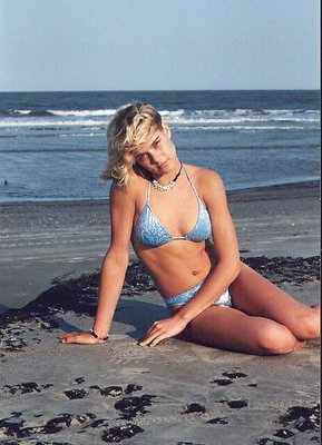
colors are great. tighten up a little on the model. one thing that i see a lot of is too much head room. if you're going for it on purpose it can really work. but there are so many people who don't. the center of the frame isn't always our friend.
i'm going to go snoop around on your other images. keep going.
Very nice picture, and Tina is very good model... However, I can't but agree with the forementioned comments: the lack of sharpness, the cropping and the waterline. Still a great photo though.
You have a pretty model and a great setting. Overall, the shot is done well, but I have a few comments. 1) Why is the head positioned below the water line? It makes her look cramped, rather than free. 2) The grain is a bit too strong. 3) You've cut off her feet. Body cropping can be done, but there has to be a reason. I can't see that here.