|
|
 Paul Lara
 {K:88111} 1/29/2004
|
Very nice portrait. The light from below really accentuates her eyes.
|
|
|
|
|
Tomasz Sarna
{K:1778} 12/22/2003
|
Just perfect, exellent composition, beautiful model, there is "something" in her eyes, great job!
Regards Tom
|
|
|
|
 Jahanzeb Baqai
{K:197} 12/2/2003
Jahanzeb Baqai
{K:197} 12/2/2003
|
Well captured
Eyes, i am always a big fan eyes.
JB
|
|
|
|
 Massimo Di Maggio
{K:-53658} 9/25/2003
Massimo Di Maggio
{K:-53658} 9/25/2003
|
Good portrait, pretty eyes and beautiful look, of course I like the reflections! Bye Max
|
|
|
|
 Rui Palha
{K:13624} 4/14/2003
Rui Palha
{K:13624} 4/14/2003
|
Soft and good portrait.
|
|
|
|
|
sibheen s. apel
{K:401} 4/7/2003
|
Autumn :) You seem to be on a good way to become "famous" ;)
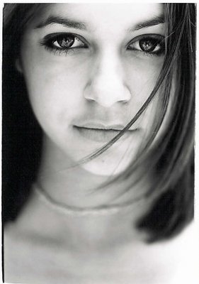
Seriously: this is a good portrait. Appealing tonality and wise choice of dof. Lays definitely emphasis onto her gloomy eyes. I also like her hair kinda crossing her face. Gives a more vivid expression.
Though I like you rough approach of presentation I have to agree with comments burining in that top left corner. It's too bright and attracts the viewers eyes too much;)
Slán!
P.S.: And you were right about your dof suggestion on "sense of age" ;)
|
|
|
|
|
Anindya Maity
{K:7880} 1/31/2003
|
Beautiful.Everything else has been said already.
|
|
|
|
 marília campos
{K:517} 1/23/2003
marília campos
{K:517} 1/23/2003
|
very very beautiful.
|
|
|
|
|
Nejat Talas
{K:15} 12/14/2002
|
Nice one. Flying hair does effect as Marc mentions and I like the tight crop as it is...
|
|
|
|
|
Marc Gougenheim
{K:5398} 12/3/2002
|
Simple and nice. Beautiful expression, I love the hair flying around... Have you tried a higher key on this ? I think it should work even better if you brighten your mid-tones - and maybe to the extreme... The eyes are what makes this shot what it is - so I'd like all the skin to somehow disappear... Not a MUST of course, but imo a valid alternative... Regards.
|
|
|
|
|
Tim Dinofa
{K:162} 10/2/2002
|
Autumn, what a great shot. The way you have it cropped now is just perfect. I really like the space on the bottom, it shows the great DOF used and adds visual interest to the portrait. The bottom right could be burned in a little more. By the way, her eyes and hair are amazing.
|
|
|
|
 Rob Holschbach
{K:2748} 9/3/2002
Rob Holschbach
{K:2748} 9/3/2002
|
This is a great portrait Autumn!
|
|
|
|
|
Barry Tipping
{K:959} 9/3/2002
|
This is a great portrait Autumn. I think the blurred necklage balances the bottom half of the image; avoiding too much whitespace. In the attachment, I rotated 1 degree CCW and cropped the image. Nice work!
|

|
|
|
|
|
Autumn Ruhe
{K:993} 9/3/2002
|
brian- i agree, the corner should be burned in
julia g- hm, i never noticed the necklace, but now i see your point, it does look a little strange... and yes i did use a reflector.
thank you all for your comments! i sincerely appreciate them.
|
|
|
|
|
Julia G
{K:222} 8/29/2002
|
This is a beautiful portrait and your sister is just a beautiful girl. Love the strand of hair crossing over - perfectly positioned.....the only thing that bothers me a little is the necklace - a different one, maybe, but this one almost looks like a weird fold in her neck.... but this is just a really great shot.....
Did you use a reflector?
|
|
|
|
|
Pete Kinser
{K:106} 8/28/2002
|
I've enjoyed this series of your sister. I'm not too big on doing portraits myself, but this series certainly enjoyable. what about the photos of our members project?
|
|


")


