|
|
 Tim Long
{K:9228} 2/27/2004
Tim Long
{K:9228} 2/27/2004
|
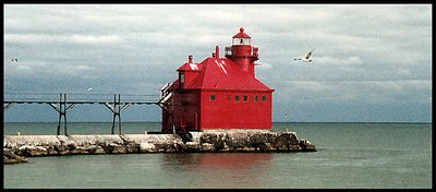
Very nice Nichole. I agree with you and the others about off-centering the red, though I think that in this case the composition does help tell the story of the scene. Cropped from the right and it becomes solely about the building, not the sea, though more correct. Regards. Good work.
Tim
|
|
|
|
|
John Hatziemmanouil
{K:40580} 1/10/2004
|
Again very good. A worthy composition!
|
|
|
|
|
Chris Lauritzen
{K:14949} 1/6/2004
|
Nichole,
I really like this shot and I will have to make the trip up there to take a shot of this myself. The red is very bold and works well and I do thing the image needs a bit of cropping but I say keep the pier and crop off the right side of the image. The pier leads your eye to the lighthouse. I would crop just behind the bird on the right. Also I am not sure about the grain; I think the image would look a little better smoother.
Was this shot on film or digital?
I am attaching a version to illustrate what I was thinking.
|

|
|
|
|
 donato r.
{K:16361} 1/6/2004
donato r.
{K:16361} 1/6/2004
|
bella composizione!
ciao donato
|
|
|
|
|
Mark Peterson
{K:3452} 1/5/2004
|
I like this one better than the vertical shot. The gulls add to the photo.
|
|
|
|
 Jim Loy
 {K:31373} 1/5/2004
|
Nicole, I am in love.....Ya stole me heart with this first photo---I love lighthouses! I think the crop would work great just off the outcropping of rock and just a smidge beyond the bird...give a perspective of "out there." As for the litter box and the Tower...if ya want, rotate it until the iron work on the right is on top...that was the actual angle I had...with the iron work at my head end. And the litter box was cleaner than the subway....
Am off now to see more of your work.
Jim
|
|
|
|
 Nicole Marcisz
{K:10268} 1/5/2004
Nicole Marcisz
{K:10268} 1/5/2004
|
Yes, this lighthouse is that bold of a red. I used a polarizer to help deepen the red. I agree about the cropping. I will fix and repost. let me know what you think.
the grain is because it was a faster film. I like the grainyness of it.
|
|
|
|
 JL E
{K:9693} 1/5/2004
JL E
{K:9693} 1/5/2004
|
beautiful work wirh colours! is that real?
cheers
|
|
|
|
|
Aleksandar Lazarevski
{K:1285} 1/4/2004
|
Beautiful red detail in the gray environment. great shot. Regards, Aleksandar.
|
|
|
|
|
Richard A. Yavorsky, Jr.
{K:95} 1/4/2004
|
It would be fun to play with this image in an image editor, experimenting with greyscaling out some or all of the background and leaving the house (and possibly pier) in its natural (or enhanced) color.
|
|
|
|
 Howard M. Parsons
{K:3496} 1/4/2004
Howard M. Parsons
{K:3496} 1/4/2004
|
I think the composition would be improved if some of the right side (sky & water)were cropped off. It isn't needed, and the lighthouse would then be pulled off center to the right.
|
|
|
|
|
Rouben Gargaloyan
{K:646} 1/4/2004
|
Nice picture - I like this screaming red lighthouse "in the middle" of a sea... I'd put the house off center a little bit (sacrifice 80-90% of pier detail - it doesn't add that much value to the picture) to emphasize how "lost in the water" this red house really is. Is the granularity (graininess I guess) of this picture done on purpose or a technical drawback? Excellent idea but I'd get much more appeal from slightly rearranged composition. (IMHO)
|
|