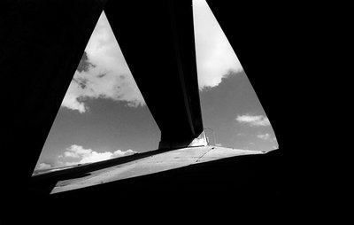
I love high contrast images like this one. Given you've placed this in architecture, however, I am not sure how far you want to go with the abstract. It's a bit distracting that the right tip of clouds/sky leaves the canvas. Thus, I'd suggest either cropping tighter so that all the areas bleed, or, cheat with some photoshop and bring in the black area. See my quick stab in the attached file. In the first one, it's less abstract and perhaps more architectural, whereby in the second, it's definitely all about the contrasts. IMHO.


")


