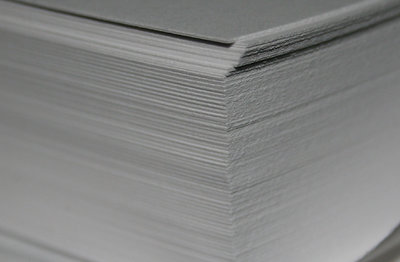
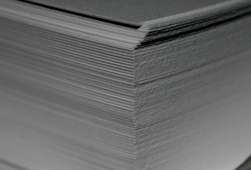
micheal - thanks for the thoughts. the photo is the original color shot i took one late night at the office, and no PS was done to it. below is a quick study having rotated it to near vertical and giving it more contrast/less brightness. the original shows all of the subject matter and trying to move the verticals to 1/3 or 1/4 removes (i believe) too much of it. but i do agree that more attention paid to the proportion would produce a more settled image.
You may want to increase the brightness and contrast for a pure white and pure black tones across the photo. PS can do this, or Picasa 2 free from Google.
Do some research on the rule of thirds - I think this could be just a little stronger by placing the vertical lines on the 1/3 or 1/4 of the frame.
You are getting a nice effect from depth of focus, but a little more extreme blurring may actually help this macro shot.
Wonderful interesting lines and textures. If you were to do it again adding a different colour paper within the ream would have added a great focal point. The roughness of the paper this close up makes it look like a stone pillar, very creative idea.