Now you mention it, I'm rather surprised by the lack of comments on this one. It's a nice photo, and there's not much wrong with it...
I have to commend you on your self-critisism. It mentions most of the things, yet I think you're also a bit hard on yourself:
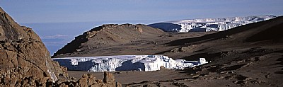
1. The blown out areas are minor, and not much of a distracting thing. I do think you could ease down a bit on the red / magenta layers, and change the blue hue a bit, as I have a feeling there's a slightly reddish wash over this photo.
2. The "balance" in the composition... Hmmm. Yeah, I see what you mean, yet it also creates a directional element, leading the eye to the opening on the left. Not bad at all.
3. Looking at the edges of the rocks, I would say it's a bit over sharpened, though, but that could also be a shadow / highlight issue if you've been tweaking this in CS2.
4. A reference to the scale would've been nice, not only to indicate the sheer size, but also as an eye catcher. I think a few mountaineers in this image, for example, would prevent the eye from wandering off, as well as increase the impact of this shot.
Still, I like this image a lot, very good contrast indeed, and I also like the composition. Nice work!
Good technically except for the blown out part on the fore glacier. Nice contrast, saturation and sharpness.
Not very "balanced" due to heavy dark on right.
Could use a figure for scale (hill on the far sde is probably 100 meters tall, valley floor seen under the cloud through the "V" is about 3500 meters below).