|
|
 Partha Pal
{K:11619} 9/30/2006
Partha Pal
{K:11619} 9/30/2006
|
Small one but beautiful,
Good creative composition.
Well done:) :)
|
|
|
|
|
Surajeet Ray
{K:1231} 8/31/2006
|
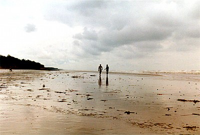
To me the land looks more attractive than the sky. So you should have tried a portrait pic placing the horizon as well as your subject at the top to leave more space in FG.Land color is too good.A moody pic.
|
|
|
|
 Anupam Dasgupta
{K:1357} 8/31/2006
Anupam Dasgupta
{K:1357} 8/31/2006
|
Thanks Jose
|
|
|
|
 Jose Ignacio (Nacho) Garcia Barcia
{K:96391} 8/31/2006
Jose Ignacio (Nacho) Garcia Barcia
{K:96391} 8/31/2006
|
exquisite tones. outstanding. marvelous silhouettes. ama<zing beauty. cong.
|
|
|
|
 Subroto Sen
{K:101} 8/30/2006
Subroto Sen
{K:101} 8/30/2006
|
I have given my comments in KPC and would like to reiterate that this picture would have been so different , had you placed the figures either on the right or left side of this frame.
|
|
|
|
|
Anupam Dasgupta
{K:1357} 8/30/2006
|
thank you AnindyaDa for your comments
|
|
|
|
|
Anindya Maity
{K:7880} 8/29/2006
|
I like the concept and the basic comp,but for two points-the sky is blown out in some areas,and the figs (as also the horizon) are placed centrally.
|
|
|
|
 Nilanjan Mitra
{K:12955} 8/29/2006
Nilanjan Mitra
{K:12955} 8/29/2006
|
great capture.. anupam.. :) ektu boro hole aro bhalo lagbe mone hoi..
|
|
|
|
|
Anupam Dasgupta
{K:1357} 8/29/2006
|
Thanks Arijit... i will remind your comments in future.
|
|
|
|
|
Sandip Aine
{K:5008} 8/29/2006
|
i agree with arijitda's comments ... the pic looks nice .. but it would have been much better with a better arrangement ...
|
|
|
|
 arijit(ratul) talukder
{K:6029} 8/29/2006
arijit(ratul) talukder
{K:6029} 8/29/2006
|
nice shot! the two figures adds a feeling of lonliness to the picture which i like very much. but why have u placed them centrally ? placing them a little left , and giving a little more space to the horizon and the sky may have enhanced the mood . this are entirely my views , and u have every right to dump them. all the best , keep clicking .
regards
arijit.
|
|