|
|
 Doyle D. Chastain
 {K:101119} 4/9/2007
|
Michele:
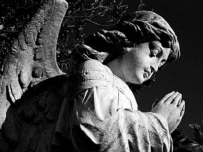
This is a pretty good conversion . . . though it does feel a bit harsh. I'm not sure how they have you converting but I like to use a filter system on PS conversions so that you can look at the various changes possible with a color filter on B&W images. I discussed this no that long ago with AJ. Here is a workflow I suggested to him . . . with a side effect of protecting the original image:
This workflow worked when I used PS-E4 and a variation might work for you too . . .
Step 1: Make a new Hue/Saturation layer above the BG layer. Don't make any changes to the default settings for this layer. If you double-click the layer, you can re-name it 'Filter'. Set the mode of this adjustment layer to color.
Step 2: Make a second Hue/Saturation adjustment layer above the filter layer and alter the settings so saturation is -100. Double click and rename this B&W Film. The monochrome image now on screen is what you would get in a standard desaturated color image.
Step 3: Double click on the left thumbnail on the filter layer and move the hue slider. You should be able to observe changes in the B&W image (unless the preview box is not checked . . . though it IS checked by default) . . .This changes the way the color values are translated to B&W. Here too . . . moving the saturation slider can emphasize certain portions of the image.
So if you haven't done it, experiment (and watch the effect) with these sliders - then hit OK. Use CTRL Z and CTRY Y (Undo/redo shortcuts - may vary) to flip back and forth between before and after effects . . . make sure you like the change. If yes . . . end With CTRL Y . . . if No . . . end with CTRY Z.
But in this case . . . the color image with the warm color of the stone adjacent to the cool colors of the sky make a pronounced difference to the photo's impact. The B&W emphasizes the texture and a cold reality . . . Both are good . . . but it really depends on the effect you're wanting to acheive. Nicely done and, for my way of thinking . . . you don't need the palm trees.
Regards,
Doyle I <~~~~~
|
|
|
|
|
Richard DuCroix
{K:1142} 1/23/2007
|
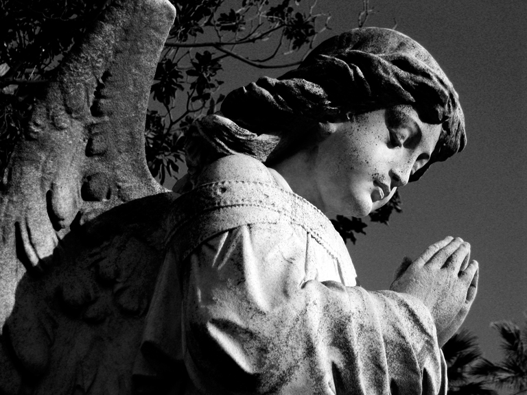
there is definitely a quiet, almost surreal beauty to them.
|
|
|
|
 Michelle Gerdes
{K:524} 1/23/2007
Michelle Gerdes
{K:524} 1/23/2007
|
Here's what the scene looked like, so LA!
But the light was so great that day & the sky so blue!
|

|
|
|
|
|
Michelle Gerdes
{K:524} 1/22/2007
|
Thank for the critque! REALLY! I like a dark sky, I guess it's from the old days of infared so I got cared away maybe. How's this one?
The palm trees are so LA so I should leave them in.
|

Angel #2 |
|
|
|
|
Michelle Gerdes
{K:524} 1/22/2007
|
Thanks for looking Richard.
Graveyards are great specially this time of year when the light comes in low all day, great shadows! Also the subjects hold still!
|
|
|
|
|
Akaky Bashmachkin
{K:-1095} 1/22/2007
|
Michelle, either version is good, but in this case your color version is the better of the two. Your b&w version is overly harsh, and you've lost important shadow detail in the conversion; the leaves behind the angel and the palm tree at the lower right of the image are both nearly invisible. This is fine, if that is the effect you're aiming for, but you've also lost the warm glow of the weathered stone, which gives the angel its patina of age. The b&w version looks like it could have put in the cemetery last week; you color version looks as though it has been standing there for quite a while. Again, this is not to bash your b&w version; it is very good and, to me, looks like something William Klein would do, but put head to head, your color version is the better of the two, I think.
|
|
|
|
|
Richard DuCroix
{K:1142} 1/22/2007
|
great pic...i love graveyard photos...keep it up!
|
|
|
|
|
Michelle Gerdes
{K:524} 1/22/2007
|
here is the color one
|

color version also uploaded |
|


")