The start of another very old series named "The gardens of St. Gallen". I was shooting these photos in the typical lunchtime when I was working (for yet another bank ;-)) in St. Gallen. Well, the work was as dull as it can get in a bank, and so when you have time for a pause from work, what you do? Right, get the camera and get lost for an hour. The series should rather be named "Flowers in the gardens of St. Gallen" since the images do not really show gardens but flowers as individuals. But now the name is there, and so I keep it.
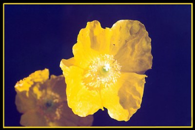
This one is a very puzzling one to me. Take for example the orientation. Whatever rotation you try it's always wrong! So I just left it the way I shot it. Special thanks to anybody who finds the right orientation, I must say!
Then take the yellow. Yes, it's strong and real *yellow*. But it is overexposed, or it is "unpure", or what the heck? Another thanks in advance for anybody that tells me what is going on!
And then take the background. I wanted simply yellow on black and I got yellow on... yes, what is that color of the background? Black with blue tint? Or hyper-dark blue? Or what? And how comes that a dark black can not only transform into a not as black dark but rather into a somewhat colored black on film? Muct have to do with the not identical responce curves for red/green/blue, or do I miss something?
And then take design. Well, the whole thing is there and yet someting is missing. Or something is too much? Help me!
I like your composition, Nick, although it is a little overexposed, as you say. As for the colour I'm not sure why it turned out that way, but I like the bluish background. Dave.


 talukder")