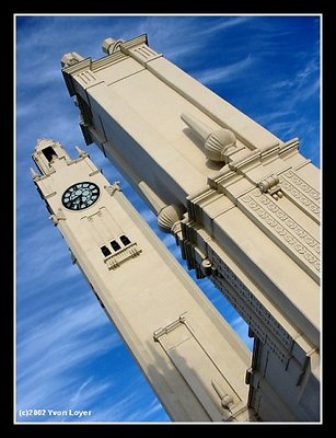
great shot. I think that I am drawn more to the BW in part because I am a bw type of guy, but the sky in the color seems to be what draws my eye rather than the buildings. I like the tones and lines in the BW. That said, either works well.
Hi, pretty cool shot! I like the b&w version better because it puts more emphasis on the perspective and shapes of the building, as well as the contrasts between the different areas. It makes me think of a 3-point perspective drawing. Having said that, both are neat shots, clean, crisp, and clear :-) Cheers,Marc