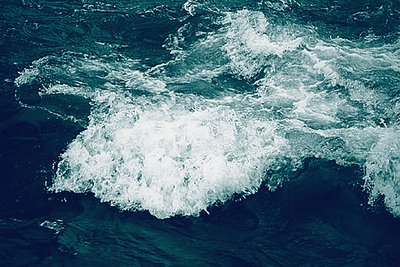
Following Roger's suggestion, I changed to a blue palette. Also, bowing to Bill's objection, I switched the category to Deep Blue. Let me know whether you think this works any better than the other one.
Also, I had deliberately kept the exposure short in order to try and freeze the turbulence and the spray.
Thanks for all the comments. I am taking the opportunity to view your photographs and to use the same link for communication. I liked your portfolio, particularly the Buddha images. Since we have to live in troubled water, it is the life of Buddha that always fascinates me. Please visit Bishnupur at least for once. From your photographs, it seemed that you are interested in different architectural forms. Bishnupur demands a visit from you. With best wishes...
I think this works better (but then I would, wouldn't I!). More important, what do YOU think? I think the short shutter speed was the right choice, too. Those blurred misty shots of water flowing seem to work best when the water is following a clear, regularly defined path, as in a river or a waterfall. Even then it's hard to avoid a visual cliche. When you have chaotic movement, with spray/spume and tossing waves, I think freezing them is the right approach--otherwise you just a get a confusing mess. My only reservation about the blue above is that it looks like the original colour, rather than a duotone or a tripletone. I was thinking of something a little more, ah, subtle. But this certainly works well. Hmmm. I'd better be careful what I suggest if you're going to follow suggestions... [grin]