|
|
|
Stephen Smith
{K:861} 3/5/2004
|
Thanks for the comments Lori, agree with what you say and something to work on. Regards Steve.
|
|
|
|
Lori Stitt
 {K:75282} 2/26/2004
|
Hi Stephen,
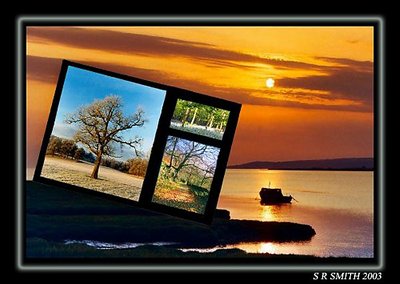
This is clever indeed! I like the idea very much, my first impression was 'HOW COOL'! Then I read the commentary that went back and fourth on this photograph. I think this idea would be great if they were all of the same image,or almost of the same, but all at different seasons. Then one would tie in the 'seasons' theme.
I think the idea is so creative, and catches the eye! And you have nice images, but you were limited by the sizes...And, I think pretty much anything goes in 'photoart'...and this is pleasine! Good job!
Lori :)
|
|
|
|
|
Stephen Smith
{K:861} 1/4/2004
|
Thanks Jim can see what you mean about keeping it parallel or making it just 4 windows, as you say would have been better for more detail. Regards Steve.
|
|
|
|
|
Jim Goldstein
{K:21230} 1/3/2004
|
I've seen some images where images are multiple windows with each picture being of differing sizes. The other difference being the lines of each image are parallel to the lines of the frame. They looked rather sharp. I think perhaps the limited image dimensions here don't help your work. The detail can't be seen in a 640 pixel wide file. I do think parallel lines would work better though at least with this image. The lines should be in line with those of your image. Of course that is often easier said than done.
|
|
|
|
|
Stephen Smith
{K:861} 1/3/2004
|
Thanks for the comments Jim, just something I put together for a competition in a hurry. Do you think making the 3 image window bigger and more square on the larger pic would improve it. Just wish that more would comment whether negative or not as only then can i improve. You have wonderful photos in your portfolio Jim.
|
|
|
|
|
Jim Goldstein
{K:21230} 1/3/2004
|
Very high quality work. The placement of the 3 image montage as such is a distraction for me of the larger image. That is not to say this is bad, but just not something that seems to be harmonious to my eyes. Regarding the size of the images in the inserted montage... they're on the small side. With out the title I would not quite have made the connection as quickly that all the images were of the different seasons. Again very nice work!
|
|