|
|
|
John Charlton
{K:5595} 5/16/2004
|
Very mysterious... do you notice that the errant photo has a small mountain rising from the water. Somewhat reminicent of the island of Montreal as seen from the south shore.
Amazing the things you will find on the "net."
I like your intial post just fine.
|
|
|
|
 Matej Maceas
 {K:24381} 5/10/2004
|
Yes, I see the net as well. This image was attached as a suggestion to another photo, and the image number of that attachment was 441026 - one less than your attachment. Apparently the system assigned the same file to both numbers.
|
|
|
|
|
Christian Barrette
{K:21125} 5/10/2004
|
Hmmm...
I wonder if you see what I see in my last comment. This picture of a fence (or net ?) doesn't belong to me. I have reported it in the Suggestions Forum. Waiting fo a follow-up.
|
|
|
|
|
Mike Marcotte
{K:3948} 5/9/2004
|
I would like to see this historic city some day. Also I like the suggestion of Matej.
|
|
|
|
|
Christian Barrette
{K:21125} 5/9/2004
|
I woke up this morning thinking (among other things...) that perhaps a B&W would be better to enhance the graphical value of the alternate post.
The contrast was raised, but not to the point of washing out the sky, and the arc and radius drawn on the ground were held with a definite dodge action. It may start to look unnatural though...
Do you think that an even darker, perhaps more contrasted version would work better ?
|

|
|
|
|
|
Matej Maceas
{K:24381} 5/8/2004
|
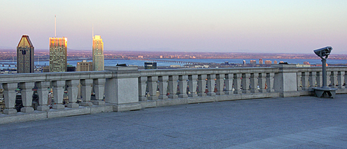
Now that you mention the gradient in the sky, I have to admit that the crop I suggested was somewhat rushed in its vertical placement - even less foreground with full sky would likely work better. A lesson for me to slow down a little.
In the realm of non-panoramic possibilities, I agree with you that the second post might well be the way to go. The sunlit building tops and the radius lie almost exactly on the diagonal. If, as you mentioned, you increase the contrast in the tiles, I think the result could work quite well.
|
|
|
|
 NN
{K:26787} 5/8/2004
NN
{K:26787} 5/8/2004
|
Very very beautiful colours/tones! I personally like this original version more because of the tones and - the binoculars; the empty space in the foreground kind of requires them?
|
|
|
|
|
Christian Barrette
{K:21125} 5/8/2004
|
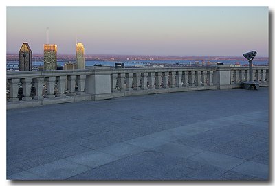
This is an interesting interpretation Matej. It is better balanced between the buildings and the binoculars, but I realize too that this former element is a distraction.
I would then try to work on my second post. I understand that the arc and radius drawn by the paler tiles are not contrasting sharply enough. This could be worked. Actually, I have used a bit of dodging on them. I could perhaps boost the contrast locally because I would not like to loose the gradient in the sy. If I find time in the hours to come, I will post again.
BTW, I find it a real relief that K and C are not grinding at this time. I guess I will turn to Comments Only.
BTW again - Wouldn't be interesting if we would post only after having answered this question: "What is it that I want to learn from my co-FilmUsers by showing this ?" This is pretty much what you do and I think it's the best use possible of this site.
|
|
|
|
|
Matej Maceas
{K:24381} 5/8/2004
|
The binoculars add informational value, but on the other hand, they create a restricting composition with two horizontally aligned elements, joined together by the balustrade. The circumferential curve of the lighter tiles does make the composition more dynamic to some extent, and the point where it intersects with the radial line adds a sort of a third point of focus, but overall I'm not convinced the effect is strong enough to carry the otherwise empty foreground.
I would therefore suggest a panoramic crop, as per the attached image. I also boosted the highlights with a Levels layer. What do you think?
|
|
|
|
|
|
Christian Barrette
{K:21125} 5/8/2004
|
I have this other version where the glow of the sun is more striking, but it is darker. Also, the presence of the binoculars in the main post is adding to the theme, I think. If you please, I would like to hear your opinions. Thank you.
|

|
|