|
|
|
Luke Luther
{K:14693} 10/24/2004
|
I think it is the intense hue and the color saturation that makes it special.
|
|
|
|
|
Kim Culbert
{K:37070} 6/14/2004
|
Hi Bobbie!
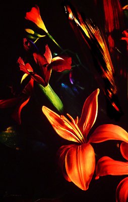
Thanks for the recent comments on my pics, and I'll email you back later this evening with some thoughts on my tungsten light experiment.
This is a digital picture of the slide projected on my wall... I don't have a scanner that can do prints or slides any justice so I tried taking a digital photo of the projected slide. It seems to work fairly well, at least so i can upload to Usefilm. I wouldn't want to make prints from these digital pics, as the quality isn't super, but it works well for sharpness and detail to post on the web. THanks again for all your help!
|
|
|
|
|
Bobbie C.
{K:1425} 6/14/2004
|
I really like it - I'd like to see the original slide, though. There's nothing like a projected slide. This looks like a painting on black velvet. I don't understand, though, is this a scan of the slide or a photo of the projected slide?
|
|
|
|
|
Kim Culbert
{K:37070} 5/25/2004
|
hahhaha, it's not supposed to be subtle, and I'm glad that it's not. I like what you've done to this... it really makes it hit you over the head even more with the bg clutter gone. That chunk o' flower in the bottom right now does look funny all by itself... don't you think? Should I tone it down? Crop more of it out? Or do you mind it down there>?
--Stephen... I try to take 2 or 3 shots of my pics off the wall, white balancing and exposing on different parts of the image to get a range of exposures to choose from. This one is just way out in right field, as the darks are so dark and the lights so light. There isn't much room to play with here without blowing things out or losing them in the darkness.
Thanks everyone so far for the comments... yes, even yours Becky, about the velvet canvas. *grin*
|
|
|
|
|
Stefan Engström
{K:24473} 5/25/2004
|
I'm wondering if you are blowing out any channels when you capture the slide (still photographing projected images?).
|
|
|
|
|
Becky V
{K:9699} 5/24/2004
|
I'm glad you listened to me! :p
I still love it, although I think you're right about its translation to digital format. This has to be seen through a slide projector to be properly appreciated!
I really like Dirck's version of this photo, especially since there was something bothering me about the red/yellow leafy object in the upper right. However, the bottom-most flower (the one cropped in half) now looks a bit out of place - before it blended in with all the objects on the right.
Please forgive this wishy-washy critique. You know I like it and totally think it belongs on a velvet canvas. And I don't mean that in a bad way!
|
|
|
|
|
Dirck DuFlon
{K:35779} 5/21/2004
|
Well, subtle it ain't!  First thing I thought when I saw this was: "black light" (I'm dating myself, aren't I?) First thing I thought when I saw this was: "black light" (I'm dating myself, aren't I?)
Once the colors settle down a little, though, there are a number of elements I like about this shot. Daniel was right when he mentioned the 'painterly' quality of this, although maybe not in the traditional sense - more like a nice, dense tempera paint! The molding of the foreground flower is wonderfully 'chunky' and almost cartoonish!
The little blob on the bottom half, left margin feels a little out of place to me - it doesn't seem to have the same flat quality as the rest of the image. I think it would look cool to limit it to the vertical line of the flowers, with their similar qualities, against the black background. What do you think?
|

|
|
|
|
|
Daniel Iggers
{K:530} 5/19/2004
|
I like it. I can't put my finger on it. At first the contrast seemed too extreme, and then it grew on me. The word "painterly" comes to mind (whatever that means). I like the flash of neon blue.
|
|
|
|
|
Augusto Buffa (Ali)
{K:10454} 5/19/2004
|
There is much artistic taste in this image. Beautiful and of great "artistic effect"! Excuse my bad english. Brava. Congrats!
àli
|
|