|
|
 Gayle's Eclectic Photos
{K:91109} 6/30/2004
Gayle's Eclectic Photos
{K:91109} 6/30/2004
|
Very well seen,Paul...can't count how many times i have been here,or by here and never took a shot..love the desat with the colors..like the way you composed..gayle
|
|
|
|
|
E H
{K:1665} 6/29/2004
|
This is a really cool capture, Paul! Nice play of zig-zag lines everywhere!
|
|
|
|
 Tim Schumm
{K:29196} 6/26/2004
Tim Schumm
{K:29196} 6/26/2004
|
Cool photo and a great narration to boot!
|
|
|
|
 Trish McCoy
{K:15897} 6/26/2004
Trish McCoy
{K:15897} 6/26/2004
|
nicely done job on the selective coloring.
|
|
|
|
|
Gloria Fusco
{K:7054} 6/25/2004
|
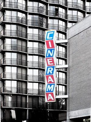
Great Paul, I really like how the color from the sign stands apart from the background..if you had chosen any other way..I am sure the impact would be lost....the sign reminds me of childrens building blocks. Excellent composition...Gloria
|
|
|
|
 Paul Lara
 {K:88111} 6/25/2004
|
Thanks Kriss!
|
|
|
|
|
Kristina Kohut
{K:49990} 6/25/2004
|
What a great composition! It's something with this that reminds me so much of my childhood, but I can't put my finger on what it is... Feels strange, but in a really good way!
This desaturation mixed with the colour is so good! Very nice work, Paul, I really like it!
|
|
|
|
 André Bermak
{K:14443} 6/25/2004
André Bermak
{K:14443} 6/25/2004
|
Excelente captura.Ótima composição!!!!
|
|
|
|
|
Paul Lara
{K:88111} 6/25/2004
|
Yeah, almost as important as the sign is, the balconies behind it seem to be from the same '50's style as well, which is what caught my eye, and I instantly visioned the shot like it is (well, with more grain, but I didn't like it, so I turned the grain down a bit).
|
|
|
|
|
Paul Lara
{K:88111} 6/25/2004
|
Thanks Jeff. I desaturated everything but the sign, but I still left ~ 25% color in the background image to keep the transition from being too sharp.
|
|
|
|
|
Kevin Collier
{K:19076} 6/25/2004
|
I thought that was Seattle. I saw an original print of Raiders of the Lost Arc there a couple of years ago. Nothing like the BIG screen.
Like your version here.
K
|
|
|
|
|
Jeff Fiore
{K:11277} 6/25/2004
|
Nicely done! I like the way the crookedness of the sign compliments the geomentric shape of the apartment in the backgroung. I also like how it looks like a B&W image with a colored sign.
|
|