|
|
 kouichi
 {K:701} 9/18/2009
|
..Excellent!
|
|
|
|
 RC. Dany
{K:64104} 9/1/2005
RC. Dany
{K:64104} 9/1/2005
|
Excellent !!!!!!!!
|
|
|
|
 Lilywhite Lilith
{K:1809} 9/5/2004
Lilywhite Lilith
{K:1809} 9/5/2004
|
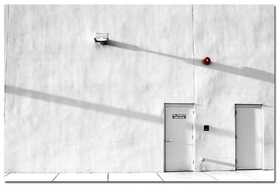
very cool picture. superb composition. and it's mysterious to me [what is behind these two doors?]...
great work, i like it a lot...
best regards, ekkehard
|
|
|
|
|
Todd Miller
{K:16464} 8/23/2004
|
this is a lovely shot. great minimalist feel, and i like the red. nice work.
|
|
|
|
|
Christian Payne
{K:1398} 8/7/2004
|
You really have an eye for a great image it is rare that i easily give a seven but this is a superb capture.
I tend to shy away from manipulated images but this is just great and looking at your other stuff your adjustments are often as subtle as i were to change the levels.
With computers playing more and more of a part in photography (especially here on the net.) I think your style will dominate the future of the digital image.
I cant wait to see what you get up to in the future.
Thanks.
|
|
|
|
|
daíven rizz
{K:650} 7/31/2004
|
well captured Vadim I like shadows and the bright red st ands out well done
and yes I'm a military photographer.
|
|
|
|
 Tony Diana
{K:13396} 7/24/2004
Tony Diana
{K:13396} 7/24/2004
|
Un estupendo trabajo, digno de BIP
|
|
|
|
|
Barry Wakelin
{K:7838} 7/22/2004
|
A very intense image. It works really well for all the reasons already mentioned. I agree with Mark though that the line on the left is a distraction and the floor at least should be horizontal. Great work though.
|
|
|
|
|
Mark Beltran
{K:32612} 7/22/2004
|
The wall has a very curious texture. It's not what one would usually expect. I think the exposure is right on the money. The composition could be tighter, though. The crease on the far left really bothers me, as does the tilted flooring. When you do architectural or something related to it, you have to pay attention to the lines and how they converge and diverge. It's just a little unkempt.
|
|
|
|
|
matthew hoffman
{K:658} 7/22/2004
|
Vadim, If I may interject a few comments to help you understand what the deal is.
1) in most photography, less is more (fewer details mean you can focus on the subject). Here, you have managed to make minimalism (or nothing, if you get my meaning) the subject, which makes this very powerful in a subtle way.
2) You present us with white walls and two doors. From a Psychological standpoint, people will be drawn to this because they feel they need to add something to the picture. Many people will want to know why you called it "boiler room" when boilers seem to be lacking. I myself want to open the doors. It is almost like there is a mystery to be solved.
Does this help? Because I agree with the others that this is an astounding image!
Bravo!
Matt
|
|
|
|
|
Vadim Melamedov
{K:1466} 7/21/2004
|
Thank you for your comments... Honestly I do not see what the big deal is. It's just a damn wall with the couple of neat shadows on it. Anyway, thanks to Randal Dean everybody thinks I'm a genius :-) I really appreciate it!
|
|
|
|
|
Vadim Melamedov
{K:1466} 7/21/2004
|
Thank you for your comments... Honestly I do not see what the big deal is. It's just a damn wall with the couple of neat shadows on it. Anyway, thanks to Ronal Dean everybody thinks I'm a genius :-) I really appreciate it!
|
|
|
|
 Roberto Arcari Farinetti
{K:209486} 7/21/2004
Roberto Arcari Farinetti
{K:209486} 7/21/2004
|
oh my god..
Vadim..
fantastic WHITE!
excellen incredible and strongly effect!!!!
you are great
roby
7+
my best congrats
|
|
|
|
|
Kevin Collier
{K:19076} 7/21/2004
|
I agree with all the other posts - this is a very well done image -- love the shadows and small hint of color. K
|
|
|
|
|
Ahmet Baki Kocaballi
{K:13618} 7/21/2004
|
very good capture and composition
|
|
|
|
|
Rebecca Raybon
{K:26654} 7/21/2004
|
Very artistic view of an everyday vision. Very well seen and presented.
|
|
|
|
|
Viktor Pravdica
{K:4907} 7/21/2004
|
:)
|
|
|
|
|
Ken Tinley
{K:1856} 7/21/2004
|
very beautiful.
|
|
|
|
|
Ian Crean
{K:14866} 7/21/2004
|
Very absorbing, clinical image, the kind you can just stare at for ages, it seems to have so much space an impression enhanced by the elongated shadows. Nice production. Haven't we met somewhere before?!!! (you're portfolio notes are just too modest).
|
|
|
|
|
Paula Goddard
{K:8492} 7/21/2004
|
agree with Randal: great photo. funny, cause you say "boiler room", but looking at the picture i feel very cold and icy. but i do like the contradiction! :-)
|
|
|
|
 Angelo Villaschi
{K:49617} 7/21/2004
Angelo Villaschi
{K:49617} 7/21/2004
|
Good work with selective desaturation. Works quite well, and I like it.
Perhaps it could be improved a bit by facing parallel to the wall, not at an angle, which has given that "diagonal vertical" at the left.
|
|
|
|
|
Yoshi Enoki Jr
{K:3021} 7/21/2004
|
Reminds me of the scene we did for "American Beauty" - where Mr. Burnham smokes a joint with Ricky the neighbour at the back of the hotel's loading area -
this was the sort of thing Sam (Mendes) was looking for -
thanks!
|
|
|
|
 Timothy Schirmer
{K:7201} 7/21/2004
Timothy Schirmer
{K:7201} 7/21/2004
|
WOW, very cool
|
|
|
|
|
Randal Dean
{K:4004} 7/18/2004
|
 Well, I must say, I just don't get it. This is a fine image, one that on first look appears to be black and white, but there's that red alarm bell. This is very well composed, the shadows with their long lines at a low-angle diagonal. The texture of the wall is like paper. I think your composition is superb. What I don't get is, Why has this image not been viewed more, and where are the comments? This is an exceptional photo, IMHO.
|
|


")


