|
|
 Matej Maceas
 {K:24381} 10/16/2004
|
I agree with Viktor about the titles. If you like to have them underneath the photo, great, but at least use a different font ;-)
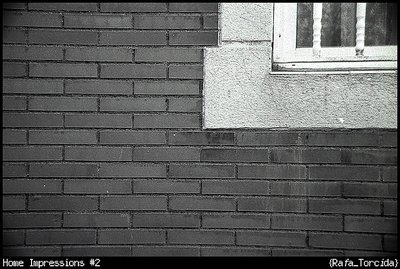
The geometry of the bricks and the window is compromised by the very strong distortion. I guess this is to be expected from a hyperzoom lens (but I must admit that my favourite 50mm prime has the same problem, albeit to a much lesser extent).
Overall, I like the photo, I enjoy viewing this kind of architectural abstracts.
|
|
|
|
 Teunis Haveman
{K:53426} 10/5/2004
Teunis Haveman
{K:53426} 10/5/2004
|
Rafael, great contrast
Teunis
|
|
|
|
|
Alberto Turiel
{K:-35} 10/5/2004
|
Yo la habría girado un pelín hacia la izquierda, la línea de ladrillos justo encima del título ... pero bueno quizas yo soy muy 'cuadrado'
|
|
|
|
|
Viktor Pravdica
{K:4907} 10/5/2004
|
If i were on your place i would remove them. But it is my opinion only :) That is all
|
|
|
|
|
Rafael Torcida
{K:1926} 10/5/2004
|
Thanks for your comments Viktor.... any suggestion for the titles?. I like the way it is now but I'm willing to hear any idea :).
|
|
|
|
|
Viktor Pravdica
{K:4907} 10/5/2004
|
Nice work again!
I do not like the way you put titles on your photos. They are so disturbing to me.
|
|