|
|
|
Sara Cosby
{K:2704} 11/23/2004
|
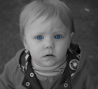
I like the higher contrast, but I don't like the blown out highlights, I wanted to keep it soft. But would love any other suggestions. I tried one last crop and think I adjusted a bit more...
|

|
|
|
|
|
Cheryl Ogle
{K:24494} 11/23/2004
|
Ummm - here's the photo. Finger went too fast. :)
|

|
|
|
|
|
Cheryl Ogle
{K:24494} 11/23/2004
|
Very nice photo Sara. I love the idea behind it. I did attach a version with a screen and level adjustment to show you how it can make the black pop (Howie showed me the "unsharp" filter which I applied also)...
|
|
|
|
|
Ana Martins
{K:5643} 11/20/2004
|
She?s sooooooo beautiful! The beautiful blue of her eyes in really enhanced when all the rest is in black and white.
Thanks for the comment on my pic.
Cheers, Ana
|
|
|
|
|
Alan Andrews
{K:283} 11/15/2004
|
Yes, I think it looks much better. What do you think? Good job!
|
|
|
|
|
Sara Cosby
{K:2704} 11/13/2004
|
how 'bout this one?
|

|
|
|
|
|
Alan Andrews
{K:283} 11/12/2004
|
Beautiful eyes! Better contrast will improve your photo greatly. Using PS Elements, go to Enhance and click AutoLevels and that will usually do a good job. To customize the contrast, go to Enhance, click Brightness/Contrast, then Levels. Play with moving the little triangles and you'll be amazed at how your picture will come to life.
|
|
|
|
|
A K
{K:8499} 11/11/2004
|
Sarah - use PSCS, so I'm not sure what you won't have in elements. Generally removing/desaturing the colour is not the best way to go. There are HEAPS of conversion methods out there. I think this one works with elements - http://www.russellbrown.com/tips/pdf/colortoB&W.pdf but do a search on google, and you'll find heaps. Hth.
|
|
|
|
|
Sara Cosby
{K:2704} 11/11/2004
|
I'm VERY new to digital (just bought my D70 a week and a half ago) so is it possible to explain how or is that complicated? I went into Elements (all the software we have) and removed the color with the magic wand tool all but the eyes. I know it does a LOT of things I'm clueless on.
|
|
|
|
|
A K
{K:8499} 11/11/2004
|
I think you really need to brighten up those tones. At the moment the black and white looks really flat and muddy. Try a different conversion, or use some curves to add a bit more definetion :)
|
|