|
|
|
Carsten Ranke
{K:14476} 3/8/2005
|
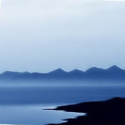
I must say, I like the grainy version more than the neat image result. Very good abstract
|
|
|
|
 Sam Andre
{K:12484} 1/25/2005
Sam Andre
{K:12484} 1/25/2005
|
well, well... some difference can be noticed :))
|
|
|
|
|
David Wade
{K:2123} 1/25/2005
|
Thank you!!! Here's the result. It works better on other images, mainly because this was rotated a bit to get the horizon horizontal.
|
|
|
|
|
|
Sam Andre
{K:12484} 1/25/2005
|
try the free software at neatimage.com
|
|
|
|
|
David Wade
{K:2123} 1/25/2005
|
I would've tried to soften out the graininess but it was already slightly grainy from enlargement but I don't have software which will sort that, so extra grainy it was.
|
|
|
|
|
Sam Andre
{K:12484} 1/24/2005
|
oooops missed your answer on the previous question
|
|
|
|
|
Sam Andre
{K:12484} 1/24/2005
|
nice soft colours, but why is it so grainy despite all the work you mput into it?
|
|
|
|
|
David Wade
{K:2123} 1/18/2005
|
The graininess IS intentional, done by oversharpening, which is why it's in the 'photoart' catagory.
|
|
|
|
|
Fabrizio Fiorucci
{K:4871} 1/18/2005
|
Nice tones, but I can't figure out whether the grainy effect is intentional or due to excessive jpeg compression... I'm a bit puzzled ;-)
Warm scottish tones are always so enchanting... here's another shot in that area: http://www.usefilm.com/image/638245.html
|
|