|
|
|
ed lawson
{K:896} 2/27/2005
|
Hey Omar. Great shot - and a nice change! (you've been busy!) Like the DOF and a very natural, expressive look here. best, ed
|
|
|
|
 Roberto Arcari Farinetti
 {K:209486} 2/11/2005
|
I find this photography really and simply fantastic.
roby
|
|
|
|
 Khaled Mursi Hammoud
{K:54005} 2/9/2005
Khaled Mursi Hammoud
{K:54005} 2/9/2005
|
Nice posing and expression on her face.
I like the DOF too, perfect.
Well done Omar,
Khaled.
|
|
|
|
|
Omar Rifaat
{K:10141} 2/6/2005
|
Stefan,
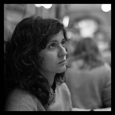
Thanks for your comments. I had to open aperature all the way (1.8) because light was low. I think next time I will experiment with pushing this film...
Regards,
Omar
|
|
|
|
|
Stefan A. F. Kassler
{K:3727} 2/6/2005
|
Also a good portrait. I like the bokeh in the background. Which aperture did you use? After the first eye, the picture becomes unsharp. Well, it is not terrible, but a larger dof would be better. But that happens very often.
Regards,
Stefan Kassler
|
|
|
|
 Tony Diana
{K:13396} 2/5/2005
Tony Diana
{K:13396} 2/5/2005
|
Un estupendo retrato.
gracias por su visita
|
|
|
|
|
Omar Rifaat
{K:10141} 2/5/2005
|
George,
your comments appreciated, as always. I will go and do some experimenting with channels!
Your advice is priceless! ;)
Omar
|
|
|
|
 George Black
{K:102014} 2/4/2005
George Black
{K:102014} 2/4/2005
|
This is an absolutely charming portrait, so easy and unselfconscious. My thoughts (worth every penny you've paid!)
1] A tight crop of the subject to yield a portrait orientation.
2] I'm sure you're right about using film for b/w. I love the quality, and I've got boxes upon boxes of b/w negatives. And so we face the complications of scanning. From a digital image, I can usually get better results from using Channels instead of Desaturate. For some images, the difference is remarkable.
Best wishes,
--george
|
|
|
|
|
Omar Rifaat
{K:10141} 2/4/2005
|
Jennifer,
thanks so much for your encouraging and helpful comments. I notice that using real B&W film somehow produces much better results than simply de-saturating a colour image (not quite sure why though!). I'm going to try some Ilford next. Also thanks for the tips on pushing the film. At 400 its pretty versatile, but I'd like to experiment with grainy effect.
I'll keep you posted!
Omar
|
|
|
|
|
Bea Friedli
{K:10189} 2/4/2005
|
hi Omar..keep playing with b/w..this is wonderful
|
|
|
|
 Ahmad Hasan
{K:4164} 2/4/2005
Ahmad Hasan
{K:4164} 2/4/2005
|
nice one brother she seems distracted off her surrounding and immersed in her own thoughts
|
|
|
|
 Jeanette Hägglund
{K:59855} 2/4/2005
Jeanette Hägglund
{K:59855} 2/4/2005
|
Nice natural portrait of a woman in wonder...in her own world of thoughts. Excellent!
Jeanette
|
|
|
|
|
A K
{K:8499} 2/4/2005
|
I like how natural and unposed this is.
|
|
|
|
|
jennifer armstrong
{K:6688} 2/4/2005
|
great shot, Omar. I like the naturalness of it - not a glamour shot at all, which is so lovely, just a moment of her in time. The square format works really well here & i like the chunky black border you've added. The shallow dof & the blown-out lights work really well. Just a note - i've often pushed tcn to 800 or even 1600 for lower light shots & have been happy with the results - gets a little grainy, especially at 1600, but i don't mind that personally. You can also have it printed in a sepia tone, or anywhere in between, because it's processed & printed as colour film - it's fun to try the different toning from time to time. Just some thoughts! Great shot. :O)
|
|