|
|
 Paul Lara
 {K:88111} 4/18/2005
|
Oh, well then...
If it's supposed to be a head shot, it has to be cropped MUCH tighter, and she should be looking into the camera.
|
|
|
|
|
Cheri Meredith-Evans
{K:1766} 4/18/2005
|
Thank you very much Ferdinand. Hope you will look at the other two I've posted of this model.
~Cheri :)
|
|
|
|
|
Cheri Meredith-Evans
{K:1766} 4/18/2005
|
Thank you David.
~Cheri
|
|
|
|
|
Cheri Meredith-Evans
{K:1766} 4/18/2005
|
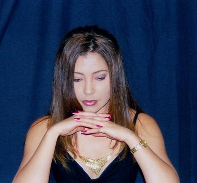
Thanks for your comments Paul however I guess I should've written in the "about" that I had to put the subject in the middle of the frame it was a graded project for class. It was supposed to look like a "head shot". There are two more in this series that you might like better. Sorry about the misunderstanding. Thank you for your comment just the same and thank you for the tips.
~Cheri :)
|
|
|
|
|
Ferdinand
{K:3516} 4/15/2005
|
It's a really beautiful portrait, with a very attractive model. Paul is right about the centering - it's always better to avoid that. I would myself tend to move slightly to the side of the model, rather than shooting her straight ahead, to avoid a flat look. But actually these are minor points - it's still a very appealing image.
|
|
|
|
|
D W
{K:2560} 4/15/2005
|
I see what you're getting at. Keep it up.
Dave
|
|
|
|
|
Paul Lara
{K:88111} 4/15/2005
|
It's all about the dead-center of the frame, and why to avoid it, Cheri. It insinuates stasis, static, still, unchanging. Moving your subject out of center helps create a tension and dynamic to the shot.
Not only centered left-to-right, but her eyes are centered top-to-bottom, which is not good. Look at nearly all the astoundingly beautiful portraits on Usefilm (and there are hundreds) and you'll begin to note the eyes are usually at the upper-third line.
I hope this helps in the future, Cheri.
|
|