|
|
 levent buyuk
{K:2041} 6/13/2005
|
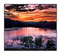
This is my favorite.I like composition & feelings.My congs..
|
|
|
|
 Robert Delgadillo
 {K:3509} 6/13/2005
|
Branimir, thank you so much, I highly value your opinion.
Bob
|
|
|
|
 Branimir Fagarazzi
{K:38367} 6/12/2005
|
Verry nice work.I like shadovs.
Best regard
|
|
|
|
 Dino Lupani
{K:15142} 6/10/2005
|
Great shot and composition.
Regards
|
|
|
|
 Jose Ignacio (Nacho) Garcia Barcia
{K:96391} 5/20/2005
|
wonderful tones.
|
|
|
|
 Robert Delgadillo
 {K:3509} 5/20/2005
|
There are so many levels to photoshop I have yet to try them all, mainly because I need a reason to use them before I use them. And I've only got so much time and so many images that need help! Thank you so much for helping to explain the processes you worked on my image. I will try to duplicate it on a future image. I really appreciate your taking the time to give me your techniques. The second sepia posted is the better of the 2, the first had a little to much fade out on the edges for my taste.
Bob
|
|
|
|
|
Tiger Lily
{K:10966} 5/20/2005
|
Sorry, that didn't work; here's a better version (I hope).
|

|
|
|
|
|
Tiger Lily
{K:10966} 5/20/2005
|
Robert, I used subtle sepia tones. If you take both images into photoshop it'll be easier to see the color difference side by side. You could increase the sepia factor; true sepia is a reddish dark brown I presume.
I'll try to describe the steps involved for the rest. I made a duplicate layer of the background (your original image). Blurred it with the blur tool under filter menu. I used gaussian blur. The amount is left up to you. Then add a mask layer from the layer menu. Click on the brush, set color to black and paint over the man. Finally I pulled the texturizer from the filter menu and added sandstone filter. I think it was 100% & 4 but you can experiment with these values and see what you like best.
Softened the corners with a gradient to emphasize the faded look. Gradient set to "Foreground (white) to transparent".
|

|
|
|
|
 Robert Delgadillo
 {K:3509} 5/19/2005
|
I'm with you Lily in deference to Jim, I tried several versions with the man centered (B&W,Portrait) and they just didn't seem to work as well. The std left to right, front to rear composition basics hold well here. I do like your treatment that I hadn't though of (isolation/separation of the man) gives a floating on canvas feel. Using a sepia tone might work with this? Your treatment, i think, uses some masking techniques which I'm just beginning to work with.
|
|
|
|
|
Tiger Lily
{K:10966} 5/19/2005
|
I personally like the off centered composition.
Here's a faded look I came up with. Used blur tool and also the texturizer. No blur on the man.
|

|
|
|
|
Mary Brown
 {K:71879} 5/19/2005
|
The picture very definate;ly goes with yourc eescription.
Mary
|
|
|
|
 Robert Delgadillo
 {K:3509} 5/18/2005
|
It might be a little tough centering him. I might give that a try later. You can see the original in my portfolio under PS#1. There you can see what I worked from and the evolution of this series.
Bob
|
|
|
|
 James Kazan
{K:-129} 5/18/2005
|
Bob
No not bad. It has a good range of gary and black. The hot spot is a tad distracting. Do you have enough capture on the right to center the road and walking man?
Jim
|
|


