|
|
 Urs Rubin
 {K:5172} 7/16/2005
|
Hi Antonia
Thank you for your kind comment on this experiment!
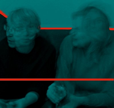
As I wrote to Hugo de Wolf, I wanted to create some kind of sphere, clime between those two lines, which doesn't seem to happen to those who look at the picture. Well. all I can do ist to try to become more clear with my testimonies ... :)
And this by learning, by getting input, thank you for it, Antonia!
Urs
|
|
|
|
|
Urs Rubin
{K:5172} 7/15/2005
|
Hi Hugo
Thank you very much for your comment!
I agree, the way you interpret those two lines do lead to the result you say. My idea was to create some kind of third dimension, a kind of lowlands between those two borders. To achieve this resullt, I maybe should have choosen another color between those lines to make the idea better visible.
However, I'm very proud you took the time to comment my picture, I guess I can learn a lot of your work presented here in Usefilm!
Kind regards
Urs
|
|
|
|
|
Urs Rubin
{K:5172} 7/15/2005
|
Hi Hugo
Thank you very much for your comment!
I agree, the way you interpret those two lines do lead to the result you say. My idea was to create some kind of third dimension, a kind of lowlands between those two borders. To achieve this result, I maybe should have choosen another color between those lines to make the idea better visible. I guess that also the color of the lines ar not wisely enough choosen, they cut the piicture instead of holding it together.
|
|
|
|
 Hugo de Wolf
{K:185110} 7/15/2005
Hugo de Wolf
{K:185110} 7/15/2005
|
Hi Urs,
I like what you've done here. The motion in the heads makes it tick; very good dynamic element.
I'm not sure I agree with how you placed the guiding lines... I think the (diagonal) line through the two faces of the woman on the left runs through the hands of the woman on the right, making the lowest line obsolete.
I do like the contrast in colours, though. As an element of the graphic design, it works well. The problem is that as you've placed the lines very dominantly in the frame, emphasising the horizontals, the effect of the slow shutter and the dynamism introduced by the motion of the subjects is reduced by the more static layout of the lines.
Hope you see what I mean. Still, I like this rudimentary approach... Original and creative work.
Cheers,
Hugo
|
|
|
|
|
daz asdasd
{K:1026} 7/15/2005
|
Nice one, Urs.
Interesting and creative work you've done in PS, I like it.
Very well composed, and a very good combination of colors.
By the way. I would like you to register at this site:
www.a71an.com
We need creative photographers like you.
I'm looking forward to see your work there too.
/Thomas
|
|
|
|
|
Francesco Francesco
{K:8101} 7/15/2005
|
Very original, the red lines make the picture more interesting and captivating.
Well done, congrats!
Ciao Francesco
|
|
|
|
|
Antonia BauerleinSehnert
{K:30599} 7/15/2005
|
I think it is a work of art. It is captivating. I'm immediately drawn into the scene -- there is a delicacy to the image's shadows that is very appealing to me. The brilliant orange compliments the dark, subtle teal, and the placement seems just right (rule of 3rds). Antonia
|
|


 - Day One - Lift-Off")


