|
|
patrizio napolitano
 {K:13119} 11/24/2005
|
eccellente accostamento cromatico e ottima e simpatica idea!
patrizio
|
|
|
|
|
Mahdy Charafeddin
{K:1998} 11/18/2005
|
great colors
extra charming
good work
|
|
|
|
 WAEL HAMDAN
{K:7476} 11/17/2005
WAEL HAMDAN
{K:7476} 11/17/2005
|
colour is better Zahraa
well done
wael
|
|
|
|
|
Zara Hajaig
{K:1143} 11/16/2005
|
Hermin Abramovitch who gave u the right to go and abuse people like that? do u think ur better or something? bcz if u do then wake up!!! and say sorry to Zahraa and dont throw insults like that
|
|
|
|
 Nour El Refai
{K:12481} 11/16/2005
Nour El Refai
{K:12481} 11/16/2005
|
with those colors, it can't be boring, excellent work my friend
ofcourse the B&W is wonderful too
|
|
|
|
 Jeanette Hägglund
{K:59855} 11/16/2005
Jeanette Hägglund
{K:59855} 11/16/2005
|
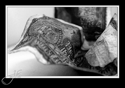
Great dof! First i thought it was a fabric until i realised it ?s money!
:)
Jeanette
|
|
|
|
 Fakhra O.
{K:5961} 11/15/2005
Fakhra O.
{K:5961} 11/15/2005
|
Not boring at all.
Loved the b&w version.
Well done my friend.
|
|
|
|
 hermin abramovitch
{K:1915} 11/15/2005
hermin abramovitch
{K:1915} 11/15/2005
|
yeap! the title defines you. :) I'd go for the B&W as the visual impact is more concentrated.
|
|
|
|
 AJ Miller
{K:49168} 11/15/2005
AJ Miller
{K:49168} 11/15/2005
|
I prefer the B&W as it seems to have stronger contrast.
AJ
|
|
|
|
 Shady Adly
{K:7814} 11/15/2005
Shady Adly
{K:7814} 11/15/2005
|
Very nice companion of harmony of colors...
Well done
|
|
|
|
 Yahya El Hosafy
{K:8369} 11/15/2005
Yahya El Hosafy
{K:8369} 11/15/2005
|
wonderfull Zahraa.
i love your work and i am with you as far as you wanna take your closes and macros.
u compose your photos very well and the angles you choose are great.
as for this photo, i am sure the b/w is better as it strongly shows the texture, the crankles u made to it, plus the colors seem to be destracting.
very nice contrasts.
|
|
|
|
 Ahmed Ismail
{K:19853} 11/14/2005
Ahmed Ismail
{K:19853} 11/14/2005
|
The color one's pretty nice. But the B&W seems to give a better feel to the image.
We certainly aren't bored with your photos. You are so talented in giving a new face even to pieces of paper. I would love to see more!!
|
|
|
|
 Riham Essam
{K:4931} 11/14/2005
Riham Essam
{K:4931} 11/14/2005
|
Its amazing in the two conditions well done ...bravo
Best Regards,
Riham Essam
|
|
|
|
 AlZahraa Sulie
{K:7255} 11/14/2005
AlZahraa Sulie
{K:7255} 11/14/2005
|
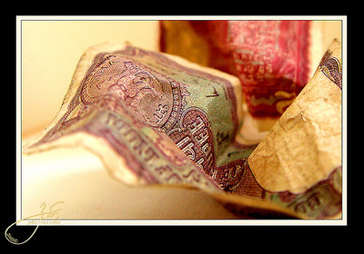
I was a bit confused wither to post it in colours or in B&W. I really like the colour palette in that one. And I though it would be a small shift from the pervious monochromatic ones.
Here?s the same image in B&W..
Let me know which is better!
Thanks all in Advance :)
Zahraá
|

|
|
|
|
 Gustavo Scheverin
{K:164501} 11/14/2005
Gustavo Scheverin
{K:164501} 11/14/2005
|
Interesante close up.
Felicitaciones!
|
|