|
|
Critique By:
martijn wams (K:6351)
4/15/2006 2:42:57 PM
you've created a feeling of lost here. the vastness of the ocean to get lost in, the chaos and randomness of the footprints, the loss of identity by the totally wrapped person. The loneliness of her standing alone. it's all already there in the photo. The added touches perfect the mood to the photo. Well done. Regards, martijn
|
| Photo By: Lars Raun
(K:1701)
|
|
|
Critique By:
martijn wams (K:6351)
4/15/2006 1:55:13 PM
Amazing work with light. How do you get such great contrast with color and black with still such soft tones on your subject. I'm shooting with a 300D as well, and have yet to get these amazing results. This has a deep religious feel to it. Like we are witnessing a deep private moment here. great work, a 7 from me. Kind regards, Martijn
|
| Photo By: Laura Bulau
(K:42)
|
|
|
Critique By:
martijn wams (K:6351)
4/15/2006 1:37:30 PM
I'm seeing more and more off these works of more photo's in one image and I really like it. You've created a feeling that Stella is watching us, watching her. And daring us to judge her about dressing up the tree trunk. I love how everything in the main photo is diagonal, whereas the horizon is normal. Great composition. Well done. Regards, martijn
|
| Photo By: lubomir
(K:938)
|
|
|
Critique By:
martijn wams (K:6351)
4/15/2006 1:31:41 PM
wonderfull focus. And great idea, so simple, but effective. I like how you can only see the rim of the glass. Regards, martijn
|
| Photo By: Galal El Missary
(K:84569)
|
|
|
Critique By:
martijn wams (K:6351)
4/15/2006 1:17:42 PM
Great composition, the lines really bring you to the middle of the shot. Whereas the colors and light bring you to the top. Which makes you look around the photo more, which is good for the subject. Well done
|
| Photo By: Jozef Priecko
(K:18)
|
|
|
Critique By:
martijn wams (K:6351)
4/15/2006 1:13:08 PM
I like the collage work, it gives you so much more to look at. the repetition of the same objects makes me feel more part of the envirement and make me care more about it. (Which is amazing, because well, they are beachchairs) Great use of tone as well, it has that old movieshot feeling. (it reminds me off the show Carnival) Go see the last work of Hugo de Wolf on usefilm. He's put up some interesting collagework the last days. Regards, Martijn
|
| Photo By: Andrea B.
(K:874)
|
|
|
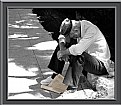
Critique By:
martijn wams (K:6351)
4/15/2006 1:04:53 PM
great composition (except for the cut of shoe)and I like the coloration of the paper, it emphasizing it, yet is still verry subtle. the light spots on the tiles seem a bit to bright and take away some of the attention. Verry well spotted subject. Regards, martijn
|
| Photo By: selami Torun
(K:9397)
|
|
|
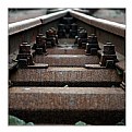
Critique By:
martijn wams (K:6351)
4/15/2006 12:56:48 PM
great green tones and overall feeling you've captured here. I like the whole athmosphere. I do think that if you had walked a bit more to the left of the object and put the tree a bit more left of the frame it would be a bit better composition and most importantly you wouldn't have had the difference in sharpness/contrast because of the light on the left-top. Regards, Martijn
|
| Photo By: Weston Dru
(K:3243)
|
|
|
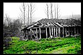
Critique By:
martijn wams (K:6351)
4/15/2006 12:49:43 PM
It's a good idea to put the house in black and white, it gives it a feeling that its lost and forgotten.It might be a good idea to bring the color back in the sky as well. To emphasize the house. whereas now the sky gets equal attention as the house. Regards, Martijn
|
| Photo By: Cem Güner
(K:452)
|
|
|
Critique By:
martijn wams (K:6351)
4/12/2006 2:01:23 PM
great idea, and well executioned (no pun intended) The bear looks a bit sad going to heaven. I love the long crop with the blinds. well done.
|
| Photo By: Derek Bair
(K:1530)
|
|
|
Critique By:
martijn wams (K:6351)
4/12/2006 1:59:05 PM
great shot, because of the composition it looks like the bird is actually standing on the overhanging pole's reflection. Well seen. good work
|
| Photo By: Hankel O'Fung
(K:513)
|
|
|
Critique By:
martijn wams (K:6351)
4/12/2006 1:57:25 PM
beautiful artwork, a great sensitivity you've created here. well done
|
| Photo By: Alyona Nesterova
(K:15)
|
|
|
Critique By:
martijn wams (K:6351)
4/12/2006 1:54:41 PM
Indeed, i'd love to wake up to this sight in the morning. Great overall tone and light/shadow work. congrats
|
| Photo By: Kiko Blos
(K:27)
|
|
|
Critique By:
martijn wams (K:6351)
4/12/2006 1:44:46 PM
I love how the hole is still open at the bottom and already closed towards the top. It creates an unusual vision that goes well with the person at the other side, who you only see when you search for him. great idea, well done
|
| Photo By: drilan P drilan
(K:12030)
|
|
|
Critique By:
martijn wams (K:6351)
4/12/2006 1:32:01 PM
beautiful perspective and great symmetrie. An unusual symmetrie when it concerns railwaytracks, which makes it even more interesting to watch. Well spoted. congrats
|
| Photo By: Andreas Marx
(K:1443)
|
|
|
Critique By:
martijn wams (K:6351)
4/12/2006 1:27:39 PM
great use of color and overall tone, it has indeed got that urban feel to it. the loneliness and despair of the girl goes great with the setting. It's all verry depressing, and the grain really brings that further out. Well done
|
| Photo By: Urban_cat K.
(K:25)
|
|
|
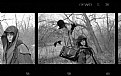
Critique By:
martijn wams (K:6351)
4/12/2006 1:09:25 PM
I like the collage idea. It seems to split the middle picture in two parts as well. the photo's each have great composition and use of color. the framework might use some shadow work on the left and above the photo's. To create a feeling the are placed in. Now it is neither in nor on the background. great work on the photos, congrats
|
| Photo By: Hugo de Wolf
(K:185110)
|
|
|
Critique By:
martijn wams (K:6351)
4/12/2006 12:50:38 PM
I like the colors and the darkness you've created. And it gives the photo an overall good atmosphere. But I think the contrast is a bit to big for the top sky and clouds in the picture. Love the sunrays, though (probably the result of the strong contrast, i know you can't have it all) good work. kind regards
|
| Photo By: rahim yalcintas
(K:730)
|
|
|
Critique By:
martijn wams (K:6351)
4/12/2006 12:47:03 PM
great composition, I like it how one side is hidden out of the frame and the other by the flowerpeddles. And the reflection in the eye is the great centerpiece.How on earth did you create that. It's like a whole other world is in her eye, maybe its her innerworld, her identity, to go along with the idea. great work, well done
|
| Photo By: Nicholla Briggs
(K:121)
|
|
|
Critique By:
martijn wams (K:6351)
4/12/2006 12:42:54 PM
great shot, well spotted. I really like the open window. Didn't you just hate it that the windows weren't put in the center of the building, would have brought a bit more symmetrie. Although now it has an a-symmetrie that has it's own appeal. annyways, great work. Kind regards, martijn
|
| Photo By: Vlad Sournine
(K:2397)
|
|
|
Critique By:
martijn wams (K:6351)
4/12/2006 12:39:07 PM
verry funny, this shot, good composition as well. I like it in the black and white tones, but still curious how the legs are different in color to the rest of the costume. kind regards Martijn
|
Photo By: Tony Hunter
(K:4647)

|
|
|
Critique By:
martijn wams (K:6351)
4/12/2006 12:35:49 PM
wonderfull idea, it's a childrens book story in one photograph. there is so much imagery in here. great work
|
| Photo By: Marino Thorlacius
(K:57)
|
|
|
Critique By:
martijn wams (K:6351)
4/12/2006 12:33:40 PM
lovely tones, I like the idea of tone-opposites going with the background dark and light opposites. And great focus as well. just to bad the light strip is just a bit to bright. otherwise great job.
|
| Photo By: David Nahum
(K:403)
|
|
|
Critique By:
martijn wams (K:6351)
4/12/2006 12:27:48 PM
You've created an amazing sence of depth here. The branches seem to move if I look from one place to the next, really magical. The overall tone is great, but all prais to the overall focus. Well done
|
| Photo By: Larry Fosse
(K:66493)
|
|
|
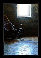
Critique By:
martijn wams (K:6351)
4/12/2006 12:24:38 PM
I really like the composition and the dark tones. The playing with light and darkness is wellthought and placed. Only I find the light bits a bit to staleblue on the floor and the chair. Maybe you can take out the blue a bit. Otherwise, good work. congrats
|
| Photo By: selami Torun
(K:9397)
|
|
|
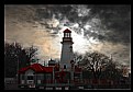
Critique By:
martijn wams (K:6351)
4/7/2006 8:39:53 PM
great sky you've captured here. I love how you've put the blue bit of sky behind the tower. And great use of less color.
|
| Photo By: Sally A.
(K:4601)
|
|
|
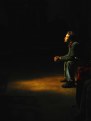
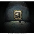
Critique By:
martijn wams (K:6351)
4/7/2006 4:08:52 PM
great surrealistic lighting and colouring you've created here. The photo itself looks like a painting. The lighting is so well done, put in the center in such a dark place. great work
|
| Photo By: lubomir
(K:938)
|
|
|
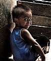
Critique By:
martijn wams (K:6351)
4/7/2006 4:05:24 PM
lovely idea. good crop for a head to head with the world. And you've captured a surtain tenderness that i like and think we all should have regarding the rest of the world. Well done
|
| Photo By: marília campos
(K:517)
|
|
|
Critique By:
martijn wams (K:6351)
4/7/2006 4:02:19 PM
great shadow/light work. The skintones are great. The crop is a bit to tight on the bottom but the composition in itself is verry nicely done. congrats.
|
| Photo By: lius hanzen
(K:2844)
|
|
|
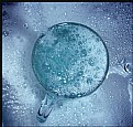
Critique By:
martijn wams (K:6351)
4/7/2006 3:58:51 PM
I've tried photograph bubbles, and I know how hard it is. It's easier when its on a surface like here. But still you've got a great focus on the bubble here that is verry hard to get. well done
|
| Photo By: Patricia Gerstel
(K:437)
|
|