|
|
Critique By:
Jenny Brown (K:2859)
2/17/2003 12:08:02 PM
More contrast could help this a bit; a darker green behind it, somewhat more 'glowing' lighting. It may take some experimentation to make that work tho.
|
| Photo By: Karen Johnson
(K:2951)
|
|
|
Critique By:
Jenny Brown (K:2859)
1/15/2003 12:07:39 PM
This feels too rich in color saturation. You've set the contrast as if the image had faded over time. When that occurs, any sepia toning fades with it, to a lighter color and much less saturation. In this case you have one aspect enhancing its look of age and the other working against it.
Here's a guess at an enhancement; it could go even farther though. Alternatively if you want to keep the rich color, try leaving more darkness in his shirt and more contrast in the overall image.
|
| Photo By: Michael Cockrell
(K:89)
|
|
|
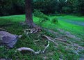
Critique By:
Jenny Brown (K:2859)
11/22/2002 8:02:14 AM
The pic was mainly an exploration of low-light... the camera could pick up much more subtlety than my eyes could, and thus saw a glow I could barely pick out. If I'd realized how successful the picture was going to be, I'd have moved slightly left and focused a bit more on the tree, roots, and rock, which were my main subject.
|
| Photo By: Jenny Brown
(K:2859)
|
|
|
Critique By:
Jenny Brown (K:2859)
11/22/2002 7:50:13 AM
The color combination is neat, but it feels underexposed. The blackness in the clouds is kind of overwhelming.
|
| Photo By: Greg Summers
(K:1115)
|
|
|
Critique By:
Jenny Brown (K:2859)
11/22/2002 7:37:35 AM
What did you do to get that intense saturation? Were there any digital enhancements, or was it this bright on print film? That color is pretty amazing.
|
| Photo By: Scott Hamming
(K:106)
|
|
|
Critique By:
Jenny Brown (K:2859)
11/21/2002 9:04:07 AM
A diffuser to picture left would soften the glare on her shoulder and balance the light better. You might also consider adding rim lighting to the hair to make it glow slightly. Good pose and colors though; with a few final touches you could have some really wow images.
|
| Photo By: Kristupa Saragih
(K:1031)
|
|
|
Critique By:
Jenny Brown (K:2859)
11/20/2002 2:10:34 PM
Interesting but way too dark. It feels underexposed. Is there a feeling you were trying to get this way? If you give information on your intent, I might be able to make a lighting recommendation to help you achieve it.
|
| Photo By: Maralana D Hay
(K:24)
|
|
|
Critique By:
Jenny Brown (K:2859)
11/20/2002 2:05:13 PM
Eeek, it's staring back at me! Fascinating interplay of textures and colors. Almost slightly too dark for me though. Maybe that's a scanning issue, I don't know.
|
Photo By: Tony Smallman
(K:23858)

|
|
|
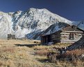
Critique By:
Jenny Brown (K:2859)
11/20/2002 2:00:32 PM
The colors and sharpness are excellent, but I find the composition somewhat cramped and awkward. The building is sort of falling off the edge on the right, and something else is intruding (though I can't easily tell what that stuff is). It's not clear if you're taking a picture of the mountains or of the building; which is foreground and which is background. If you made that more clear I think it would be a very strong image.
|
| Photo By: Gregg Lowrimore
(K:2)
|
|
|
Critique By:
Jenny Brown (K:2859)
11/20/2002 1:58:21 PM
The color is neat but the lighting is somewhat bland. I realize it's hard to get a colored sky with the November cloudiness, but if you could make it back on a day with some blue in the sky it may help. It would also be nice to see more detail on the dark areas, though maybe that's a side effect of the scan.
|
| Photo By: Joanna Pecha
(K:16)
|
|
|
Critique By:
Jenny Brown (K:2859)
11/20/2002 1:56:35 PM
Her expression is wonderful but the white thing in the foreground is kind of distracting. Could you have moved a bit to get around it? Otherwise pretty neat.
|
| Photo By: Kristupa Saragih
(K:1031)
|
|
|
Critique By:
Jenny Brown (K:2859)
11/20/2002 1:54:57 PM
Amazing color and shape; so how did you get the gods to offer up such a beautiful firey cloud for you?  I assume persistence paid off. I assume persistence paid off.
|
| Photo By: Greg Summers
(K:1115)
|
|
|
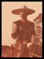
Critique By:
Jenny Brown (K:2859)
11/20/2002 12:52:49 PM
Wonderful skin detail; the sharpness really does him justice. He looks fascinating and makes me want to learn more about him.
|
| Photo By: Loyce D. Hood
(K:1859)
|
|
|
Critique By:
Jenny Brown (K:2859)
11/20/2002 12:40:45 PM
Fascinating play on words. I really like this image, simply because it melts so beautifully.
|
| Photo By: Jon Rank
(K:683)
|
|
|
Critique By:
Jenny Brown (K:2859)
11/20/2002 12:36:24 PM
The lighting in this is fascinating, as well as the apparent tenderness of the setup. The light sky behind the head is kinda weird, but the glow on the beard and the dog's face are very nice. The colors and sharpness add to that glow.
|
| Photo By: Gary Petersen
(K:383)
|
|
|
Critique By:
Jenny Brown (K:2859)
11/20/2002 12:28:13 PM
Er, makes the /creature/ look more active. Silly typos.
|
| Photo By: lino alvarez
(K:4)
|
|
|
Critique By:
Jenny Brown (K:2859)
11/20/2002 12:27:02 PM
Good composition, considering how hard to photography these birds tend to be. I would have liked less graininess, but having used a digital zoom myself to reach these guys on occassion, I can appreciate that sometimes you just can't get close enough. The juxtaposition of nature and man-made stuff does make for an interesting picture. Were you lucky enough to get a pic with the bird's wings spread? I try to hang around long enough to get that (tho it's tough timing sometimes) because it makes the create look more active.
|
| Photo By: lino alvarez
(K:4)
|
|
|
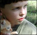
Critique By:
Jenny Brown (K:2859)
11/20/2002 12:23:57 PM
The title comes across as a bit corny, but the photo itself has a strong impact of shared childhood. They're both looking out (in wonder?) at the field and its possibilities. I'm sure they will have plenty of good times together, and the composition really emphasizes their similar youth. Perhaps a slightly less tight crop, to give more a feeling of opportunity and expansiveness, but having the kitty close to his face is very wonderful.
|
| Photo By: Kimberly Adams
(K:87)
|
|
|
Critique By:
Jenny Brown (K:2859)
11/20/2002 12:12:13 PM
Wonderful pose and softness; rim lighting here would add an accent to mom's hair and make things just a bit livelier.
|
| Photo By: April Nabours
(K:0)
|
|
|
Critique By:
Jenny Brown (K:2859)
11/20/2002 12:09:37 PM
I think it's the shadowed eyes and lack of catchlight that makes both their faces look menacing. The child is also sort of staring at the stick which makes it more a focus too.
|
| Photo By: April Nabours
(K:0)
|
|
|
Critique By:
Jenny Brown (K:2859)
11/20/2002 12:05:16 PM
The setting is nice but I think it can benefit from increased depth of field. As soft as the background is, I see winter instead of summer, especially with her long shirt, and lack of detail in the trees. More focus detail would really help.
|
| Photo By: April Nabours
(K:0)
|
|
|
Critique By:
Jenny Brown (K:2859)
11/20/2002 11:49:01 AM
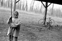
Your title for this one makes it seem to include so much more than the picture shows... what is broken? how? how does it impact the girl? Here she is just glancing at the camera, sort of plain, but there is so much more you can probably show of her surroundings, that would make it closer to an environmental portrait. I think you can take this idea much farther.
|
| Photo By: April Nabours
(K:0)
|
|
|
Critique By:
Jenny Brown (K:2859)
11/20/2002 11:46:48 AM
This is a neat combination of mom and baby; but mom's hair vanishes in the background, and baby vanishes at the edge. You might try investigating 'rim lighting' for mom's hair, as it will give a slight glow to the edge of her hair so the shape stays clear. Basically, the idea is to put a light behind her (where she completely blocks it from the camera's view) that leaks just a bit of light over the edges of her hair and shoulders. Likewise, including just a bit of dark background next to the baby would stop its shape from running off the edge of the picture.
|
| Photo By: April Nabours
(K:0)
|
|
|
Critique By:
Jenny Brown (K:2859)
11/20/2002 11:09:24 AM
I really like the lighting; the flower petals nearly glow. I find the shape slightly awkward though; the bottle itself has a very strong shape, which is interrupted somewhat abruptly by the flower petal on the left. That results in a feeling of the bottle being lopsided. If I saw the entire bottle shape, or it was equally interrupted on the right, it'd be a more comfortable picture. The red glow is unusual, and I can't quite figure out what it was meant to be. The overall bottle and flower lighting is excellent though.
|
| Photo By: Greg Summers
(K:1115)
|
|
|
Critique By:
Jenny Brown (K:2859)
11/20/2002 11:05:35 AM
This is really neat; the backlight/sidelight makes the petals glow. Just where I would normally see it losing focus (due to depth of field) instead there is something just as interesting going on with the neat lighting. The combination of light and depth of field balances so well, I can't see anything to improve on it there. I do feel the cropping at the top edge is slightly tight; tho I only notice that after I get over the WOW of the colors/shape.
|
| Photo By: Marja Konimaki
(K:178)
|
|
|
Critique By:
Jenny Brown (K:2859)
9/21/2002 7:22:09 PM
This is a pretty cool picture. There's something catching about it that I like; it draws me in. You might want to work with your scans a bit more though with the Adjust Levels command... your blacks aren't quite black. Here's an example of a fixed one, which hopefully is more like your original print.
|
| Photo By: Dylan Davies
(K:362)
|
|