|
|
Critique By:
Don Figaro (K:1109)
2/19/2004 1:29:22 PM
Excellent!!!!!!!!
Good shot!!!!!!
Regards
Ricsi
|
| Photo By: Paul Groff
(K:10)
|
|
|
Critique By:
Don Figaro (K:1109)
2/16/2004 2:49:43 PM
Excellent!!!!!!!
Regards Richi
|
| Photo By: Paul Groff
(K:10)
|
|
|
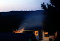
Critique By:
Kim Culbert (K:37070)
1/28/2004 11:18:57 AM
It's got an interest abstract feel to it, but I need something in focus! Fireworks can be hard to capture though...
|
| Photo By: Paul Groff
(K:10)
|
|
|
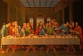
Critique By:
Gary Gantert (K:2104)
12/5/2003 11:22:48 AM
When I shoot copywork I put a softbox on either side far enough away that no reflections show.
The key is to meter. Make sure the light is even, side to side and top to bottom.
|
| Photo By: Paul Groff
(K:10)
|
|
|
Critique By:
angger bondan k (K:50)
9/5/2003 7:34:01 AM
Nice moment
|
| Photo By: Paul Groff
(K:10)
|
|
|
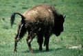
Critique By:
Girish Menon (K:1384)
6/1/2003 5:04:09 AM
o man! is the pee digital? i guess it is.
|
| Photo By: Paul Groff
(K:10)
|
|
|
Critique By:
Mike Marcotte (K:3948)
5/11/2003 7:25:26 PM
I laughed out loud when I saw this.
|
| Photo By: Paul Groff
(K:10)
|
|
|
Critique By:
Brad Morris (K:3307)
5/4/2003 11:17:15 PM
Lens Flare looks a little out of place here but from the realism point of view. It does combine to make an interesting abstract though
|
| Photo By: Paul Groff
(K:10)
|
|
|
Critique By:
Rob Patrick (K:2177)
4/27/2003 1:41:13 PM
And just a nifty photograph!
|
| Photo By: Paul Groff
(K:10)
|
|
|
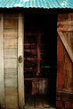
Critique By:
Rob Patrick (K:2177)
4/27/2003 1:36:50 PM
Good subject! I like the texture of the old wood.
|
| Photo By: Paul Groff
(K:10)
|
|
|
Critique By:
Mário Sousa (K:16985)
4/21/2003 1:00:24 AM
beautiful
|
| Photo By: Paul Groff
(K:10)
|
|
|
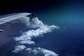
Critique By:
Larry J. Rhodes (K:2441)
11/3/2002 7:56:06 AM
Paul,
I like this picture...even the blue color cast from the cloud coverage adds a nice mood of coldness to it...almost loneliness, I guess. It's just tilted slightly to the left, so I decided to go ahead and rotate it...and, while I was at it, I thought I'd see what it looks like with a little more white balance. Attached is what I did to it. 
|
| Photo By: Paul Groff
(K:10)
|
|
|
Critique By:
Paul Groff (K:10)
10/5/2002 2:02:09 AM
Hi Roy, I'll (Debbie) answer for Paul. He doesn't like to type very much The color is due to the airplane window and how the light was hitting the window Also underneath the clouds-you can barely see it-is the landscaping of San Diego.
|
| Photo By: Paul Groff
(K:10)
|
|
|
Critique By:
Russ Cooper (K:759)
10/4/2002 9:23:39 PM
This is real interesting. It's obviously daytime (isn't it?) ... what made the sky black in the upper left and the greenish glow in the upper right?
|
| Photo By: Paul Groff
(K:10)
|
|
|
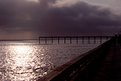
Critique By:
Sarah Needham (K:2482)
9/15/2002 6:05:00 AM
I like the lines in this. The way the pavement takes your eye to the pier, then your eye goes down the pier and settles on the light on the water. Very nice.
Sarah
|
| Photo By: Paul Groff
(K:10)
|
|
|
Critique By:
Paul Groff (K:10)
9/11/2002 4:25:17 PM
this lighthouse was the first one built in San Diego,in the 1800's.It sits on top of a hill so it got fogged out alot. I grew up here so I used to ride my bike here all the time.
|
| Photo By: Paul Groff
(K:10)
|
|
|
Critique By:
Joe McCary (K:3235)
9/10/2002 8:45:31 PM
I love it! I can almost hear the sels off to the south barking! Good job.
|
| Photo By: Paul Groff
(K:10)
|
|
|
Critique By:
Sue O'S (K:12878)
9/10/2002 10:47:07 AM
Very cool sky! I agree with John about having more space above the ventilator ball and lightning rod.
Classic shot of a classy lighthouse.
|
| Photo By: Paul Groff
(K:10)
|
|
|
Critique By:
John Myers (K:4308)
9/10/2002 9:55:46 AM
oh, forgot to say it in previous post...i LOVE that sky! simple, dark, and beautiful.
|
| Photo By: Paul Groff
(K:10)
|
|
|
Critique By:
John Myers (K:4308)
9/10/2002 9:53:06 AM
beautiful and the colors go very well together. but, however, my eye would like to see a tad more foreground and a tad more sky on top. perhaps a slightly wider lens would suit this shot more.
|
| Photo By: Paul Groff
(K:10)
|
|
|
Critique By:
Dave Holland (K:13074)
8/24/2002 7:29:44 PM
Nicely framed, Paul.
|
| Photo By: Paul Groff
(K:10)
|
|
|
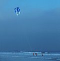
Critique By:
Ken Alexander (K:3905)
8/24/2002 8:03:23 AM
I like the all-blue color scheme in this--it makes the people stand out.
|
| Photo By: Paul Groff
(K:10)
|
|
|
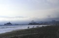
Critique By:
John Charlton (K:5595)
8/21/2002 1:47:58 PM
Nice shot Paul. The horizon doesn't bother me here but for me there seems to be too much sky. I love the feel of it all the same and wish I had been there.
|
| Photo By: Paul Groff
(K:10)
|
|
|
Critique By:
Sylvain Pearson (K:259)
8/21/2002 11:18:34 AM
This picture is technically correct. I would have like the subject to be in a different color then the background...
but I know it was out of your control!
|
| Photo By: Paul Groff
(K:10)
|
|
|
Critique By:
Debbie Groff (K:9569)
8/20/2002 10:27:08 PM
LOL Dawna and Robert...The wave behind me seemed so so so much bigger than the picture shows..I'm holding my arms out because I thought when the wave hit me I would get all washed up
|
| Photo By: Paul Groff
(K:10)
|
|
|
Critique By:
Toni Martin (K:5092)
8/20/2002 5:33:10 PM
Paul, I love the mood of this image, the mist and people. Be sure to check the horizon on this one though, it looks a little tilted to the right. Still, a nice image.
|
| Photo By: Paul Groff
(K:10)
|
|
|
Critique By:
Ken Alexander (K:3905)
8/20/2002 8:36:57 AM
Great job making the best of a rather blah sky condition. Nice tones set a definite mood. Well executed!
|
| Photo By: Paul Groff
(K:10)
|
|
|
Critique By:
Danny Provost (K:812)
8/13/2002 4:52:05 PM
Nice photo,I like soft look
|
| Photo By: Paul Groff
(K:10)
|
|
|
Critique By:
Nicholle Kuzniak (K:98)
8/13/2002 6:33:43 AM
Nice moment captured. The photo looks a little out of focus.
|
| Photo By: Paul Groff
(K:10)
|
|
|
Critique By:
Dave Holland (K:13074)
8/13/2002 6:28:40 AM
I like the inclusion of the crowd. The sun feels static, dead center. Did you try different crops?
|
| Photo By: Paul Groff
(K:10)
|
|