|
|
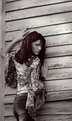
Critique By:
David N. VanMeter (K:552)
8/21/2002 3:44:55 AM
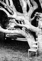
I am with you Vincent. Personally I wouldn't change a thing. I don't like photographs that are textbook studies of the rules of photography anyway. Sometimes you just need to let all of that go and ask yourself if you like it. If the answer is yes then nothing else matters. However, just to prove I can still pick nits with the best of them. I would move that top crop down one clapboard and balance the amount of wall on the top and right. :-)
|
| Photo By: matt fruge
(K:83)
|
|
|
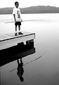
Critique By:
David N. VanMeter (K:552)
8/16/2002 5:24:38 PM
This is a stunner! I just wish the horizon were straight.
|
| Photo By: Pete Kinser
(K:106)
|
|
|
Critique By:
David N. VanMeter (K:552)
8/16/2002 5:57:28 AM
Thats as opposed to the unleaded variety. I meant LED not LEAD. Blame Led Zeppelin.
|
| Photo By: William R Eastman III
(K:2141)
|
|
|
Critique By:
David N. VanMeter (K:552)
8/16/2002 5:56:16 AM
Let me add to my previous comment. After looking at this again, the bowler is lead fine. Whats throwing my eye off is the other bowlers.
|
| Photo By: William R Eastman III
(K:2141)
|
|
|
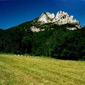
Critique By:
David N. VanMeter (K:552)
8/16/2002 4:38:58 AM
There is little of visual interest here. Unless you have a long lens or actually climb the rocks there is little of visual interest to photograph of the rocks themselves anyway. I tried on numerous occasions to come up with something here on the 8x10 camera and about the best place to shoot from was the visitor center. I have been on top of these rocks (many years ago) and they are much more dramatic up close.
|
| Photo By: Joe Shupienis
(K:19)
|
|
|
Critique By:
David N. VanMeter (K:552)
8/16/2002 4:26:39 AM
I normally have a dislike for "flower" picture but this caught my eye. I disagree that the top is too hot I like that spike of light energy. My eye follows the darkest parts at the bottom to the that spot at the top. I will grant that there is not a lot of reasons to stay in the picture but the pattern and color/light ranges are excellent.
|
| Photo By: Maarten Venter
(K:885)
|
|
|
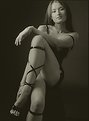
Critique By:
David N. VanMeter (K:552)
8/16/2002 4:22:55 AM
I am immediately drawn to the model by the convergent lines of the background. I have no problems at all with this background but then I never liked rules. Excellent model, what a face!
|
| Photo By: Andy R.
(K:74)
|
|
|
Critique By:
David N. VanMeter (K:552)
8/16/2002 4:20:32 AM
I always wondered what happened to has-been cricket players. :-). I think I would have lead the image just a hair more. The action of the bowler seems to be stifled by the left side of the image.
|
| Photo By: William R Eastman III
(K:2141)
|
|
|
Critique By:
David N. VanMeter (K:552)
8/16/2002 4:16:46 AM
People can say what they want but I would have shot this too. I have shot similar things and been yelled at for it. Good job Chelsea. I will post my version.
|
Photo By: Chelsea Burke
(K:5750)

|
|
|
Critique By:
David N. VanMeter (K:552)
8/16/2002 4:13:00 AM
Interesting but the high number of out of focus trees in the foreground makes my eyes hurt when I try to look at the image. They keep trying to focus on those trees. As "landscapes" go, this is a case of "I can't see the outhouse for the trees"
|
| Photo By: Scott J Machalk
(K:173)
|
|
|
Critique By:
David N. VanMeter (K:552)
8/16/2002 4:10:19 AM
Let me first say that I really like this portrait. It is very well conceptualized. My only minor gripe in execution is that, although there is detail in the shadow, her eye in the shadow has no life. I am also slightly distracted by the appendage(?) above-right of her arm. Its more of a case of "what is that?" The roundness of the shoulder is very well done though. Excellent results with the Delta 3200, btw
|
| Photo By: vivek dhar
(K:25)
|
|
|
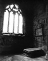
Critique By:
David N. VanMeter (K:552)
8/14/2002 11:29:56 AM
The window may be a little crooked but I attribute most of the distortion to wide-angle keystoning.
|
| Photo By: David N. VanMeter
(K:552)
|
|
|
Critique By:
David N. VanMeter (K:552)
8/14/2002 9:44:42 AM
This is really nicely executed but I have one nitpicky observation. I have not been able to take my eye off of her nose. The dark shadowing to the left of the nose is really making the bump on her nose stand out. I wouldn't take this observation to much to heart though because it could just be my psyche at work.
|
| Photo By: Phillip Filtz
(K:1792)
|
|
|
Critique By:
David N. VanMeter (K:552)
8/14/2002 3:37:02 AM
That was my feeling about this too. However there was not much I could do about the background except use less DOF which was another after thought I had. If I were digitally inclined I am sure there is someting I could do about that background. I think this is going to be one of those images I learned a hard lesson about bad technique from no matter what my intentions were toward it.
|
| Photo By: David N. VanMeter
(K:552)
|
|
|
Critique By:
David N. VanMeter (K:552)
8/13/2002 4:32:27 AM
Thanks for the comments. I would have loved to have gotten rid of that bush as well but I was standing on a rocky outcropping and was limited to where I could go and still maintain some compositional integrity. I would have loved to have a cherry picker and gotten some elevation on the scene. If any one is wondering this was shot from Java Point in Craignure on the Isle of Mull
|
| Photo By: David N. VanMeter
(K:552)
|
|
|
Critique By:
David N. VanMeter (K:552)
8/13/2002 4:27:22 AM
Thanks everyone for your comments. I am wholly aware of the horizon tilt as this was a "shoot from the hip" situation. This is the proof and I figured some day when I got a better print made by a good lab I would get that problem fixed. This is the only picture that really worked because after this the swans moved off and had their heads under water feeding. I do agree that cropping from the right would be an interesting idea.
|
| Photo By: David N. VanMeter
(K:552)
|
|
|
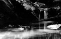
Critique By:
David N. VanMeter (K:552)
8/12/2002 4:57:52 PM
No filters were used in this shot. Done around 8:30 in the evening near the end of May.
|
| Photo By: David N. VanMeter
(K:552)
|
|
|
Critique By:
David N. VanMeter (K:552)
5/14/2002 11:51:19 AM
I'm with you on this one Koen. Very static. Just not enough visual interest for me.
|
| Photo By: Rodney R Collard Sr
(K:4)
|
|
|
Critique By:
David N. VanMeter (K:552)
5/14/2002 11:49:51 AM
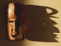
I always enjoy this type of high-contrast play with shadows. Almost makes me want to stucco the wall for a little rougher texture... but that would be work.
|
| Photo By: Kevin Lamb
(K:0)
|
|
|
Critique By:
David N. VanMeter (K:552)
5/12/2002 4:20:41 AM
Really superb. I have to admit the thumbnail gave me a giggle because I thought it was a "grey" alien. Keep up the "no digital stuff". Excellence of craft does not need fixing.
|
| Photo By: dimitris theocharis
(K:-276)
|
|
|
Critique By:
David N. VanMeter (K:552)
5/12/2002 4:16:02 AM
As portraits go its nice but I agree that the antenna an windmills in the background are vey distracting and contradictory to your purpose. I don't think cropping will help because of the antenna being next to her head.
|
| Photo By: Sabine Stiebritz
(K:94)
|
|
|
Critique By:
David N. VanMeter (K:552)
5/12/2002 4:11:34 AM
Very nice placement of elements but the scan does not show any detail in the large black area on the right. Check your neg and see if you picked up anything there and dodge just a little to bring it up. If its the scan, I understand completely.
|
| Photo By: Jason McClendon
(K:19)
|
|
|
Critique By:
David N. VanMeter (K:552)
5/7/2002 6:02:53 AM
The thumbnail caught my eye but when I opened the larger size I was kind of disappointed by the lack of shadown detail.
|
| Photo By: Joseph Rushmore
(K:240)
|
|
|
Critique By:
David N. VanMeter (K:552)
5/7/2002 6:00:18 AM
This is one of those images that produces a variety of opinions because of how the individiual interprets the lines. I would say that to apply the rule of thirds horizontally and vertically to the heavy, bolted lines would make this more interesting. Otherwise great idea.
|
| Photo By: Marcus Edwards
(K:19)
|
|
|
Critique By:
David N. VanMeter (K:552)
5/3/2002 4:31:28 AM
Good eye. What really caught my eye on the thumbnail was what I thought was a tree growing in front of an arch. I was wrong however the column and vines does give the impression of a huge tree with its foliage drooping toward the ground. Nice construct.
|
| Photo By: Victor Ginzburg
(K:53)
|
|
|
Critique By:
David N. VanMeter (K:552)
5/3/2002 4:28:18 AM
Very little I can say but excellent. You should be very happy with this image.
|
| Photo By: Henri Gustav Eftevand
(K:10)
|
|
|
Critique By:
David N. VanMeter (K:552)
5/2/2002 12:07:02 PM
Sweet shot. Nicely done.
|
| Photo By: Chris Lawrence
(K:124)
|
|
|
Critique By:
David N. VanMeter (K:552)
5/2/2002 10:32:52 AM
I have this tendency to want to 2nd guess a photograph and say, "Gee, I would like to see this over here...", etc. So, before I do that let me say I really really like this. IF I were to have had any input in this I would have hoped for the leafy cluster in the upper left to be in upper right or I would have hoped for a cloud to be in that open sky space. IR Rules!
|
| Photo By: Christine Huie
(K:63)
|
|
|
Critique By:
David N. VanMeter (K:552)
5/2/2002 9:09:17 AM
Yes Koen, a Holga is an abberation but we love it anyway. :-)
|
| Photo By: Ted Williams
(K:324)
|
|
|
Critique By:
David N. VanMeter (K:552)
5/2/2002 6:32:44 AM
I agree with the previous two posts except one little thing that bugs me. I wish the crop wasn't so tight at the top of the head. Other than that you are right on the money IMHO.
|
| Photo By: Chris Blaszczyk
(K:610)
|
|


 talukder")