|
|
|
Nikki Whyburn
{K:859} 4/14/2007
|
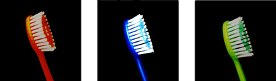
Thanks for the comment Emily. I know, the blue one turned out really bright compared to the other toothbrushes. It was a bit harder to photograph cause it blended in too much with the black background.
Peace, Nikki.
|
|
|
|
|
emily swann
{K:96} 4/13/2007
|
i like the range of colours the blue is a bit to bright but thats ok if the blue was placed on the sides it wouldn't work as well
|
|
|
|
 Megan Irwin
{K:1666} 12/18/2006
Megan Irwin
{K:1666} 12/18/2006
|
Thanks for your very thoughtful comment nikki. :)
I like this image. I would love to see it larger though. I agree with soph, one of them should be changed around. I suggest turning one of them black and white in high contrast, and then flipping it like soph said. But other than that, I really like it. The title is really imaginative too. A good title is key to a good photograph.
Cheers
Meg
|
|
|
|
|
Nikki Whyburn
{K:859} 12/18/2006
|
Thanks. The blue toothbrush is too bright, I agree, but it was kind of hard to get the lighting right for that one. I might have a go at rotating on of the toothbrushes like you suggested. Thanks.
Nikki.
|
|
|
|
 Sophie King
{K:3250} 12/18/2006
Sophie King
{K:3250} 12/18/2006
|
This is good but i think its too uniform. One should be placed a different way. The blue is also a tad too bright, detracting from the other 2 toothbrushes. Perhaps flip the green toothbrush horizontally so its facing the other way, just to make it a little more quirky.
Good job and a great idea,
-Soph
|
|