|
|
|
Erik Shea
{K:1600} 9/8/2005
|
Thank you Judi, and I totally understand. I wouldn't want someone taking any of my images either, especially pawning it off as their own.
|
|
|
|
 Judi Liosatos
{K:34047} 9/8/2005
Judi Liosatos
{K:34047} 9/8/2005
|
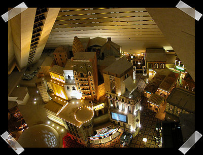
Fantastic capture. That is definitely something I won't see in my home town. We have a college that is three storeys high. And a few houses that are two storeys...but nothing other than that. Thankyou for sharing with us. I like the lighting very much.
Please don't worry too much about the wrong impression over Sunset Garden. You weren't to know...but at the same time I wasn't going to let that person take the credit for that image and especially not allow him to put his copyright on it...LOL!!
Judi
|
|
|
|
 John Nobody
{K:4914} 9/3/2005
John Nobody
{K:4914} 9/3/2005
|
Interesting composition
|
|
|
|
|
Erik Shea
{K:1600} 8/20/2005
|
Thank you Carsten, I like color better also. Its amazing what they can put inside one of those casinos.
|
|
|
|
|
Carsten Ranke
{K:14476} 8/20/2005
|
Intriguing shot, this perspective is puzzling, makes me dizzy... Color is better IMO, separates the structures better than they come out in B&W. Nice one !
|
|
|
|
|
Erik Shea
{K:1600} 5/9/2005
|
Thank you Peta, I like the color much better as well. The elevators were very odd, but its the only time I've ever been ones that didn't just go straight up.
|
|
|
|
 p e t a .
{K:18700} 5/9/2005
p e t a .
{K:18700} 5/9/2005
|
awesome, I stayed at the luxor...the elevators were weird hey! great shot, colour is best.
|
|
|
|
|
Erik Shea
{K:1600} 5/4/2005
|
Thank you Eduard
|
|
|
|
|
Erik Shea
{K:1600} 5/4/2005
|
Thank you Lea, everyone has such wonderful frames out there and I was trying to find something that would be nice and cool at the same time. I'll keep looking for a nice frame and signature..
|
|
|
|
|
Erik Shea
{K:1600} 5/4/2005
|
thanks erkoc, I like the color better as well, I don't like many of my shots in BW and this was Ok, and Rob told me to get some opinions. Glad everyone likes the Color better.
|
|
|
|
|
Erik Shea
{K:1600} 5/4/2005
|
Thanks Girish
|
|
|
|
|
Lea Mulqueen
{K:7396} 5/4/2005
|
Soper shot! I much prefer the color version. The tape doesn't do much for me but I seem to be in the minority with that opinoion. :-)
|
|
|
|
 Eduard Nikoliqi
{K:556} 5/4/2005
Eduard Nikoliqi
{K:556} 5/4/2005
|
Great shot!
|
|
|
|
|
erkoc dalaman
{K:4295} 5/4/2005
|
Very cool image and tape effect..Both is very good but coloured is better I guess..congrats..
|
|
|
|
|
Girish Chonkar
{K:6903} 5/4/2005
|
Definitely the color version is better. good photograph.
|
|
|
|
|
Erik Shea
{K:1600} 5/4/2005
|
Thank you Allan, I believe I like the color one better too, it is amazing what they do in those casino/hotels.
|
|
|
|
|
Erik Shea
{K:1600} 5/4/2005
|
Thanks Melody
|
|
|
|
|
allan basik
{K:434} 5/4/2005
|
great shot.
1st i like the color better.
i've been there and i do't remember it looking so cardboard, but your photo brigs out the truth of the place. it looks like an architectural model potograghed through a model scope. very very nice.
ab
|
|
|
|
 Melody Russell
{K:1089} 5/4/2005
Melody Russell
{K:1089} 5/4/2005
|
I like the effect with the tape. Very cool!
|
|
|
|
|
Fayez Arthy
{K:401} 5/4/2005
|
wooooooooooow very nice
|
|
|
|
|
Erik Shea
{K:1600} 5/4/2005
|
I don't typically play with BW, but wanted to get some opinions on which looks better.
|

|
|