|
|
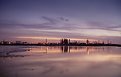
Critique By:
Kevin Collier (K:19076)
11/23/2004 6:03:20 AM
really a cool sureal image -- well done - K
|
| Photo By: Tim Bailey
(K:-467)
|
|
|
Critique By:
Alastair Bell (K:29571)

11/23/2004 12:57:27 AM
You have a great portfolio but this one stands out for me! Excellent PS work too!
|
| Photo By: Tim Bailey
(K:-467)
|
|
|
Critique By:
baYu6wqlPP vH612wLkPsS (K:2519)
11/21/2004 11:20:52 PM
Yeah, amazing, everywhere we are surrounded by beauty. Well seen and taken, technically excellent.
|
| Photo By: Tim Bailey
(K:-467)
|
|
|
Critique By:
Lisa B (K:1011)
11/21/2004 11:14:32 PM
pretty colors, great job
Lisa
|
| Photo By: Tim Bailey
(K:-467)
|
|
|
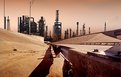
Critique By:
Patrick Ziegler (K:21797)
11/7/2004 7:59:11 PM
A contrast of industy and nature. Are those geese leaving the frame top left?
|
| Photo By: Tim Bailey
(K:-467)
|
|
|
Critique By:
Banchie Banchie (K:866)
11/6/2004 5:51:07 PM
beautiful panorama
|
| Photo By: Tim Bailey
(K:-467)
|
|
|
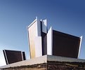
Critique By:
Rosa Maria Rejas (K:705)
10/23/2004 1:20:11 PM
me fascina la fotografia arquitectónica. Muy buena foto las líneas y colores te quedaron muy bien. En que ciudad está ubicado tan magnífico edificio?.. felicitaciones
|
| Photo By: Tim Bailey
(K:-467)
|
|
|
Critique By:
Manu (K:13082)
10/22/2004 8:53:34 AM
Great architectural shot....subtly enhanced with PS..well done and like the reflections in the lower part.
Cheers
Manu
|
| Photo By: Tim Bailey
(K:-467)
|
|
|
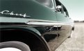
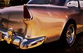
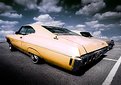
Critique By:
Mario Couture (K:2264)
10/13/2004 8:44:02 PM
Interesting! I love these kind of composition!
But,the dof may be to strong, and what do we see in the reflection? It sure be better without it!
Is a ps blur used in this shot? If so, maybe decrease the level just a little....
|
| Photo By: Tim Bailey
(K:-467)
|
|
|
Critique By:
Mario Couture (K:2264)
10/13/2004 8:22:11 PM
It could have been fun to see the entire car... but we may have miss the "miss elli"
|
| Photo By: Tim Bailey
(K:-467)
|
|
|
Critique By:
Stephen R. Pellerine (K:2370)
10/12/2004 11:04:01 PM
Cool
|
| Photo By: Tim Bailey
(K:-467)
|
|
|
Critique By:
Roberto Carli (K:13689)
10/12/2004 8:34:59 PM
Interesting reflection,very good tone!!
|
| Photo By: Tim Bailey
(K:-467)
|
|
|
Critique By:
Mario Couture (K:2264)
10/12/2004 3:19:17 PM
Everything near perfect :-)
Just that stupid tire that goes out of the body...
|
| Photo By: Tim Bailey
(K:-467)
|
|
|
Critique By:
Paul Burnett (K:45)
10/11/2004 5:06:16 AM
Strong lines... the form takes over from the fact that it is a car... nice work. Paul.
|
| Photo By: Tim Bailey
(K:-467)
|
|
|
Critique By:
Teunis Haveman (K:37426)
10/9/2004 7:31:48 PM
Tim, beautiful colour
Teunis
|
| Photo By: Tim Bailey
(K:-467)
|
|
|
Critique By:
Brian Rueger (K:7341)
10/9/2004 1:34:30 AM
Very nice shot. Too about bad the reflection of the truck in the quarter panel.
|
| Photo By: Tim Bailey
(K:-467)
|
|
|
Critique By:
Bente D. (K:578)
10/8/2004 8:04:48 PM
...one I like. The glares .... did you put them there or are they unintentioned? Look Ok as they are placed.
|
| Photo By: Tim Bailey
(K:-467)
|
|
|
Critique By:
Sam Oppenheim (K:3362)
10/7/2004 3:04:41 AM
Very nicely shot and composed. The reflection goes on forever without interruption, how did the car get there? alone? unencumbered with animals, tracks, buildings, etc. It looks like a car commercial where the vehicle is placed in a snowbank or someplace it would not likely go.
You really appreciate the lines in the car's body through reflection and perspecive.
In fact, The black levels are not pure, it is mostly blue and reflective which makes the 'black beauty' really a focus for depth in reflection and quality of light, rather than a silhouette, or black object. Excellent automotive still life!
|
| Photo By: Tim Bailey
(K:-467)
|
|
|
Critique By:
Pedro Libório (K:36301)
10/6/2004 11:27:49 PM
quite nice composition!
regards.
|
| Photo By: Tim Bailey
(K:-467)
|
|
|
Critique By:
aaron lucy (K:611)
9/26/2004 2:50:02 AM
wow, great shot
|
| Photo By: Tim Bailey
(K:-467)
|
|
|
Critique By:
E S (K:102)
9/23/2004 7:43:36 PM
Spontaneous; cool!
|
| Photo By: Tim Bailey
(K:-467)
|
|
|
Critique By:
Tim Bailey (K:-467)
9/23/2004 3:17:49 AM
Thank you for your suggestions.
|
| Photo By: Tim Bailey
(K:-467)
|
|
|
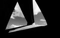
Critique By:
Jim Webb (K:209)
9/23/2004 12:14:37 AM
dramatic lighting and framing, but, if you are going for photoart and not journalism, cheat: photoshop out the distracting side elements on the upper left
|
| Photo By: Tim Bailey
(K:-467)
|
|
|
Critique By:
Jim Webb (K:209)
9/22/2004 10:33:20 PM
I love high contrast images like this one. Given you've placed this in architecture, however, I am not sure how far you want to go with the abstract. It's a bit distracting that the right tip of clouds/sky leaves the canvas. Thus, I'd suggest either cropping tighter so that all the areas bleed, or, cheat with some photoshop and bring in the black area. See my quick stab in the attached file. In the first one, it's less abstract and perhaps more architectural, whereby in the second, it's definitely all about the contrasts. IMHO.
|
| Photo By: Tim Bailey
(K:-467)
|
|
|
Critique By:
Thomas Rubin (K:1251)
9/22/2004 9:41:31 PM
Needs no title because it lives of it's contrasts..
I really like it because it's a brave picture that makes me reflect
Thomas
|
| Photo By: Tim Bailey
(K:-467)
|
|
|
Critique By:
Dwight Parker (K:253)
9/22/2004 8:27:21 PM
Good photo- great concept...
|
| Photo By: Tim Bailey
(K:-467)
|
|
|
Critique By:
Nicole Piotrkowski (K:15)
9/22/2004 5:13:39 AM
i really enjoy the dramatic nature of this photo.
|
| Photo By: Tim Bailey
(K:-467)
|
|
|
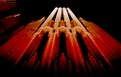
Critique By:
SORRENTE Patrick (K:3307)
9/7/2004 11:20:07 AM
Yeat ! Great shot !
|
| Photo By: Tim Bailey
(K:-467)
|
|
|
Critique By:
Andy Simmons (K:7704)
9/6/2004 6:25:17 PM
The dostortion provided by the WA lens is very effective here in emphasizing the sleek lines of the cars. Ther light and the color shift add a surreal quality to the scene. Interesting shot.
|
| Photo By: Tim Bailey
(K:-467)
|
|
|
Critique By:
Gerhard F (K:2820)
9/6/2004 5:20:54 PM
excellent shot! really looks like made in the 70-ies
|
| Photo By: Tim Bailey
(K:-467)
|
|