|
|
Critique By:
l v (K:3830)
9/26/2003 2:10:56 AM
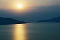
I find this to be a very relaxing picture. The colors are soft and delicate. The water is calm yet it shows some movement that makes it more interesting than a perfectly still surface is. The mountains barely visible in the background provide a smooth transition between the main picture and the void of the horizon. The sun is not too strong but, instead, nicely hidden behind the clouds. Finally, the mountains clearly visible create a nice path into the picture.
Bye,Luca
|
| Photo By: Damir Cudic
(K:2558)
|
|
|
Critique By:
l v (K:3830)
9/26/2003 2:01:02 AM
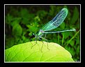
The image is amazingly sharp and well defined. The blurred background works well and I don't mind too much if one of the leaves is out of focus. I would have maybe tried to crop out the leave in the bottom left but maybe doing it would make the top leave look bad. The blue of the flower is really nice, although the grey border on the left part spoils it a little. The blue also stands very well against the yellow/green/orange of the background. What spoils the whole effect, though, is the fact that there is blue right behind the flower in the background. It's really a pity because it doesn't make the flower stand out as it could have.
Bye,Luca
|
| Photo By: John Lamb
(K:9687)
|
|
|
Critique By:
l v (K:3830)
9/26/2003 1:50:34 AM
A very intriguing perspective ! The green and blue of the water pools stand nicely together, but I am not as sure about the ground color in between. I think it would have been better if it was a very different color from the water, to give more importance to the pools (especially the one in the foreground). The ground in the background is a little too dark, but no big deal.
Bye,Luca
|
| Photo By: Thomas Rubin
(K:1251)
|
|
|
Critique By:
l v (K:3830)
9/26/2003 1:35:32 AM
I like the soft tonality of the sky colors and the contrast provided by the sharp straw in the background. It is also nice that you managed to catch a light that let you see the foreground, making the it different from a silhouette shot.
Bye,Luca
|
| Photo By: Cedric Sims
(K:3259)
|
|
|
Critique By:
l v (K:3830)
9/26/2003 1:27:20 AM
The light lets you see details in the whole scene, but unfortunately what's going on it's not that interesting, in my opinion. The palm on the right is nicely placed, maybe just a little too close to the top but it's a minor details. I think that the building to its right, though, shouldn't be in the picture. The buildings in the middle/right are just at the same height of the hills skyline and detract from it. I believe that the colors are a little too pale to make the picture really stand out as a thumbnail. However, I like the soft colors in the sky and the profile of the hills quite a lot, I just don't find the rest of the picture as interesting.
Bye,Luca
|
| Photo By: Rodrigo Raiher
(K:0)
|
|
|
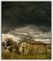
Critique By:
l v (K:3830)
9/26/2003 12:57:42 AM
I agree with the other comments: the atmosphere is terrific. The right part of the picture gives just a cold feeling, but the black cloud glooming on the left conveys the impression that something really terrible is about to happen. The black cloud really seem to be entering the picture, probably because the tall tree in the foreground bends to the right, giving that direction to the photo.
Bye,Luca
|
| Photo By: Martin Pesta
(K:559)
|
|
|
Critique By:
l v (K:3830)
9/26/2003 12:48:32 AM
OK, it's in the title, but I think there is too much green in the picture 
The dragonfly wing in particular looks really nice, but the beautiful green/blue hue is kind of lost in the middle of all the other green. A different backgroung making the insect stand out more would have been better, for my taste at least.
Bye,Luca
|
| Photo By: István Sándor
(K:2411)
|
|
|
Critique By:
l v (K:3830)
8/29/2003 3:02:03 AM
The composition/perspective is very interesting, it almost seems that you are on a mast of the boat in the foreground. I like it. The houses on the left, behind the mast, are not ideally placed, probably. There also seem to be a boat almost completely covered by the mast, I think it would be better to see it completely or don't see it at all. Minor details, anyway.
The right of the picture is too dark, but I guess you know it.
Bye,Luca
|
| Photo By: Roland Le Gall
(K:7018)
|
|
|
Critique By:
l v (K:3830)
8/29/2003 12:21:20 AM
Una foto decisamente molto calma e serena. Sempre l'alto Lario? Gli alberi sullo sfondo a destra creano un disegno molto particolare, che attira molto la mia attenzione. Forse c'e' un po' troppa luce, specialmente sulla barca ... ma forse e' solo la parte bianca che spicca.
Ciao,Luca
|
| Photo By: lucio brando
(K:2295)
|
|
|
Critique By:
l v (K:3830)
8/29/2003 12:06:15 AM
What did you use the filter for? I am not familiar with it.
I think the picture is technically very well done: it's very sharp, colors are fine, the water is well rendered. The "thing" (waving straw?) in the bottom right is a little distracting, but not too much. However, the overall look doesn't inspire anything special to me. Maybe there just are a little too many things going on, giving a cluttered feeling or, more simply, the scene is just not for my taste
Bye,Luca
|
| Photo By: Greg McCracken
(K:129)
|
|
|
Critique By:
l v (K:3830)
8/28/2003 3:21:32 AM
I expect a medioeval noble woman to get into the picture any moment; you would then have to jump from your hiding place below the plants in the foreground and rob her ... just to give to the poors, of course ! 
I don't know if you intended to convey this feeling or if you simply went for a low angle, but I like the result. The sun fits nicely, but I find the white part in the top right a little distracting, maybe it would have been better to crop it out a little.
Ciao,Luca
|
| Photo By: Paolo Barthelemy
(K:25552)
|
|
|
Critique By:
l v (K:3830)
8/28/2003 3:13:20 AM
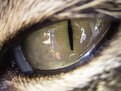
I am sure the cat is friendly, but the picture gives a very different idea ! You conveyed an impression of ferocity really well: good crop and angle. A pity for the reflection, it spoils the atmosphere a little.
Bye,Luca
|
| Photo By: sam x
(K:234)
|
|
|
Critique By:
l v (K:3830)
8/28/2003 3:06:56 AM
Ci sono un mucchio di cose molto belle nella foto. Il riflesso sul mare quasi nero e' molto efficace, cosi' come le nuvole in primo piano. La torre sulla sinistra e le rocce sullo sfondo danno un tocco diverso al solito tramonto. Mi piace anche l'effetto delle onde contro gli scogli e la pianta a riempire lo spazio in basso a sinistra. L'unica cosa che non mi piace molto sono i riflessi della luce. Inoltre sarebbe bello poter leggere qualcosa del posto e avere qualche informazione sulla macchina fotografica etc.
Ciao,
Luca
|
| Photo By: Francesco Bazzi
(K:953)
|
|
|
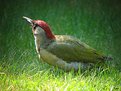
Critique By:
l v (K:3830)
8/28/2003 2:58:16 AM
Nice, simple picture. The red patch on the head of the bird is the most attractive thing, for me. The top corners appear darker (vignetting, I guess), but it helps to give even more attention to the subject in my opinion. The bright light on the grass at the bottom, instead, is a little distracting.
Bye,Luca
|
Photo By: Taco heikamp
(K:3030)

|
|
|
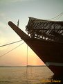
Critique By:
l v (K:3830)
8/28/2003 2:45:35 AM
I like all those lines converging almost where the sun would be if the boat wasn't there. The soft colors are pleasing. I am not a big fan of putting signatures on picture, I must say, but it's not too intrusive in this case.
Bye,Luca
|
| Photo By: Musabah Almarar
(K:866)
|
|
|
Critique By:
l v (K:3830)
8/28/2003 2:38:08 AM
Excellent picture ! I maybe would have preferred that the pilon (?) of the bridge on the left wasn't cropped. This minor details aside, I think every is great: the bridge bringing you to the sun; the soft light and colors giving a very calm feeling, wonderfully complemented by the still water. The colored reflection and the rocks fill the right nicely, I don't think the picture would have been as nice without them.
I am giving it full score, not usual for me.
Bye,Luca
|
| Photo By: Pedro Gilberto
(K:15)
|
|
|
Critique By:
l v (K:3830)
8/6/2003 2:40:19 AM
Very nice ! A wonderful background, with very interesting mountains (so many planes) and clouds to complement them; the haze gives a soft touch to the picture that looks really nice. The bird introduces an element that catches the attention, although it tends to lead the eye to the far left of the picture and sort of disregard the rest. It probably would have been much better if it had flown into the picture rather than out of it. I feel that there is maybe a little too much fence at the bottom, and it is by far the less attractive thing in the photo. Cropping it might have unbalanced the horizon though, I don't know.
Bye,Luca
|
| Photo By: Roger Cotgreave
(K:15892)
|
|
|
Critique By:
l v (K:3830)
8/6/2003 2:31:00 AM
A rather strange perspective, the whole picture seems as if distorted to the right: I like it ! I think that the dog being aligned with the shadows adds to the feeling. I don't particularly mind the shadow in the bottom right corner (the photographer?) or the tilted orizon. What I don't like is that you can't really see the details in the dark part of the dog.
Bye,Luca
|
| Photo By: Sophie Jenkins
(K:10)
|
|
|
Critique By:
l v (K:3830)
8/6/2003 1:59:13 AM
The colors are really impressive, you are right in pointing them out. The rock formation in the middle really strikes me; I have never been up to the Highlands (Lock Lomon was the northernmost part for me) but I have a completely different picture of Scotland in mind. The sky also looks rather unscottish A very open view, "liberating" renders the scene perfectly.
Ciao,Luca
|
| Photo By: kita mcintosh
(K:18594)
|
|
|
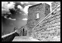
Critique By:
l v (K:3830)
8/6/2003 1:55:07 AM
Un piccolo appunto che ho e' che forse e' un pochino soft in certi punti. Scritto questo, la prospettiva e' molto bella e c'e' una certa atmosfera nella foto. Anche il muretto di destra che porta verso il cancello funziona molto bene, secondo me.
Quello che non mi convince tanto e' lo sfondo del cancello stesso e della finestra. Come mai cosi' grigi, piatti e diversi dal cielo? Hai fatto qualcosa alla composizione con photoshop? Solo curiosita', niente di sbagliato nel cambiare una foto, eventualmente.
Ciao,Luca
|
| Photo By: Andrea Giudice
(K:298)
|
|
|
Critique By:
l v (K:3830)
8/6/2003 1:46:53 AM
Very nice composition, with the DOF giving a very nice perspective. The path climbing to the house behind the trees is very appealling. A pity for the badly overexposed sky, though. Is it me or is there a slight red cast to the picture?
Ciao,Luca
|
| Photo By: Paolo Barthelemy
(K:25552)
|
|
|
Critique By:
l v (K:3830)
8/6/2003 12:58:44 AM
A differenza di tante altre tue foto, questa non mi ispira niente di particolare. La citta' sembra quasi nascosta, in basso, e in parte coperta dagli alberi. Il lampione sulla destra che si 'scontra' con un ramo non e' il massimo, anche. I colori della foto sono belli ma gli alberi, che prendono molta importanza, sono un po' troppo in ombra secondo me, specie quello piu' a sinistra. Forse con qualcuno sulla panchina avrebbe assunto tutto un altro significato ma, onestamente, cosi' com'e' mi meraviglio che abbia tutti 7: cosi' sembra di sminuire le altre tue bellissime foto con uguale punteggio.
Ciao,Luca
|
| Photo By: luisa vassallo
(K:28230)
|
|
|
Critique By:
l v (K:3830)
8/6/2003 12:49:29 AM
Well executed, but I personally don't like this kind of pictures, usually. I much prefer to see the subject in focus and blurred background to convey the impression of motion. You couldn't have done it here with subjects moving in opposite directions, of course. The problem I have, for instance, is that you can't see the bike. Sure, it's a cyclist, but it gives a somehow "ghosty" impression.
Bye,Luca
|
| Photo By: Amancio Couto
(K:15720)
|
|
|
Critique By:
l v (K:3830)
7/23/2003 1:27:35 PM
Hi John, you are probably right. The monitor might have something to do with it as well. Thanks for taking the time to discuss the comments.
Luca
|
| Photo By: john morris
(K:30)
|
|
|
Critique By:
l v (K:3830)
7/23/2003 3:49:35 AM
See comment on 'stairs 2', I just wanted to add my ratings here.
Luca
|
| Photo By: Masahiko Shibata
(K:14107)
|
|
|
Critique By:
l v (K:3830)
7/23/2003 3:30:39 AM
It looks a little soft to me, but the main problem is the overexposed sky, which really spoils an otherwise beutiful picture. I like the composition a lot, for instance, expecially the line between the puddle, the gap in the grass and the distant part of the lake.
Bye,Luca
|
| Photo By: john morris
(K:30)
|
|
|
Critique By:
l v (K:3830)
7/23/2003 3:18:47 AM
Mi piace molto la luce della parte bassa della foto. La nuvola nera da' un'aria molto cupa che complementa bene la luce della casa, secondo me; l'effetto e' appena un po rovinato dalle nuvole centrali molto chiare. Il senso di profondita' e' reso ottimamente, credo grazie allo sharpening (che settings usi, per curiosita'?).
Ciao,Luca
|
| Photo By: Lorenzo Lessi
(K:6589)
|
|
|
Critique By:
l v (K:3830)
7/23/2003 3:08:51 AM
I like the composition, but the photo looks rather oversharpened. The top is rather washed out, too.
Bye,Luca
|
| Photo By: Al S
(K:5131)
|
|
|
Critique By:
l v (K:3830)
7/23/2003 2:52:48 AM
Bell'effetto, originale. Come l'hai ottenuto, in camera o con photoshop ?
Ciao,Luca
|
| Photo By: ileana barigelletti
(K:3571)
|
|
|
Critique By:
l v (K:3830)
7/23/2003 2:36:00 AM
I like the tonality and the overall mood of the picture, that reminds me of something like Blade Runner. The water reflected on the surface helps this feeling, at least for me, whereas the rightmost scooter spoils it a little.
Bye,Luca
|
| Photo By: Bikramadittya G. Roy
(K:7202)
|
|