|
|
Critique By:
Paul Maguire (K:1113)
1/7/2010 11:21:03 AM
Doh! I've been there. It stings. Still, the noise is only noticeable in the sky so I reckon you could lasso and hit it with a harsh noise filter, without touching the foreground. Take care, Paul
|
Photo By: ian gardiner
(K:1203)

|
|
|
Critique By:
Paul Maguire (K:1113)
1/7/2010 11:18:12 AM
You are most welcome, Subhabrata. Thanks for your kind words.
|
| Photo By: Subhabrata Sen
(K:63)
|
|
|
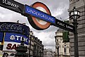
Critique By:
Paul Maguire (K:1113)
1/7/2010 10:25:51 AM
The panoramic format and ultra-wide angle is quite impactful, and if this is a photo stitch then it is well executed, but the photo lacks any foreground interest. I think the shoreline and fence posts in each corner just make it a bit cluttered, as does the power line in the sky on the left. It would have worked better either as a really simple composition with no foreground clutter at all, or with more foreground to "anchor" the scene. Sorry if I'm being hard, and it is just one opinion among many.
|
| Photo By: Subhabrata Sen
(K:63)
|
|
|
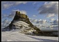
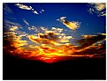
Critique By:
Paul Maguire (K:1113)
1/7/2010 10:15:38 AM
Beautiful. It's good to see that someone is braving the snow to get great shots like this. I reckon this could be improved further with a little processing. The colours are just a little bit dark nd muddy, and whilst that adds to the mood it does make the photo a little flat. Maybe a slight boost to the contrast is all that's needed, and a modest lift to the midtones. Also, the sharpness has worked well in the foreground but has left quite pronounced noise in the sky. You could maybe selectively reduce the noise in the sky? Sorry if I'm being picky. I actually love your shot but I personally like people to pick even the slightest faults in my own photos because that's how I improve.
|
| Photo By: ian gardiner
(K:1203)
|
|
|
Critique By:
Paul Maguire (K:1113)
1/7/2010 9:30:55 AM
Wow, amazingly sharp, perfectly focussed on the eyes, and you've captured a really natural expression. My only criticism is that it's a little too tightly cropped for my taste, as the faces to the right make me want to see just a little more. But I'm being really fussy now.
|
| Photo By: James Lee
(K:4790)
|
|
|
Critique By:
Paul Maguire (K:1113)
7/2/2007 7:48:07 PM
Excellent composition and the vivid colors complement the subject. Nice work! I'd be tempted to crop out the ferns on the left of the frame, though, as they clutter the composition.
|
| Photo By: j esford
(K:13518)
|
|
|
Critique By:
Paul Maguire (K:1113)
2/10/2007 12:30:48 PM
Amazing reflection and colors. Really eyecatching. I wonder, though, if the shot would have been better without the muddy water's edge.
Paul
http://www.paulmaguirephoto.com
|
| Photo By: Giulio Rotelli
(K:28441)
|
|
|
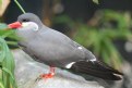
Critique By:
Paul Maguire (K:1113)
4/19/2006 11:08:07 AM
Nice frame-filling shot with good, even lighting. However, the image is let down by an overall lack of sharpness. Maybe you had to crop the original tightly to get the bird to fill the frame. If so then it will inevitably show up the limitations of the lens. One further suggestion: the beak is slightly obscured by foliage. You could perhaps have moved a little to your right to get a clear shot. Keep 'em coming!
|
| Photo By: Toni Adamski
(K:28)
|
|
|
Critique By:
Paul Maguire (K:1113)
3/30/2006 9:10:20 AM
Thanks for the suggestion, Hugo. I'll give that a try.
|
| Photo By: Paul Maguire
(K:1113)
|
|
|
Critique By:
Paul Maguire (K:1113)
3/3/2006 10:29:05 AM
Truly scary. Nice focussing and depth of field, too.
|
| Photo By: Lodovico Ludoni
(K:5210)
|
|
|
Critique By:
Paul Maguire (K:1113)
2/22/2006 2:58:37 PM
... You know what? I prefer your original. It just goes to show you that rules are there to be broken!
|
| Photo By: Ace Star
(K:21040)
|
|
|
Critique By:
Paul Maguire (K:1113)
2/22/2006 2:55:33 PM
... something like this...
|
| Photo By: Ace Star
(K:21040)
|
|
|
Critique By:
Paul Maguire (K:1113)
2/22/2006 2:50:16 PM
Wow, amazing choice of viewpoint, and the use of sepia is inspired. I agree with Kathy that the horizon is a bit crooked. I think if you correct that then you have an award-winning shot here. Best wishes.
|
| Photo By: Ace Star
(K:21040)
|
|
|
Critique By:
Paul Maguire (K:1113)
2/22/2006 9:38:08 AM
Wow, that certainly adds impact. I'm really grateful that you took the time to experiment with one of my photos, and the end result looks impressive. Thanks.
|
| Photo By: Paul Maguire
(K:1113)
|
|
|
Critique By:
Paul Maguire (K:1113)
1/23/2006 10:11:00 AM
Thanks, that might be it.
|
| Photo By: Paul Maguire
(K:1113)
|
|
|
Critique By:
Paul Maguire (K:1113)
1/23/2006 10:08:51 AM
Nice sharp shot. The edges of the moon look a bit pixelated, though. Since you're using a 6mp camera I can only assume that the problem was in resampling to post on usefilm. Might be worth trying different software/workflow.
|
| Photo By: Alin Dobrin
(K:-37)
|
|
|
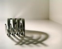
Critique By:
Paul Maguire (K:1113)
1/23/2006 9:30:33 AM
There have been so many photos of a fork shot from this sort of angle, on usefilm and in enthusiast magazines lately, that it is rapidly becoming a cliche. However, what you have done here is really original. By carefully composing the shadow as you have, the image has an extra dimension of intrigue. I really love too the way that the tips of the tines fall between the gaps behind. It creates a surreal perspective reminiscent of Escher. I'm not sure the background detail in the top left really adds anything: I'd have rather seen a tighter crop around the fork and shadow. Nonetheless, this is a really creative shot. Bravo!
|
| Photo By: hermin abramovitch
(K:1915)
|
|
|
Critique By:
Paul Maguire (K:1113)
1/15/2006 10:30:16 AM
Nice use of curves and patterns. Well spotted.
|
| Photo By: carlo raingini
(K:11977)
|
|
|
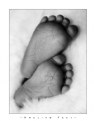
Critique By:
Paul Maguire (K:1113)
1/11/2006 8:49:00 AM
Like it a lot. I posted a similar view of feet recently but yours wins, I think. Just one question: why did you use a ND filter? Couldn't you have just shot at a faster shutter speed?
|
| Photo By: Dennis Båvenmark
(K:370)
|
|
|
Critique By:
Paul Maguire (K:1113)
1/11/2006 8:27:21 AM
You have a keen eye, my friend. Since I posted it something has been niggling me, and you're right, the picture is a little too dark overall (although I like the floating pinkies!) Thanks for the input.
|
| Photo By: Paul Maguire
(K:1113)
|
|
|
Critique By:
Paul Maguire (K:1113)
1/11/2006 8:12:51 AM
I was beginning to wonder if anyone would spot the paragliders! You're right that they are lost a little. The photo looks better at full screen or in print, but at "web-size" resolution a lot of the impact is lost. I took many photos that day so I have plenty others of Mt Blanc alone. As to the "white-wash," I see what you mean. I really struggle with RAW manipulation - getting the right contrast, white balance and exposure - but I seem to be getting better with practise. Thanks for your comment, Hugo. I really appreciate it.
|
| Photo By: Paul Maguire
(K:1113)
|
|
|
Critique By:
Paul Maguire (K:1113)
1/11/2006 7:29:10 AM
Sarah, I saw your comment on James Weber's "red" and thought I'd check out your portfolio. Great stuff! I particularly like this shot as the composition is just right. Is this off-camera flash or a studio light? Either way, you've placed it well to get some interesting shadows. I'm no expert on studio photography but if you don't mind I'll try to offer some critique, simply because I know that is far more useful than someone just saying "Woop woop, nice shot!" I think you could have done with a little more even lighting as the highlights on the nose and cheek tend to draw the viewer away from those gorgeous sultry eyes, which tends to weaken the shot. The lighting is just a little too harsh, giving unwanted highlights that give an uneven skin tone and emphasise the blemishes on the skin. Sure you can try to hide these with photoshop, but softer lighting is the better option. I'm guessing from the catchlights and shadows that you used a single (or at least very dominant) light source to the right of camera. Try using a reflector or second light to the left to provide some subtle fill-in light to soften the shadows a touch. If you have the gear available, you could try attaching a snoot to aim a second light specifically on the eyes. Also, put a soft box or umbrella on the main source to make the light less harsh. That will get rid of the harsh lighting on the skin and also give bigger catchlights in the eyes. If you don't have this sort of gear, try simply bouncing the flash off a white wall or white card close to the flash. This will soften the light enormously. The further the wall is from the flash, the softer the light.
I hope this feedback helps you just a little in your quest to be a high fashion photographer.
|
| Photo By: Sarah Chatham
(K:377)
|
|
|
Critique By:
Paul Maguire (K:1113)
1/11/2006 2:53:10 AM
Harry, I've been browsing your portfolio and I have to say that it is on the whole stunning. Some of the best wildlife photography I've seen from an "amateur" photographer. I headed straight to your website and that is now in my favourites!
I'm hoping to embark on a second career as a photographer eventually, and one revenue source I envisaged was by direct stock sales through a website. Dan Heller (.com), for instance, claims to make a decent living doing that alone. I'd be very interested to hear of your experiences and whether you are able to generate any income that way yourself. Incidentally, danheller.com offers some sound and refreshingly honest advice on how to raise the profile of a photography website to get more traffic. Best wishes.
|
| Photo By: Harry Eggens
(K:14804)
|
|
|
Critique By:
Paul Maguire (K:1113)
1/11/2006 2:47:23 AM
I thought as much! Even most non-SLR's, though, usually have a manual mode where you can set the ISO. It may be buried in the menus but it's worth a try. Personally I hate tripods, but they are sometimes a must. Although to be honest, with a bit of practise a fence post or wall is as good as any $1000-manfrotto-carbon-fibre-gizmo. --- Keep in touch ---
|
| Photo By: Ace Star
(K:21040)
|
|
|
Critique By:
Paul Maguire (K:1113)
1/11/2006 1:52:59 AM
Thanks for your comments on my images, Ace. Of your portfolio, I like this the most because the rich colours provide a beautiful contrast to the silhouetted ground, which in turn provides an anchor for the sky. The sense of symmetry left-to-right helps, too. The "digital grain" is a bit of a distraction, although it is not as noticeable here as in some of your other shots. Noise always shows up worst in subtly toned areas such as sky, so if you're not already shooting at ISO100, then try that, using a tripod if you have to. I'll look forward to seeing more great shots!
|
| Photo By: Ace Star
(K:21040)
|
|
|
Critique By:
Paul Maguire (K:1113)
1/8/2006 9:32:20 AM
Beautifully realised colours and lighting, and a powerful perspective. The fact that it is not clear what exactly the model is doing (riding rodeo on a bail of straw??) dracts form the photo somewhat.
|
| Photo By: alexandre van battel
(K:9)
|
|
|
Critique By:
Paul Maguire (K:1113)
1/5/2006 12:23:11 AM
Thanks for noticing! The tilt is a bit off-putting, isn't it? I didn't notice it until I'd already posted the photo.
|
| Photo By: Paul Maguire
(K:1113)
|
|
|
Critique By:
Paul Maguire (K:1113)
12/24/2005 11:32:40 AM
Wow, I just love the way you have used the dress to frame the model so sensuously, and the colours are not too overwhelming. I'd love to know how you achieve the muted colours in this and many of your other shots: is it down to RAW processing? Photoshop? Or lighting? Please do tell.
|
| Photo By: James Weber
(K:305)
|
|
|
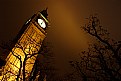
Critique By:
Paul Maguire (K:1113)
12/22/2005 2:04:27 PM
Thanks for your feedback, Jim. I really value any criticism I can get. I tried tweaking the WB as you suggested, but the original works best. I know the colours look false but they are actually close to real life: on overcast nights in London, the sky is completely orange with all the street lighting and the illumination of the buildings. When I took this photo it was foggy so the orange light was really intensified.
|
| Photo By: Paul Maguire
(K:1113)
|
|
|
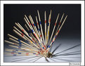
Critique By:
Paul Maguire (K:1113)
10/21/2005 2:45:03 PM
Great work. It's just a same that the sticks on the bottom left are only slightly blurred by motion: either more blurring (by a longer exposure?) or pin-sharp would have worked better.
|
| Photo By: Mert Huseyinoglu
(K:23)
|
|