|
|
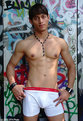
Critique By:
Jim Webb (K:209)
8/31/2005 12:18:26 PM
very provacative. the stare at the camera, the props and pose all work.
|
| Photo By: Art Dibujar
(K:1280)
|
|
|
Critique By:
Jim Webb (K:209)
9/30/2004 7:37:30 PM
great composition abstracting what could have easily been "yet another" head shot. nice tie-in of the hat and earring, and with the square format, the negative space really works well, too.
|
| Photo By: Francesca May
(K:6877)
|
|
|
Critique By:
Jim Webb (K:209)
9/30/2004 4:54:06 PM
great b&w texture study.
|
| Photo By: Robert Staeck
(K:919)
|
|
|
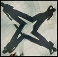
Critique By:
Jim Webb (K:209)
9/30/2004 4:12:48 PM
fun abstract, but since you are already digitally putting it together (eeek, I assume....) I'd edit out the errant shadow and pots etc in the bottom left frame.
|
| Photo By: özlem aksöz
(K:74)
|
|
|
Critique By:
Jim Webb (K:209)
9/27/2004 3:22:20 PM
nice. black and white, pink and blue: good use of contrasts and metaphor. I'd tighten up the composition to square so as to even things up though, otherwise, in my twisted opinion, more emphasis is given to the model that isn't clipped off on the right 
|
| Photo By: Kim Taylor
(K:2816)
|
|
|
Critique By:
Jim Webb (K:209)
9/24/2004 10:16:06 PM
nice composition, and the eyes make it for me in that they make the viewer want to know what has caught T&e's individual attentions.
|
| Photo By: James Lee
(K:4790)
|
|
|
Critique By:
Jim Webb (K:209)
9/24/2004 10:06:32 PM
Thank you for your comments! Exposure was definitely an issue that day, but you've described Matt to a tee: butch, grainy, and definitely out of centre
|
| Photo By: Jim Webb
(K:209)
|
|
|
Critique By:
Jim Webb (K:209)
9/23/2004 11:37:12 PM
EEEK. Typo. It was my trusty 20... da*n explorer's autofill
|
| Photo By: Jim Webb
(K:209)
|
|
|
Critique By:
Jim Webb (K:209)
9/23/2004 10:06:02 PM
x's: good points. thx! (I wish I'd not grabbed the top of a boot on the bttm as well)
|
| Photo By: Jim Webb
(K:209)
|
|
|
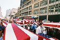
Critique By:
Jim Webb (K:209)
9/23/2004 5:32:45 PM
Thank you for the comments. Jesse, my friend and the photog in center frame, were shooting the RNC events together, and after trying to get shots of the display without people, we just stopped trying. At that point, he was focusing on one of the demonstrators, and I thought it looked good as well to have several vantage points subtlely (sp?) in view. He also is more of a long shooter, 80-200 on the camera most of the time, and me, I walk around with a 20 on most of the time and get right in the face of things. On another note, what got me really going about this display was a) how quiet people were, and how respectful of it, but also, b) how distraught people became when the organizers starting reading off the names of the fallen soldiers and Iraqi civilians (they read them in alpha. order by state, then read 20 or so Iraqi names, and then repeat thru 2000 or so names)
|
| Photo By: Jim Webb
(K:209)
|
|
|
Critique By:
Jim Webb (K:209)
9/23/2004 1:56:43 AM
dramatic graphic statement.
|
| Photo By: Luis Vieira
(K:1772)
|
|
|
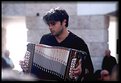
Critique By:
Jim Webb (K:209)
9/23/2004 1:37:20 AM
nice 'slice of life' photo...emotional and the soft depth of field around the musician frames him nicely
|
| Photo By: André Valente
(K:905)
|
|
|
Critique By:
Jim Webb (K:209)
9/23/2004 12:14:37 AM
dramatic lighting and framing, but, if you are going for photoart and not journalism, cheat: photoshop out the distracting side elements on the upper left
|
| Photo By: Tim Bailey
(K:-467)
|
|
|
Critique By:
Jim Webb (K:209)
9/23/2004 12:12:04 AM
awesome framing. great symmetry only shaken by the clouds.
|
| Photo By: Mohamed Kamal
(K:57)
|
|
|
Critique By:
Jim Webb (K:209)
9/23/2004 12:10:18 AM
nice framing, toning, vertical elements, texture, they all work.
|
| Photo By: The Armed Eye
(K:3563)
|
|
|
Critique By:
Jim Webb (K:209)
9/23/2004 12:05:53 AM
nice abstraction in the oof background, but distraction in the lower left corner...
|
| Photo By: Aimee' Desire'
(K:744)
|
|
|
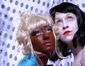
Critique By:
Jim Webb (K:209)
9/22/2004 11:47:26 PM
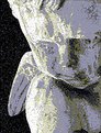
question: whose art is it? yours? the sculptor's? or the programmer of the charcoal filter in photo editor?
|
| Photo By: Tiffany Woodley
(K:231)
|
|
|
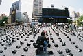
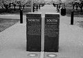
Critique By:
Jim Webb (K:209)
9/22/2004 11:42:59 PM
artwork of other artwork, in this case, a photograph of a pair of statues, is always difficult to pull off without looking like a snapshot or postcard. I'd revisit these and make the composition more abstract: tighten and level the scene, make sure the uplights in the ground are both fully in the frame, and then line it up so the black bullet light posts converge behind the markers on equal angles. and then, take two shots, one with and one without someone on the bench, and see which one works better.
|
| Photo By: Green Gemini
(K:3391)
|
|
|
Critique By:
Jim Webb (K:209)
9/22/2004 11:33:06 PM
very beautiful. colorwise, the green WORKS.
|
| Photo By: Alex Comaschi
(K:1457)
|
|
|
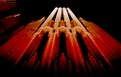
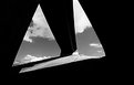
Critique By:
Jim Webb (K:209)
9/22/2004 10:33:20 PM
I love high contrast images like this one. Given you've placed this in architecture, however, I am not sure how far you want to go with the abstract. It's a bit distracting that the right tip of clouds/sky leaves the canvas. Thus, I'd suggest either cropping tighter so that all the areas bleed, or, cheat with some photoshop and bring in the black area. See my quick stab in the attached file. In the first one, it's less abstract and perhaps more architectural, whereby in the second, it's definitely all about the contrasts. IMHO.
|
| Photo By: Tim Bailey
(K:-467)
|
|
|
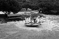
Critique By:
Jim Webb (K:209)
9/22/2004 10:11:43 PM
without any children, is this childhood lost?
|
| Photo By: João Magalhães
(K:2067)
|
|
|
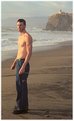
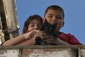
Critique By:
Jim Webb (K:209)
9/22/2004 10:04:29 PM
cute. why does this remind me of michael jackson and his child over the balcony from years ago?
|
| Photo By: Gianfranco Bussalai
(K:888)
|
|