|
|
Critique By:
Anna Brady (K:914)
9/29/2007 1:19:44 AM
Very cool concept. I love the composition along with the look and extreme lighting. The red eye is menacing! I think this was very successful and accomplishes what you were trying to do artistically. Technically, however, I wish it were not blurry. It looks like a bit of hand shake? I know the rebel itself has issues with low lighting situations, I haven't personally messed with it with extreme light and dark though - so take my statements with a grain of salt. The eyes in sharp focus which is the most important thing. Is the blur intentional then?
Oh, I also like how the blackness of the face drops off into the black background. I also enjoy that the black is truly black and the white is true white. (When I was in my darkroom class, with film, I could never achieve true blacks & whites - just a mush of greys.)
-Anna
|
| Photo By: Edlira Voges
(K:6410)
|
|
|
Critique By:
Anna Brady (K:914)
9/29/2007 1:06:23 AM
Kes: Its a seldomly recognized and very rare species known as the Maple. 
Wait....is "seldomly" even a word? : /
|
| Photo By: Anna Brady
(K:914)
|
|
|
Critique By:
Anna Brady (K:914)
9/29/2007 1:01:18 AM
Actually, It was in AV mode with spot metering on the sky.
-Anna
|
| Photo By: Anna Brady
(K:914)
|
|
|
Critique By:
Anna Brady (K:914)
9/29/2007 12:58:46 AM
I like your b&w version, it sounds silly but I hadn't tried that.
I do have to say I took this with a Fuji FinePix 3megapixel long before I knew what I was doing technically. (way back in 2004 - hehe disclaimer)
Anyways, I did mess with the color in Photoshop (something I usually don't do) I can't remember why.... I think there was something funny about the original color. (The original is not on this computer sadly) Turning it into b&w fixes that quickly and it is probably more effective. Thanks for the comments! Much appreciated!
-Anna
|
| Photo By: Anna Brady
(K:914)
|
|
|
Critique By:
Anna Brady (K:914)
9/28/2007 3:16:41 AM
Ha, I know its about the guitar, but I was paying attention to the rug! (bet you can't tell what industry I'm in.) I a succor for color gradation and aqua blues. I like how dark and subtle the background is against the cream of the stratocaster. I also enjoy the diagonal lines and how the colors look like they drop off into nothingness at the corners. Great job! Hmm...I know I'm due for a dentist appointment.
|
| Photo By: Nelson Moore [Kes] -
(K:20241)
|
|
|
Critique By:
Anna Brady (K:914)
9/27/2007 11:03:28 PM
nice perspective and lighting.
-Anna
|
| Photo By: peter wankerl
(K:2)
|
|
|
Critique By:
Anna Brady (K:914)
9/27/2007 10:59:02 PM
I really like this photo, with the stark white background. The composition is superb. I wish though, that the head of the bird was in focus rather than the tail. Additionally, I wish there was a tad bit of white space below the tail at the bottom of the photo. Great job!
|
| Photo By: Edlira Voges
(K:6410)
|
|
|
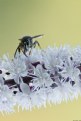
Critique By:
Anna Brady (K:914)
9/22/2007 4:17:00 AM
Very delicate. I like how the white flowers reveal that they have a purple hue when you get close. I enjoy the yellow-sage background; it makes a nice neutral against the subject. That's an awesome macro with the edge of the wasp's wings out of focus. Do you have any idea what kind of flower the wasp is sitting on?
-Anna
|
Photo By: Eb Mueller
(K:24960)

|
|
|
Critique By:
Anna Brady (K:914)
9/22/2007 4:00:31 AM
Not only do I appreciate your composition and thought for each of your photographs, I am also impressed with the quality that you are able to obtain with your S2 IS. I had an S1 IS prior to my 5D and I couldn't imagine getting the clarity that you are able to achieve. Wonderful job! I can't wait to see what you can do with a SLR. :)
-Anna
|
| Photo By: cameny
(K:5880)
|
|
|
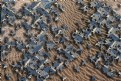
Critique By:
Anna Brady (K:914)
9/22/2007 3:42:44 AM
Very interesting - how did you create this image? I enjoy the color combination of grey blue and sand.
-Anna
|
| Photo By: Gustavo Scheverin
(K:164501)
|
|
|
Critique By:
Anna Brady (K:914)
9/22/2007 3:30:28 AM
I originally thought that the reflection was oil in the water judging from the thumbnail version of this photograph. I agree that the reflections add interest to this shot. I like it!
-Anna
|
| Photo By: Arthur Kornienko
(K:9686)
|
|
|
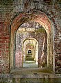
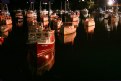
Critique By:
Anna Brady (K:914)
9/21/2007 1:24:55 AM
I love your series of paper images! What kind of light source did you use...a light table? I am also interested to know the type of paper. Did you have difficulty keeping the paper in place? I full of questions because I love your work so much! I keep on putting them in my "favorites" category and I keep on exclaiming "oooooo!" at each one I come across. They keep on getting better and better.
-Anna
|
| Photo By: Barry Walthall
(K:5312)
|
|
|
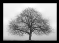
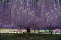
Critique By:
Anna Brady (K:914)
9/3/2007 2:09:51 AM
I hate to be redundant but, Mike said it - Thank you for sharing something that I have never seen before!
It is amazing... the care that must go into the tree in order to maintain it. Beautiful!
|
| Photo By: Yoshiyuki Tanaka
(K:13580)
|
|
|
Critique By:
Anna Brady (K:914)
9/3/2007 1:57:02 AM
I would put it on my wall this instant! I love maples! This photograph makes my heart ache for Japan.
|
| Photo By: kiyoshi serizawa
(K:279)
|
|
|
Critique By:
Anna Brady (K:914)
9/3/2007 1:52:32 AM
Beautiful! The red background is an unexpected color for the subject matter. I enjoy how the branches are at the top of the photo and how you have to look closely for the streamers of rain.
|
| Photo By: kiyoshi serizawa
(K:279)
|
|
|
Critique By:
Anna Brady (K:914)
9/3/2007 1:26:33 AM
Wonderful composition, what time of day was this taken?
|
| Photo By: Doug Hockman
(K:185)
|
|
|
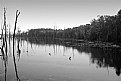
Critique By:
Anna Brady (K:914)
9/19/2006 1:30:44 AM
I like this very much. I enjoy the contrast of the weight of the chain against the fluid nature of the water.
The color variation in both the metal and the water is very nice. The striation in the water is a subtle and uncomplicated background that allows the viewer to imagine a larger marine world around this tight close up shot. All the colors work very well together: these tones of blues, browns, and oranges could be chosen by an interior designer. The iridescence is great as well.
I like how the shadows drop completely into black in some areas and how the light is blown out in other sections. The light from the sun and the bounce light from the water is wonderful. (The warm rust colored under glow.) It is great to see an object lit from multiple angles: it adds depth and interest. The texture and weathering of the links shows their age and use.
The composition is straight forward and appropriate for the big fat lines of the subject.
This is beautiful due to the subjects simplicity and complexity.
-Anna
|
| Photo By: Philip Curwen
(K:1363)
|
|
|
Critique By:
Anna Brady (K:914)
9/14/2006 6:40:44 PM
Here it is with a little more contrast.
|
| Photo By: Anna Brady
(K:914)
|
|
|
Critique By:
Anna Brady (K:914)
9/13/2006 8:55:18 PM
Ha ha! He must be thinking: "That's the last time I'm licking a rock! Blech!"
What happened? His tongue is the same color as the dirt!
I agree with Carlen about the off center composition of the photo. It's great...and so are the colors. It is nice that the background is out of focus as well.
-Anna
|
| Photo By: Chris Fowler
(K:208)
|
|
|
Critique By:
Anna Brady (K:914)
9/13/2006 7:28:09 PM
Beautiful colors! I like the contrast of the orange against the green. It looks surreal!
-Anna
|
| Photo By: Ulita ZLatkova
(K:210)
|
|
|
Critique By:
Anna Brady (K:914)
9/13/2006 5:21:43 PM
It is nice to see an image composed mainly of just color. It is refreshing to enjoy the interaction of hue and tone - just for color's sake. The glass lines at the bottom give a nice anchor to the composition as well.
-Anna
|
| Photo By: Francisco N-G
(K:28728)
|
|
|
Critique By:
Anna Brady (K:914)
9/13/2006 5:13:52 PM
I enjoy the deterioration of the leaves. It is a nice contrast against the vivid and lively petals of the flower. The photograph has a nice harvest feel. Nicely done.
-Anna
|
| Photo By: Francisco N-G
(K:28728)
|
|
|
Critique By:
Anna Brady (K:914)
9/10/2006 1:48:32 AM
The color is very nice; I like how it leans toward the green scale.
Thank you for your comment on my image!
-Anna
|
| Photo By: Julio Guzmán
(K:219)
|
|
|
Critique By:
Anna Brady (K:914)
9/10/2006 1:45:56 AM
Nice stark contrast! I like how you loose the silhouette of your kitty to white space. Very graphic!
Thank you for your comment in regards to my image!
-Anna
|
| Photo By: Jan Hoffman
(K:39467)
|
|
|
Critique By:
Anna Brady (K:914)
9/10/2006 1:43:18 AM
This is a wonderful example how Photoshop can enhance a photograph and intensify the mood and intent. Lovely.
Thank you for your comment in regards to my image.
-Anna
|
| Photo By: jacques brisebois
(K:73883)
|
|
|
Critique By:
Anna Brady (K:914)
9/10/2006 1:31:33 AM
Beautiful colors. The figures give a nice scale to the landscape.
Thank you for commenting on my image!
-Anna
|
| Photo By: Francisco N-G
(K:28728)
|
|
|
Critique By:
Anna Brady (K:914)
9/10/2006 1:22:39 AM
Beautiful! I love the strong reflections in the dark dark water. The colors are very striking as well. Compositionally, I like how you kept the light source in the frame.
-Anna
|
| Photo By: Mark Longo
(K:12760)
|
|
|
Critique By:
Anna Brady (K:914)
9/10/2006 1:18:32 AM
How did this get BIP so fast? It's still on the first page...also, it said it was uploaded on Sept. 10th, but today is the 9th. I suppose it is the 10th somewhere in the world...
Also, when does the staff decide on BIP, SC, EC, etc?
In regards to this photo, it is nice (I don't want to be mean) but I have seen better landscapes that have not gotten BIP.
-Anna
|
| Photo By: Gene Zonis
(K:6949)
|
|
|
Critique By:
Anna Brady (K:914)
9/8/2006 3:57:13 PM
Be grateful that you havent tried jellyfish.
|
| Photo By: Jim Loy
(K:31373)
|
|
|
Critique By:
Anna Brady (K:914)
9/8/2006 5:53:09 AM
Its like eating wet cardboard. Yuck.
|
| Photo By: Jim Loy
(K:31373)
|
|